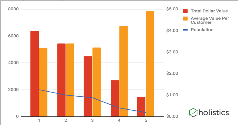
When Measuring Performance, Find Lines in the Sand
One of the most useful ideas from the 2013 book Lean Analytics is the notion of 'lines in the sand' — concrete values that tell you how well you're doing on a metric that matters.
In Part 2 of our summary of Lean Analytics, we cover the five stages of a data driven startup, and the book's tips for creating a data-driven culture in your company.
In the first part of our comprehensive summary of Lean Analytics, we examine the basics of analytical thinking, explore six startup business models, and examine the metrics that matter the most to each.
In operational analytics, you're either looking at a leading indicator, or you're looking at a lagging trend indicator. Here's why this particular categorisation is so useful.
When you're implementing company-wide analytics, it's easy to fall into the trap of measuring only one metric. Don't. The principle of pairing indicators is why.
As we are still a very small startup, we do not have a dedicated data team but we want to democratize data access. Holistics plays a big role in our company by providing visualization and reporting features via connecting with our database.
A step by step guide and video for querying S3 data to build reports and charts, by using AWS' Amazon Athena and Holistics.
Planogram and Share of Shelf/Space (SOS) reports are key field execution reports that are important concerns for decision makers to carry out the marketing strategy. In this article, we will explain what Planogram and SOS reports are.
Many Mongo users get stuck going from MongoDB data to analytics. Getting data out of Mongo and into a relational database lets you build your reporting workflow.