Tableau vs Power BI: A Feature Comparison Matrix
Tableau and Power BI are two of the most popular BI tools on the market. In this comparison, we break down their features side by side to help you decide which one should you use.
LAST UPDATED May 05, 2026
AUTHOR  Holistics Team
Over the years, we've received over hundreds of RFPs (Requests for Proposal) from a wide range of prospects and customers, from small businesses to international Fortune 500 companies. This has given us valuable insight into how data teams evaluate BI tools, the key questions they ask, and the capabilities they prioritize.
We’ve distilled those insights into a BI comparison matrix and used it to compare today’s leading BI platforms side by side.
Because every team’s priorities look a little different, we’ve also shared a Google Sheet version you can copy, adapt, and use directly with any vendors you’re assessing.
Our approach:
- Facts are prioritized over opinions, no recommendations pushed
- Details are backed by official documentation
- High-level criteria are broken down into specific, measurable sub-points
- Findings are presented in in clear, comparable tables
- Linking to real-world discussions from actual users
We understand we might come across as biased, since we're also a vendor selling BI solution. Rather than claiming neutrality, we'll let the content below speak for itself.
Found an inaccuracy or want your tool added? Use this form.
Feature-by-Feature Comparison Table
Scroll to the right to see more
| Dimension | |  Power BI Power BI | |
|---|---|---|---|
| Demo Playground Availability and quality of demo playground for testing the tool before purchase. | |||
| | |||
| Pricing Structure Pricing model and cost structure of the BI tool. | |||
| | User & Capacity Based Free account, user-based licenses, and capacity-based pricing for enterprise. source | ||
| | Contact Sales No pricing estimate available. Contact sales for a custom quote. source | $9,000+/year Power BI pricing starts at $14 per user per month for the Pro plan (annual billing) and $24 per user per month for the Premium plan. source | $9,000+/year Entry plan starts at $800/month. Enterprise plans available for larger teams. source |
| Visualizations Chart and visualization capabilities of the tool. | |||
| |  Hundreds of native chart types including bar, pie, line, area, matrix, and advanced visuals. source | ||
| |  Custom visuals from AppSource marketplace and self-developed using PBIViz tools. source | ||
| | Theming for Branding Custom styling and branding with white-labeling for client-ready embeds. source |  Custom styling through JSON themes with color palettes, typography, and branding. source | Custom Theming Comprehensive theming with custom CSS for brand alignment and styling. source |
| |  Smart Narratives, embedded text summaries, and Copilot for conversational insights. source | ||
| Ease of Use & Self-Service How user-friendly and self-service oriented the tool is for non-technical users. | |||
| | Interactive Dashboard Exploration Drilldowns, filters, and click-through exploration for data analysis. source | Interactive Drilldowns Drilldowns, filters, and click-through exploration for deeper data insights. source | |
| |  Ask Data feature for natural language queries and immediate visualizations. source | Q&A Visual AI-assisted natural language queries using Q&A visual for instant answers. source | |
| | Calculated Fields Extensive built-in calculation capabilities for common business metrics and KPIs. source | AI-assisted DAX calculations with point-and-click analytics for common operations. source | |
| |  User-friendly interface with drag-and-drop functionality and guided report creation. source |  User-friendly report canvas with drag-and-drop builders and guided tours. source | |
| | 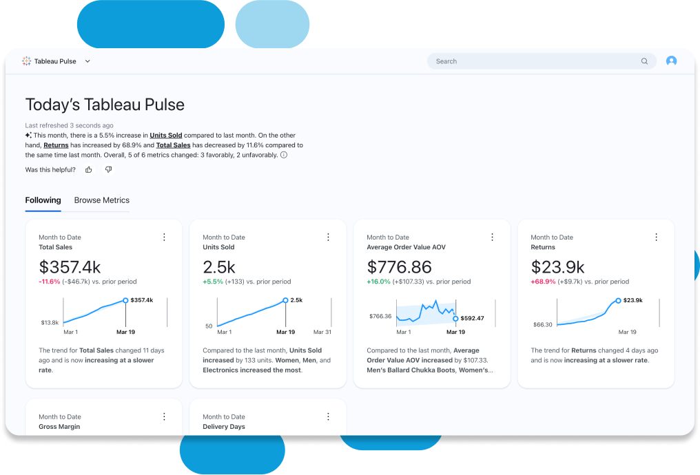 AI-powered features including natural language queries and automated insights. source | AI insights, auto-charting, natural language queries, and Key Influencer visual. source | 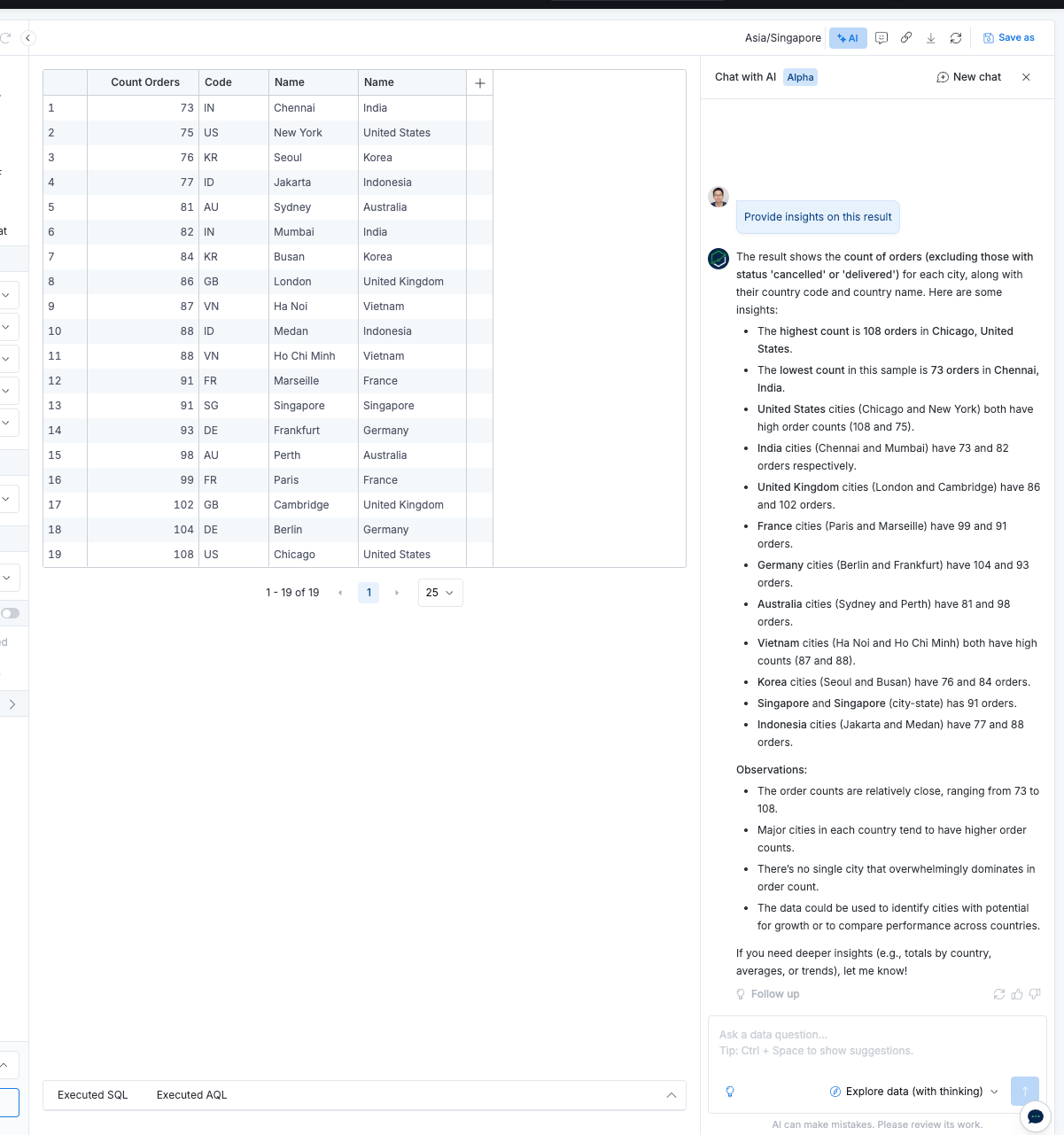 Natural language queries with AI assistant for data exploration and insights. source |
| Data Delivery How data and reports are delivered to end users. | |||
| | Comprehensive Alerts Advanced alerting system with customizable thresholds and multiple notification channels. source | Custom Alerts Custom alerts and scheduled subscriptions for timely information delivery. source | |
| | Enterprise Sharing Enterprise-grade sharing with granular permissions and secure distribution options. source |  Secure sharing via Teams, PowerPoint, Excel with PDF, CSV, Excel export options. source | Secure Sharing Internal RBAC sharing and external distribution with multiple export formats. source |
| Embedded Analytics Capabilities for embedding analytics into other applications. | |||
| |  Supports iframe embedding, REST API, and JavaScript API for integration. source | Azure PaaS Power BI Embedded as Azure PaaS for embedding interactive reports into applications. source | Iframe + API Basic dashboard embedding and self-service embedding for report creation. source |
| | Branding Options Customizable branding and theming for embedded analytics with CSS customization. source | Custom Styling Custom styling and branding of dashboards using themes and color palettes. source | |
| | Limited Self-Service Basic self-service capabilities for embedded users with appropriate licensing. source | ❌ No direct embedded report builder for end users in embedded context. source | Self-Service Embedding Embedded users can create and edit their own reports and dashboards. source |
| Reliability & Performance System reliability, performance optimization, and monitoring capabilities. | |||
| | Advanced Optimization Comprehensive query optimization with caching, incremental refresh, and performance tuning. source | Import Mode Import mode, pre-aggregation, and summary tables for performance optimization. source | |
| | Enterprise Monitoring Enterprise-grade monitoring with comprehensive performance insights and alerting. source | ❌ No explicit built-in monitoring, freshness indicators, or error alerts. source | |
| Semantic Modeling Data modeling and semantic layer capabilities. | |||
| | Tableau data model provides semantic layer capabilities with calculated fields and parameters. source |  Semantic modeling with OneLake data hub for single source of truth. source | |
| | Limited Version Control Basic version control through Tableau Server/Online with limited branching capabilities. source | Git Integration In Power BI Desktop, enable the preview feature to save reports as .PBIP projects and check into Git, while Microsoft Fabric provides native Git integration. source | |
| | Manual Sync Manual metadata management with limited automated synchronization capabilities. source | ❌ No explicit automated metadata sync from dbt or data warehouses. source | |
| | Limited Code Support Limited code-based management with some API capabilities for automation. source | ❌ No explicit analytics-as-code for dashboards or models. source | |
| Security and Governance Security features and governance capabilities. | |||
| | Enterprise Security Comprehensive RBAC, SSO, and group-based access control for enterprise environments. source |  Microsoft security standards with data governance and sensitivity labeling. source | |
| |  Built-in compliance features with audit logs and monitoring for regulatory requirements. source | ❌ No explicit audit compliance features mentioned in documentation. source | |
| | Advanced Security Advanced data masking, encryption, and security features for enterprise data protection. source | ❌ No explicit data masking or encryption features mentioned. source | |
| | Enterprise Monitoring Enterprise-grade security monitoring and logging with comprehensive visibility. source | ❌ No explicit monitoring or logging capabilities mentioned. source |


Tableau Pros and Cons
Tableau Pros
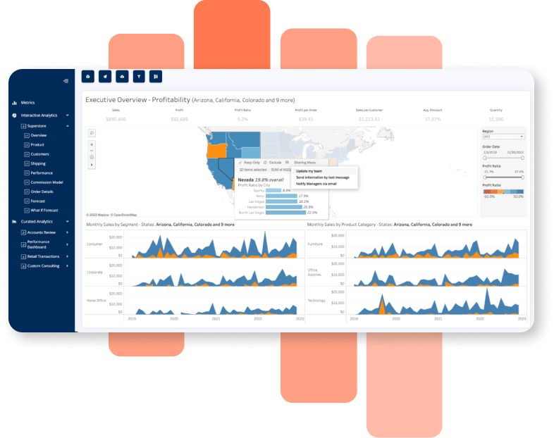
- Powerful Visualization Capabilities: Tableau is still the go-to if you want slick, interactive dashboards. It allows users to create highly interactive dashboards with drag-and-drop ease while supporting complex chart types like treemaps, waterfall charts, and geographic maps.
- Flexible customization: From grouping and sets to geographic mapping, Tableau gives you fine-grained control over how data is displayed.
- Integration & Connectivity: Tableau supports connections to a wide variety of data sources, from SQL databases to cloud platforms (AWS, Google BigQuery, Snowflake), spreadsheets, and APIs. This flexibility makes it fit nicely into mixed tech stacks.
- Scalability and Performance: Tableau users shared that it can handle large datasets efficiently with features like Hyper data engine and extracts, which speed up query performance and allow offline usage.
- Flexible Deployment options: Tableau can run on-premises (via Tableau Server) or in the cloud (Tableau Online). This makes it viable for industries like healthcare or finance where data residency and compliance rules block SaaS-only tools.
- Strong user community: Between Tableau Public, “Viz of the Day,” and thousands of forum posts, the ecosystem is rich. If you get stuck, chances are someone has already solved that edge case. This lowers the ramp-up time for teams adopting the tool.
Tableau Cons
- High Licensing Costs: Tableau licenses are priced per user. It’s manageable for small teams, but rolling it out company-wide quickly becomes expensive. Tableau Server and Tableau Online also need IT support for provisioning and performance tuning, which raises the total cost of ownership.
- Weak data prep layer: Tableau doesn’t include a full semantic or transformation layer. Most teams rely on Tableau Prep or external ETL before analysis .
- Limited governance & version control: Tableau’s proprietary .twb/.twbx files lack native Git workflows (branching/PRs/reviews). One analyst publishing over another can overwrite changes, making change management fragile versus code-first BI (e.g., Looker, Holistics, Evidence). This also complicates peer review, approvals, and audit trails.
- Data modeling gaps: Tableau doesn’t have a strong semantic layer, so business metrics can be defined inconsistently across teams.
- Salesforce strategy concerns: Since Salesforce acquired Tableau, some users feel the roadmap has tilted toward embedding Tableau into Salesforce rather than innovating on core BI features. That uncertainty makes some enterprises hesitate on long-term adoption.
When should a data team use Tableau?
Tableau is a strong fit when data storytelling and presentation are the priority. If your executives demand polished, interactive dashboards that look great in board meetings or client-facing reports, Tableau is still best-in-class. It’s also useful when teams need flexible, exploratory analysis - things like custom mapping, advanced chart types, or highly formatted visuals. For industries like consulting, media, or finance where “wow factor” visuals matter, Tableau excels. But teams should be prepared for higher licensing costs and the need for IT support to manage Tableau Server or Online, especially if deploying at enterprise scale.
Related Reading: The best alternatives to Tableau for modern data stack
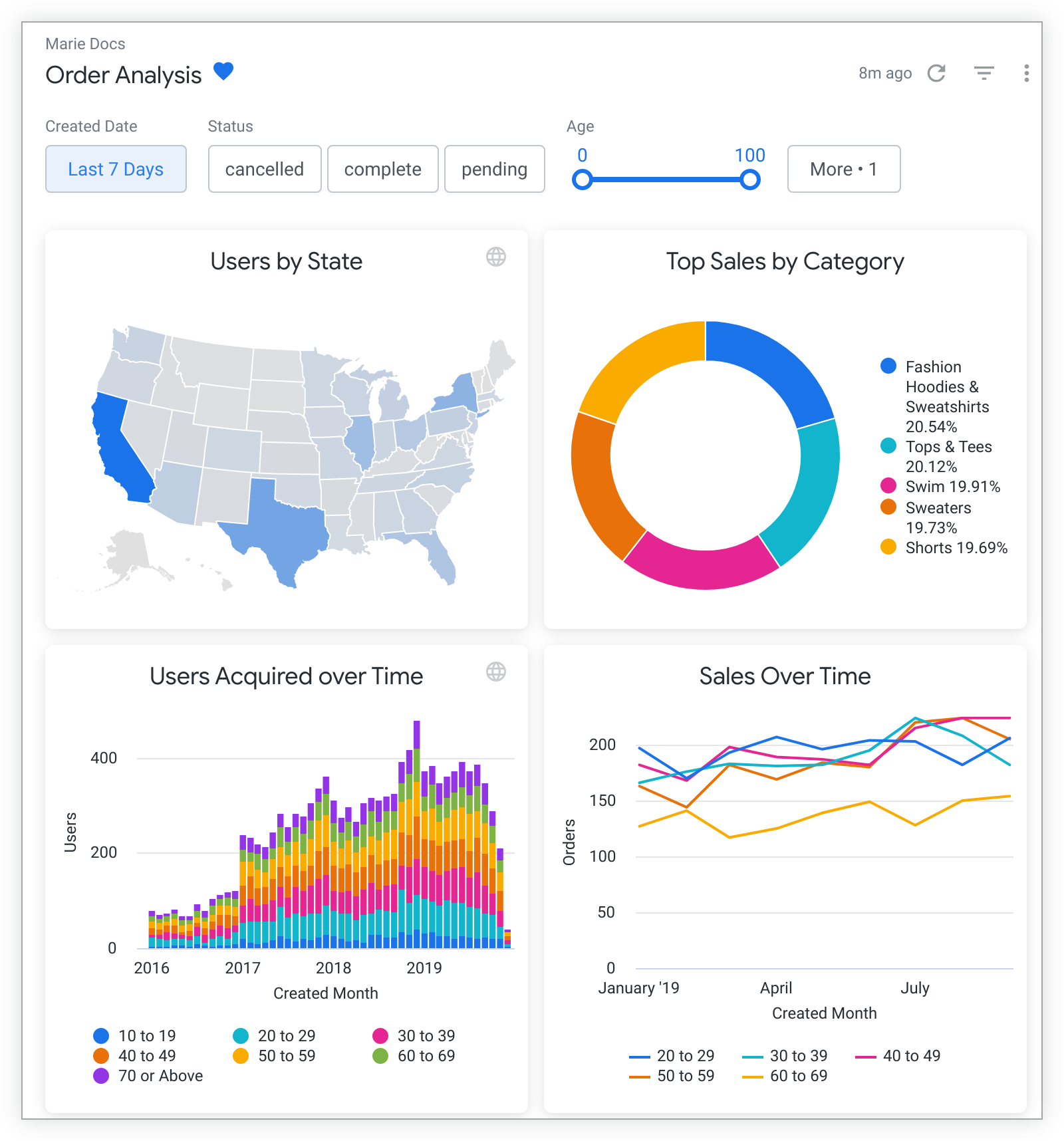
Sample Dashboard in Tableau
Power BI Pros and Cons
Power BI Pros
- Strong integration with Microsoft ecosystem: Power BI fits seamlessly with Excel, Azure, SQL Server, and Teams. For organizations already on Office 365, it’s a natural extension. You can pull in Excel models directly, use Azure Active Directory for permissions, and automate workflows with Power Automate.
- Affordable pricing model: Power BI Desktop is free for individuals, and the Pro license is only about $10 per user/month. Compared to Tableau’s user-based pricing, it’s far cheaper to roll out across a company. Even Premium capacity is often cheaper than managing Tableau Server licenses.
- Familiar interface for Excel users: The learning curve is easier if you’re used to pivot tables, Power Query, and formulas. Drag-and-drop feels familiar, and the jump from Excel to Power BI is smoother than moving to a tool like Tableau.
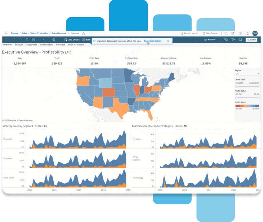
- Robust modeling features: Power BI includes a semantic layer through its data model. DAX (Data Analysis Expressions) lets analysts build reusable measures and metrics across reports, which helps with consistency.
- Scalability with Power BI Premium: For enterprises, Premium offers dedicated capacity, advanced AI capabilities, and large-scale distribution options.
Power BI Cons
- DAX learning curve: While powerful, DAX can be unintuitive for new users. It feels less natural than Tableau’s calculated fields, and most analysts need significant training before they’re productive. Many Reddit users describe DAX as “simple but not easy.”
- Visualization flexibility is limited: Power BI visuals are less customizable than Tableau’s. Even with custom visuals from AppSource, small design tweaks often require workarounds. Teams focused on presentation quality sometimes find this frustrating.
- Sharing requires paid licenses: To securely share dashboards internally, every viewer needs at least a Pro license. This makes collaboration trickier for organizations trying to minimize costs. Without it, you’re limited to publishing to the web, which isn’t secure
- Collaboration tied to Microsoft stack: Sharing and publishing require Power BI Service (cloud), which is tightly integrated with Azure and Office 365. For teams outside the Microsoft ecosystem, this can feel restrictive.
- Performance bottlenecks on large data: Import mode works well, but DirectQuery can be slow, especially with complex joins. Performance tuning often requires building optimized models in SQL or using aggregations.
When should a data team use Power BI?
Power BI is the natural choice for organizations already invested in the Microsoft ecosystem. If your company runs on Office 365, Azure, SQL Server, or Teams, Power BI integrates seamlessly and keeps licensing simple. It’s also a strong option when budgets are tight: the free desktop version is great for individuals, and Pro licenses are inexpensive compared to competitors.
Power BI works best for teams that need a robust modeling layer (via DAX) and are comfortable with a bit of technical learning. It’s less suited for presentation-heavy use cases, but for internal analytics at scale, it delivers high ROI.
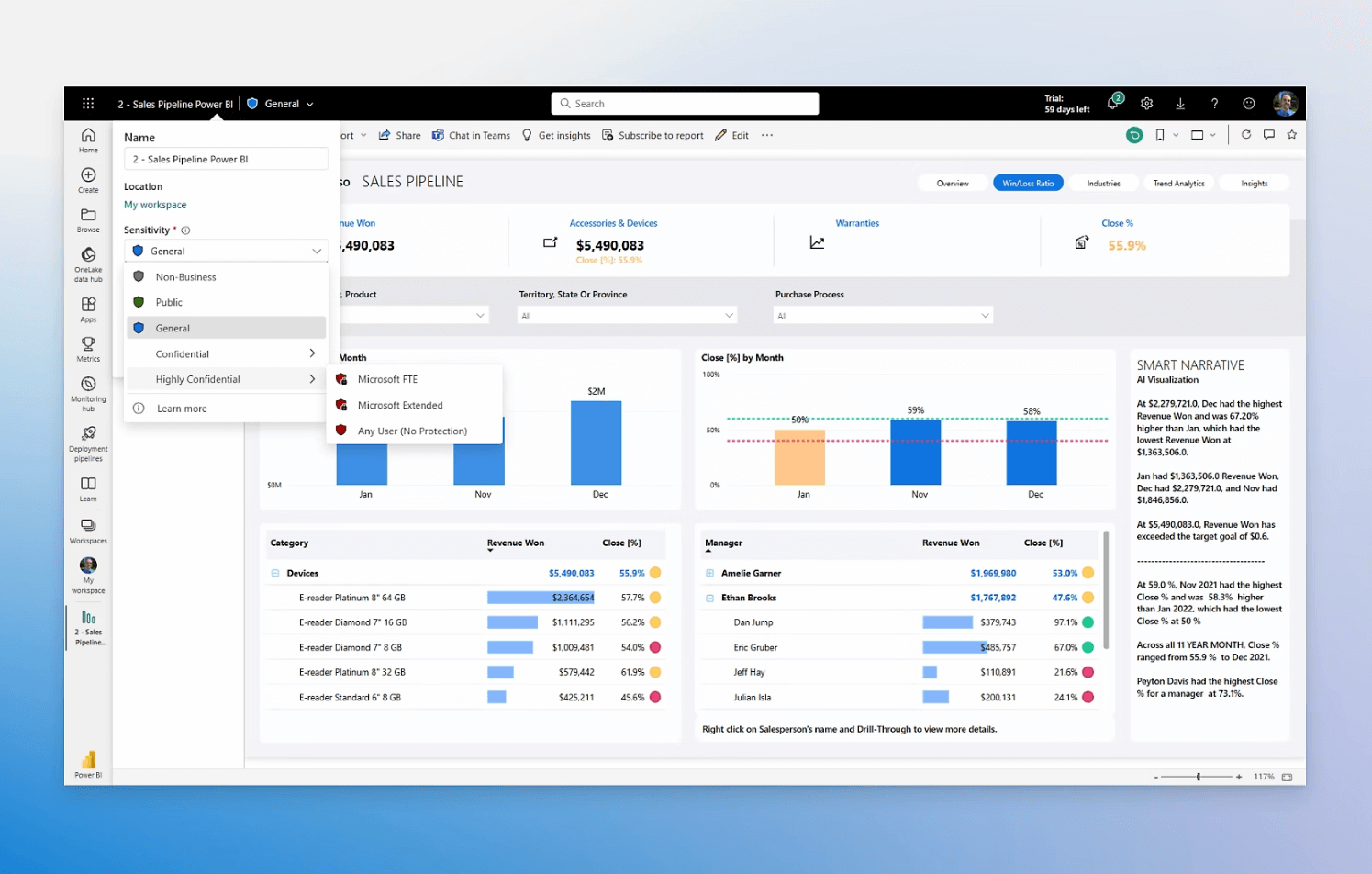
Sample Dashboard in Power BI
Tableau vs Power BI: What should you choose?
If your team is already deep in Microsoft products and cost is a concern, Power BI is the pragmatic choice. If your stakeholders value highly polished visuals and interactive storytelling, Tableau may deliver more impact. For many enterprises, both tools end up coexisting, each used for different purposes.
For teams who want the strengths of both without the trade-offs, Holistics provides a middle path.
Built on the idea of a semantic modeling layer, Holistics lets data teams define metrics once and empower business users to self-serve dashboards using AI assistant or point/click UI. It combines the modeling and analytical rigor of Power BI with the design flexibility of Tableau, while avoiding the high costs and ecosystem lock-in.
Read more: Power BI Embedded vs Tableau Embedded: Which One Should You Choose?.
Community Discussions
Discover what other practitioners are discussing about this topic.

r/businessintelligence
Posted on June 2024 View source
Which BI tools impressed you the most (excluding usual suspects Tableau, Power BI, etc)?
Every BI tool have their pros and cons.
Wondering if anyone came across a BI tool that impressed them a lot in terms of features, ease of use, scalability, etc.
Been looking at tools such as evidence.dev, Rill, streamlit, some others and wondering others perspective on it, is it any good? Types of vizualisations available, end-to-end BI process improved or added headache?
2top comments
Posted on April 2023 View source
Between the three, which BI tool do you prefer and why?
1top comment
Power BI. If you know what your doing with that tool and Azure you shouldn't need a dozen other tools. It is dominating the quadrants. It is cheap. Paginated is now included in Pro.
Dwh, measures in dax, blob storage compatibility, great visualization, can migrate cubes to it, etc.
Tableau is not getting investment, others are either immature, dying, recreating the wheel....
r/PowerBI
Posted on September 2023 View source
Why is PBI better than Tableau?
My organization is looking at Tableau and I am admittedly a bit biased against it. PBI has been introduced but most folks are using excel and its hobbled by the lack of data flows being enabled.
To me then reasons why PBI rocks are: DAX Third party tools (dax studio, tabular editor) Complex data modeling Deneb and other custom visuals Integration with the Microsoft stack / power platform/ excel The Italians/ Patrick
I have heard that tableau offers: Easier or quicker reads of data over power bi (especially over a million records) More natural integration with AWS and Sagemaker Easier to make visuals
Am I missing anything?
2top comments
My Org. Is currently transitioning from Tableau to PBI. Having used Tableau for the past 3 years I will say it’s more snappy with throwing measures on a chart to do quick analysis. Also building dashboards appear to look nicer than PBI. But having to create a new sheet for every visual can become a pain with data heavy dashboards.
As I am learning PBI, I feel getting data to join is easier in PBI. Not having to do power query in excel then load into tableau to build a data source. Where it all lives within PBI. Although DAX is intimidating, I am starting to understand the logic behind it.
The biggest weakness in Tableau right now, as I see it, is that it is owned by Salesforce. I have no confidence that they can modernize Tableau.
The biggest weakness in PBI it's its visuals. The GUI is very clunky.
r/Looker
Posted on July 2023 View source
How does Looker compare to power BI and tableau?
For those with experience in the other two tools what would you say are the pros/cons of Looker?
2top comments
Looker is a BI Platform whereas Tableau (Ive not used PBI) is a Visualization tool.
They serve different purposes imho. Tableau does not allow much flexibility when it comes to ad-hoc reporting. A Tableau best practice is to not build dashboards on datasets with more than a handful (20 or so?) attributes, whereas Looker has the concept of 'Explores' that can contain hundreds of attributes for the end user.
A company that only uses a visualization tool like Tableau really limits who has access to pull reports. People at my company complain so much about Looker and they want Tableau but what they don't realize is that if we had Tableau, they likely would not have a developer license and they would have to give their reporting/dashboarding requirements to a BI Developer to create their reports. For small companies that can really create a bottle neck and the average business end user likely doesn't know enough SQL to explore the data.
Semantic layer of using LookML rocks. Visualization piece not so much. Compared to tableau is lacks a lot.
r/BusinessIntelligence
Posted on December 2024 View source
Which BI Tool?
Hi, Our current team has a huge footprint (200+ dashboards)with QlikView. Also, the team has traditionally used it as a ETL tool as well. Now we have a mandate to decommission QlikView and start exploring other tools. We do not have an option to move to QlikSense. Internally the firm is pushing towards Power BI. Tableau is already in use, but it is not as robust as QlIkView (personal opinion).
Can someone suggest some other alternatives that can help us.
Can someone suggest some other alternatives that can help us.
2top comments
Sounds a lot like us. Legacy environment:
- multiple BI tools / multiple data warehouses
- QlikView: 340 dashboards, 2k+ daily tasks, ETL in Qlik script
- Moving to: 5Tran, Snowflake, dbt, PowerBI
Observations:
- Qlik script skillset is highly transferable to snowflake SQL.
- Snowflake is a columnar database, like Qlik, and like Qlik you do not have to worry about traditional database concepts like indexing, record locking, performance, etc. Your Qlik developers might find it difficult to find noticeable differences between Qlik script/qvd and Snowflake SQL/snowflake tables beside the obvious syntax differences.
- MSnowflake has all functionality of Qlik script (we did HEAVY ETL transformations in Qlik), and it adds capability like better data insert/merge, and recursion, etc. Some geospatial functionality that looks very similar to Qlik geo analytics which we also use heavily. Obviously, snowflake adds all the new generation of cloud data warehouse capabilities like ingesting different cloud data formats.
Tips:
- Ensure your leadership understands that cloud means renting their infrastructure. Cost is the biggest pain point of my approach-but it was the choice of our leadership team. On premise to cloud is a big transformation, make sure you know what that means.
- Separate the data warehouse and BI layers, and build good models. Note: Qlik is less picky than other tools about the model because of its associative data models. PowerBI technically works with any model, but you’ll see its best with a star schema. Also, this separation between data and presentation will allow flexibility in future tool changes.
Late to the party, and someone has already mentioned, but I’d like to vouch for Holistics, Sigma and Omni.
They are all decent BI tools, but if you’ve got heavy ETL needs like you did with QlikView, you’ll probably need to add a dedicated ETL tool into the mix. Something like Alteryx or Azure Data Factory could fill that gap.
r/BusinessIntelligence
Posted on September 2024 View source
Tableau vs Looker
The company (600 people) i work for has to streamline their BI tooling portfolio which means in a few months we need get rid of either Tableau or Looker. Currently most of the reporting is done via Tableau, but we have a few Looker users as well. To make things easier - irony - we also want to let users do their own thing (self-service BI).
I would prefer to keep both tools alive, Tableau for fancy executive type and complex dashboards, and use Looker for self-service. However leadership needs a bigger yacht so we have to cut costs, one has to go. Can’t do Power BI, we are a G-suite company.
What do you think about my view/assumptions? How would you decide which tool to pick if any?
4top comments
First of self serve BI is a myth. Second I assume your IT infrastructure can handle either option.
If you want great visualization, drill downs then Tableau is the way to go. If you are in the google ecosystem and also need some ML stuff then looker. Can also look at the volume licensing structure. I would suggest going with one rather than both. Maintenance costs would eat you alive.
Relatively new to Looker development (6 Mos and LookML certified), and nothing seems to work as well in Looker as it did in my old job in Tableau - except the crazy ass sql that can be written by clicking in a well curated explore. Looker Data Studio Pro could satisfy your Tableau hungry people (not as good as Tableau, but it's got more viz capabilities than Looker). It seems those awesome days of analysts building amazing tools, but also holding the keys to the information are numbered if not already gone. Embrace the future as disappointing as it is.
Looker's big advantage, as it's always been, is its semantic layer. It's easy there to map out hugely advanced and complex datasets in ways that then make visualization easier. It's really built as a nice semantic layer that happens to do visualization.
Tableau is kind of the opposite. Tableau sucks at actual data stuff... Managing the data, joining it, building reusable measures, etc... tableau sucks for that stuff. But Tableau makes pretty pictures.
So you might want to think about what matters to you and your users over time.
Seems pretty straight forward - get rid of Looker and make the few users who are using it change to Tableau.
You may have a lower subscription cost for looker, but you need to hold that recurring savings up against the cost of change for your tableau setup: Report migration, change management / re-training of existing user-base, dual licensing during migration period, setup of integrations, etc.
How far out is your breakeven point then on a pure cost / savings basis?
After that you have to consider that in all likelihood, your report migration will not just be a migration but a report change, in cases where Looker can't produce the same visuals etc. as Looker. That's going to add an extra element of stuffing looker down people's throats to get a worse looking product (report) than they already had.
I hope that break-even point is in the near-future. Then you can of course argue that with Looker being part of the google product suite, you've got some architectural benefits and licensing benefits and maybe some machine learning awesomeness you can make use of, potentially... down the line... if it turns out to be useful...
So without knowing your specifics, you'll need to make a pretty strong "architectural " case in addition to your business case. In addition you can possibly argue for a "process optimization" / "time to delivery" case, by having a single platform within the company for people to build expertise in. Basically saying "we're placing all bets on G-suite including BI, that's the direction, your reports may end up looking a bit worse, but we'll save money and streamline our BI process in the mid-term, and long-term we think it'll be a better product".
r/PowerBI
Posted on September 2023 View source
Power BI VS Domo? Which is better?
Which is better, Power BI or Domo? I recently joined a team that is all about Domo and may have to leave Power BI behind. I am curious as to which BI tool is better, as my experience in Domo is just beginning. So far, I don’t love it and I’m hoping there’s some gems in there I just haven’t discovered yet.
2top comments
Haven't heard of Domo but if the Gartner Magic quadrant is considered a good measure then it's a way behind Micrososft.
https://www.domo.com/learn/report/domo-named-a-challenger-in-2023-gartner-magic-quadrant
I'm always suspicious of vendors that say "contact sales for pricing". Any idea what the cost is for licencing? Looks llike you need to write some SQL to connect to data source.
Domo's Marketing strategy involves getting their salesmen in the room with C-Suite execs and keeping "technical people out of the room until we're talking about implementation".
I'm currently with a company that paid a small fortune for domo and it's almost universally hated by everyone. The analysts have to spend hours trying to get it to work, datasets collapse regularly under the weight of compute. It's absolutely not intuitive, the native MONITORING suite is an app you have to install from the marketplace.
At its best, it's a way to go get an excel export. We're currently trying to transition away from it and one of the lead contenders in the meanwhile is PowerBI.
r/PowerBI
Posted on February 2025 View source
Tableau vs. Power BI ⚔️ Clash of the Analytics Titans
The big debate in the business intelligence (BI) and analytics world right now is Tableau vs. Power BI, with AI BI being a wildcard influence both inside and outside of these leading platforms.
There are countless BI platforms out there, but Tableau and Power BI are the dominant players — as you can see from Google Search Trends chart pictured here, Power BI has seen steady growth, and search volume has surpassed Tableau — the reason for this change has multiple causes:
1. Tableau interest peaked with the SFDC acquisition and then stagnated — it’s likely leadership, marketing, and business changes led to this.
2. During the start of the COVID pandemic, we saw a steep decline in Tableau interest, whereas Power BI only experienced a temporary dip. Both orgs rebounded in Feb 2022. However, Power BI search volume has continuously surpassed Tableau since that time.
3. Post-pandemic, what was going on? Microsoft’s marketing and sales machine continues to hammer their “Fabric” data infrastructure — Azure, Power BI, etc. If a team was migrated to Azure for their data warehouse, Power BI becomes an upsell. During higher interest rate times, savvy teams are auditing their entire tech stack, and analytics tools like Tableau are no exception. Leading data and IT teams are exploring build vs buy for self-serve analytics and long-term growth. For many enterprises already on a Microsoft stack both for 365 and Fabric, it’s natural to evaluate Power BI —
4. The Salesforce roadmap with Tableau remains lose and uncertain — people are speculating Tableau will be rolled into SFDC and at some point, but there is no clear and public plan — enterprises investing millions in their data stack and 5–10 year tech stack road map do not like uncertainty.
2top comments
This helps reinforce what we all know: Salesforce killed Tableau (so far).
Also, Tableau is materially more expensive. As they become closer to parity, more companies are going to choose PBI because BI is not revenue-generating (technically). Half the price is a no-brainer unless your usecase is ONLY supported by Tableau.
<br. Honestly, Microsoft should just spend what it takes to match Tableau for viz specifically. Then charge 15-30% more. They would bury Tableau forever because the lack of visual customization is really the only concrete thing Tableau is still significantly better at.
Tableau calculated fields are way more intuitive and simple than DAX. They cannot accomplish everything DAX can, but almost everything. And for the things it can't, it's almost niche.
Still, both tools are quite good though.
r/PowerBI
Posted on September 2023 View source
Superset/Metabase vs Power BI/Tableau
I am currently evaluating which BI tool will be implemented across the company. In my earlier companies I have used Superset where I wrote SQL queries for each dashboard or insight requirement and created a visualisation directly from them.
I realised that in Power BI I can't write SQL queries directly, I can only connect directly to the database tables and do the transformation inside Power BI. A workaround would be to write sql queries separately and create a view in my db and then connect power BI to the view to create a dashboard.
I want to ask for your opinions on this. 1. Should I move to a tool where I can write queries and make visualisations. 2. Use views with power BI. 3. Simply abandon SQL queries and just do transformations entirely in power BI.
2top comments
You can write sql queries directly in power bi, in the option to import or direct query, extend the window and you can write there. Use it for import or direct query.
I advise building views anyway for reusability and maintainability outside of Power BI desktop app. Im sure Tableau has similar options.
Take into consideration how your end user interacts with the final product and if the aesthetics of one tool or another increase adoption. Those pretty charts are worthless if no one in the company leverages their insights.
For some reason every time I started at a new place, I was thrown right into the BI evaluation process. Having gone so far down the rabbit hole, here are the tools that really impressed me.
- Holistics (we use this)
- Looker
- Sigma
- Hex
Hex is more of a notebook-style tool. It’s really fast, perfect for exploratory analysis.Sigma is spreadsheet-focused, so I imagine finance folks (or any Excel lovers) would find it particularly intuitive, plus it's got solid visualization features.
Looker is an old favourite around here, you'll see plenty of love (and sometimes hate) for it in this sub.
Holistics builds on the ideas Looker established, where data team defines the relationship between tables and how metrics are calculated on a semantic layer, and then everyone else can use the tool to build their own reports. What I really like is how they’re innovating where Looker is lacking, like with their visualizations. They've got this "dashboard as code" feature that opens up a lot of creative possibilities for dashboard designs.
Superset has been a fantastic BI tool in our company as an alternative to Tableau or Looker.
Since it is free and fully open sourced it has been great to have our R+D team extend and embed it within our own product, and also empower the BI team to create custom dashboards to replace default ones for enterprise clients.