BigQuery Visualization & BI Reporting Tools To Power Up Your Data Team Performance
This post will help point out the strengths and weaknesses of some of the most popular BI tools on the market that work well with BigQuery.

Contents
What is BigQuery?
BigQuery is one of the most popular data warehouses on the market. Since BigQuery is a part of the Google Cloud Platform, besides scalability and cost-effectiveness, BigQuery customers are also generously endowed with lots of other benefits related to other Google products.
High adoption of Google BigQuery leads to a lot of BI vendors optimizing their products to fit with this server-less, multi-cloud platform. Data analysts gradually find it harder to make heads or tails of the most suitable one for their companies.
This post will help point out the strengths and weaknesses of some of the most popular BI tools on the market that work well with BigQuery. Though a careful trial is always recommended in the end, I hope this post will help you narrow down the scope of choice and thus save time and human resources trying out all the tools.
What Makes a Good BI and Data Visualization Tool for BigQuery
You’re in the right place if you’re navigating the sea of business intelligence tools and wondering which one won’t just connect to BigQuery, but actually amplify its power. Not all BI tools are created equal, and when it comes to Google’s petabyte-scale data warehouse, the differences matter.
Here’s how experienced teams evaluate BI tools for BigQuery:
1. Native Integration with BigQuery
A tight, native connector is foundational. It means no fiddling with custom drivers, fewer surprises with authentication, and direct performance gains from BigQuery’s architecture. Tools that support BigQuery’s full SQL dialect, leverage materialized views, and support authorized views will always have an edge.
2. Support for BigQuery-Specific Features
Great tools let you operate in the BigQuery way. That means:
- Pushing down queries to BigQuery (vs. pulling data into memory)
- Respecting BigQuery’s access controls (column- and row-level security)
- Supporting scheduled queries and caching strategies that reduce query costs
Some tools even support streaming inserts, federated queries, and nested/repeated fields.
3. Modeling Layer for Centralized Logic
BigQuery is powerful, but it’s still a raw warehouse. BI tools that offer a semantic layer, either natively or via integration with dbt, help teams avoid reinventing metrics and maintain consistent logic across dashboards.
Bonus points for tools that version this logic in Git.
4. Performance and Cost Management
It’s easy to rack up BigQuery costs with overly chatty dashboards. Good BI tools help you manage query frequency, reuse cached results, and use preview modes before executing expensive transformations. Transparent query logs and explain plans are a must-have.
5. User Experience: Both Analyst and Business User
Analysts need expressive tools, with full SQL control, reusable components, and notebook-style debugging. Business users need a simple UI to ask their own questions and trust the numbers. The best tools balance both without treating either audience as an afterthought.
6. Collaboration and Delivery Features
From email scheduling to embedded dashboards to Slack alerts — the way BI fits into daily workflows can be a dealbreaker. The stronger the support for access controls, versioning, and sharing modes (especially across clients or teams), the more likely the tool scales with your org.
7. Pricing and Licensing Model
Lastly, don’t ignore licensing friction. Tools that charge per viewer can become cost-prohibitive fast. Look for models that align with your use case: per-developer pricing for internal use, or usage-based tiers if you’re embedding dashboards in a SaaS product.
Top 5 BI & Reporting Tools for BigQuery
- Looker Studio (Google Data Studio)
- Holistics
- Power BI
- Looker
- Tableau
- Qlik Sense
1. Looker Studio (previously Google Data Studio)
If one is talking about Google BigQuery, they would be most likely mention Google Data Studio as the perfect complementary BI tool.
As the two products belong to the same ecosystem, setting up their integration is a matter of seconds, which gives GDS a superior advantage over its competitors.
Google Data Studio seems to target a set of semi-technical users who work with numbers and know Excel very well. They might even know a bit of scripting language (Python, JS), but not technical enough to work on data infrastructure or building full reports from scratch, or building complex analysis that requires some SQL acrobatics.
Why It Works with BigQuery
- Native BigQuery connector with minimal setup.
- Leverages Google authentication for secure sharing.
- Lightweight enough for marketing teams and agencies.
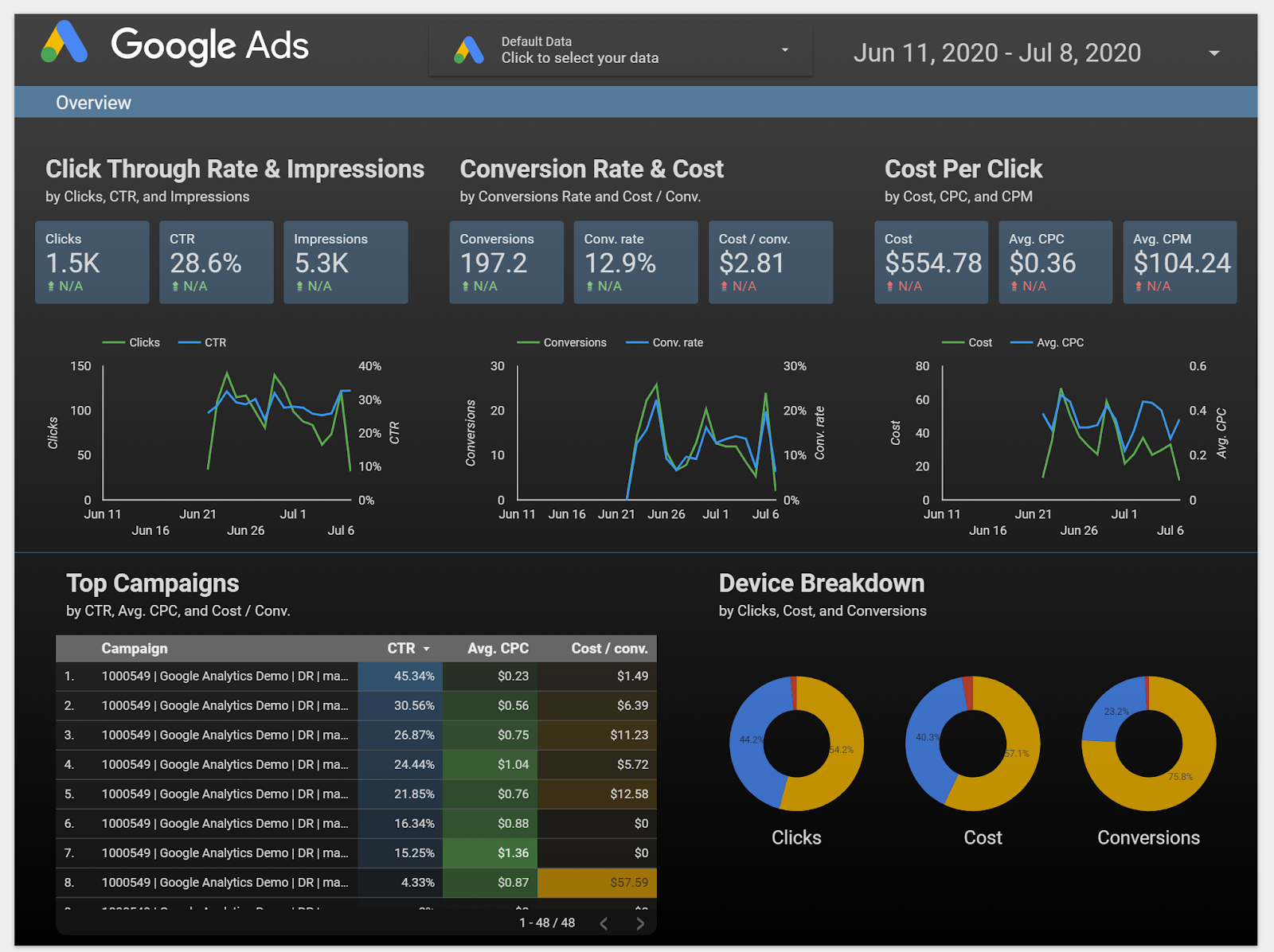
Strengths
- Great report presentation layer. The image above is self-explanatory. GDS provides a highly interactive drag & drop interface, where you can freely resize and align charts.
- Easily integrate other Google products like Google Analytics, Google Sheets, and AdWords so you can have even more information
- The UI is friendly and intuitive. If provided everything, I could start building a dashboard right away without having to read any docs (oh their pre-loaded Report Templates are awesome!)
Weaknesses
- Limited self-service analytics capabilities. If you give the dashboard above to a user, it's highly likely that he doesn't know where to find relevant data or drill down/ drill through.
- Selecting different metrics and dimensions requires some Excel knowledge in order to combine data correctly to create graphs and tables.
- If your data source is not Google-owned and needs to be integrated with Google Data Studio, it takes extra SQL code or ETL effort.
2. Holistics
Next to Google Data Studio is Holistics, a powerful self-service BI tool. Besides providing a powerful visualization layer that is easy to use for non-technical users, it also comes with a modeling layer that lets data analysts model and transform data in BigQuery and many other SQL data warehouses.
Why It Works with BigQuery
- Built for SQL-first workflows; everything is modeled in SQL or its custom AML (Analytics Modeling Language).
- Excellent support for materialized views and cached queries back into BigQuery.
- Git integration and scheduled reporting align well with modern data team practices.
Strengths
- Allows you to query the BigQuery database using customizable SQL queries and get fast results with its cache layer
- Materialized views of query results are stored back in BigQuery, for immediate access and fast visualizations and reports.
- Automated scheduling of reports and dashboards with the latest data in BigQuery, sent directly to your email inbox. This feature is fairly basic but not yet implemented in many other tools.
- Drag-and-drop interface for business users to explore data and generate reports to answer ad-hoc questions.
- Offer a custom-built DSL layer (called AML) to perform mapping between database tables and business logic, thus it's more flexible and customizable.
- Git Version Control to track every change, perform branching, code reviews to ensure an accurate analytics workflow
Weaknesses
- AML has a learning curve, especially for analysts new to semantic layers.
- Smaller ecosystem and fewer prebuilt connectors compared to larger players.
- Less polished charting options relative to Tableau or Power BI.
Related reading: BI Tools Comparison: A Community-Contributed Worksheet
3. Power BI
PowerBI is quite well-known in the BI industry, especially for enterprises that adopt the Microsoft ecosystem. It supports an impressive number of data sources, giving companies the power to centralize their data in one place.
PowerBI offers a user-friendly interface with amazing data visualization capabilities. It will work best if you're already familiar with Microsoft products.
Why It Works with BigQuery
- Connects to BigQuery via custom connector or Google Cloud integration.
- Works best with scheduled imports or cached extracts.
- DAX (Power BI’s modeling language) can be used to define reusable metrics on top of BigQuery data.
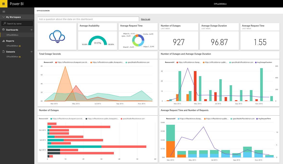
Strengths
- Support hundreds of data sources, from cloud services like Redshift to offline files like Excel
- Powerful data visualization capabilities. Besides the basic visualization types, PowerBI allows advanced users to choose from a market-place of custom visuals or create their own using well-known Javascript libraries
- PowerBI has mature data modeling capabilities.
Weaknesses
- DAX has a steep learning curve and is quite different from SQL.
- Desktop-first experience; authoring only works on Windows.
- Licensing gets tricky for sharing reports beyond your org.
4. Looker
Another Google Cloud Platform product, Looker is a powerful BI tool that provides an innovative approach for real-time data exploration and analytics.
Looker is tightly integrated with BigQuery, both technically and philosophically. It pioneered the semantic modeling layer approach and is now part of Google Cloud.
Why It Works with BigQuery
- Native support for BigQuery, including full SQL dialect and table partitioning.
- LookML compiles to SQL and pushes all queries down to the warehouse.
- Supports row-level and column-level access controls tied to BigQuery.
Strengths
- Semantic layer (LookML) makes logic reusable and governance strong.
- Git-based versioning for all analytics code.
- Works entirely in-browser — no desktop installs or OS restrictions.
- Excellent for embedded analytics and multi-tenant setups.
Weaknesses
- Looker has a steep learning curve when it comes to adopting a new language (LookML) & the model-view approach for the end-users. You definitely need to have an internal team that is dedicated to just setting it up and getting the rest of the people on board.
- Small errors are hard to troubleshoot and result in not using the dashboard much. No SQL CLI makes it disappointing for power users.
- Relative to other BI tools, the advanced charting functionality is somewhat limited
For more detailed BI tool list and analysis, check out:
5. Tableau
When it comes to data visualization Tableau is the champion of my heart. Although the setup process might be quite overwhelming with newbies, once you get used to it, you'll find that there's a long way for other tools in the market to compete with Tableau regarding this aspect.
This is simply because Tableau has dominated the market with its highly interactive dashboards, together with its huge library of visuals and supported metadata (check out their built-in map data!)
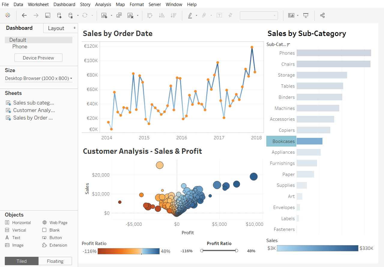
Strengths
- Best-in-class charting and interactivity.
- Mature product with a huge user community.
- Drag-and-drop UI with deep customization for visuals.
- Strong ecosystem for maps, geodata, and storytelling..
- Friendly drag-and-drop interface
Weaknesses
- Poor out-of-the-box modeling layer; you’ll need dbt or pre-processed tables.
- Desktop-centered workflow can be clunky (and Windows-centric).
- Viewer licensing can get expensive fast.
Qlik Sense
Qlik Sense is a flexible and powerful BI tool known for its associative data engine and ability to handle complex transformations inline.
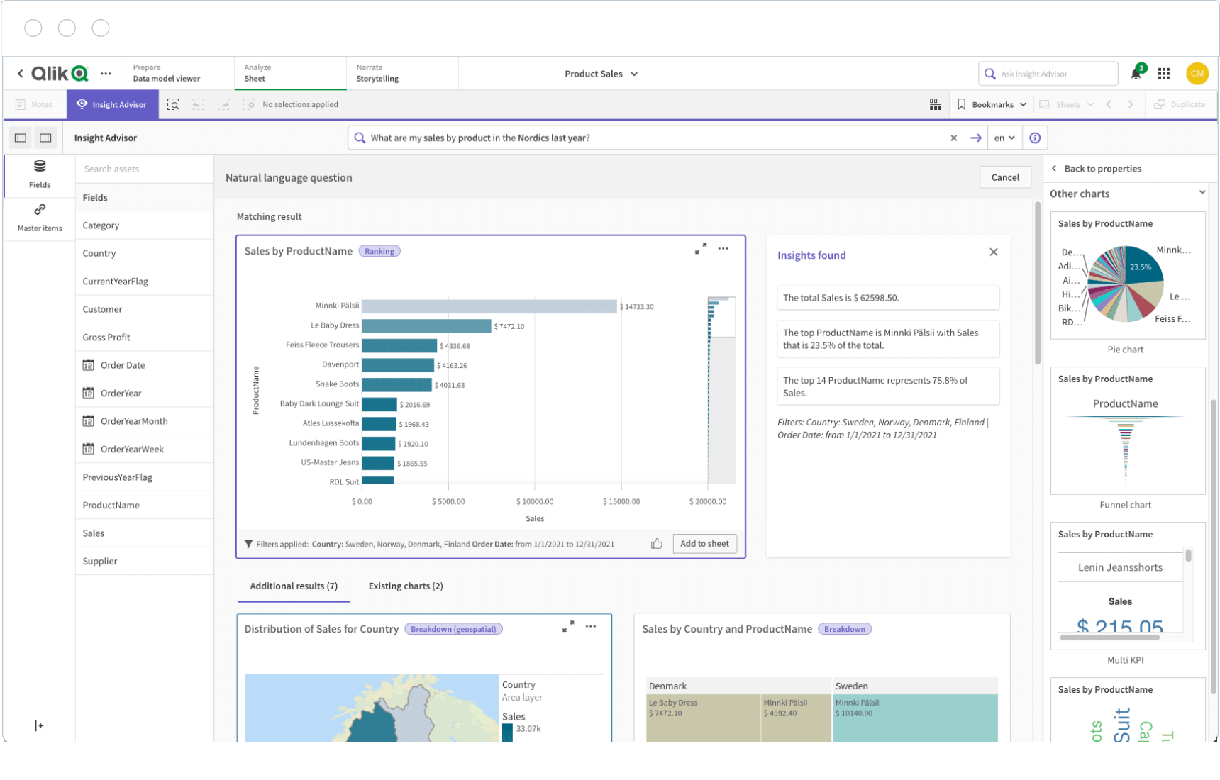
Why It Works with BigQuery
- Native connector with support for loading and transforming BigQuery data.
- Qlik’s in-memory engine can be tuned to avoid excessive BigQuery costs.
- Supports complex joins and filters that are hard to express in standard SQL.
Strengths
- Associative engine allows for flexible exploration and slicing/dicing.
- Scripting is SQL-like but more expressive in some cases.
- Strong security and access control.
Weaknesses
- High licensing cost in enterprise setups.
- Visualization and UX are dated compared to Tableau or Holistics.
- Not as beginner-friendly for non-technical users.
Conclusion
When testing out any of the above tools, remember to use a real use-case to see if the tool can really go with your day-to-day demands. Some features might sound impressive which can lure you into the trap of rationalizing its usefulness in the future by inventing edge cases that rarely happen in real life. This is also my mistake when trying out those tools, and I hope you'll never reinvent the wheel.
For more posts like this, subscribe to our newsletter below!
--
P/s: Thumbnail photo by Barn Images on Unsplash
What's happening in the BI world?
Join 30k+ people to get insights from BI practitioners around the globe. In your inbox. Every week. Learn more
No spam, ever. We respect your email privacy. Unsubscribe anytime.
