14 Best Open Source BI Tools: A 2026 Express Guide
In this article, we'll review 12 open-source & affordable BI tools that data teams love to recommend, including Preset, Holistics, Lightdash, and more!

If you need to make sense of your data, and you need a budget-friendly, flexible solution to do so, then an open source BI tool is obviously at the top of your mind.
In this article, we’ll explore 14 open source BI tools worth considering. These tools provide:
- A range of visualization options, from basic to advanced
- Support for connecting to various data sources including Amazon Redshift, Google BigQuery, and many more
- The ability to create both internal (private, with user access controls) and external (public) dashboards
- Simple sharing options—no downloads or installations required
--and more advanced data analysis features that might meet your BI needs.
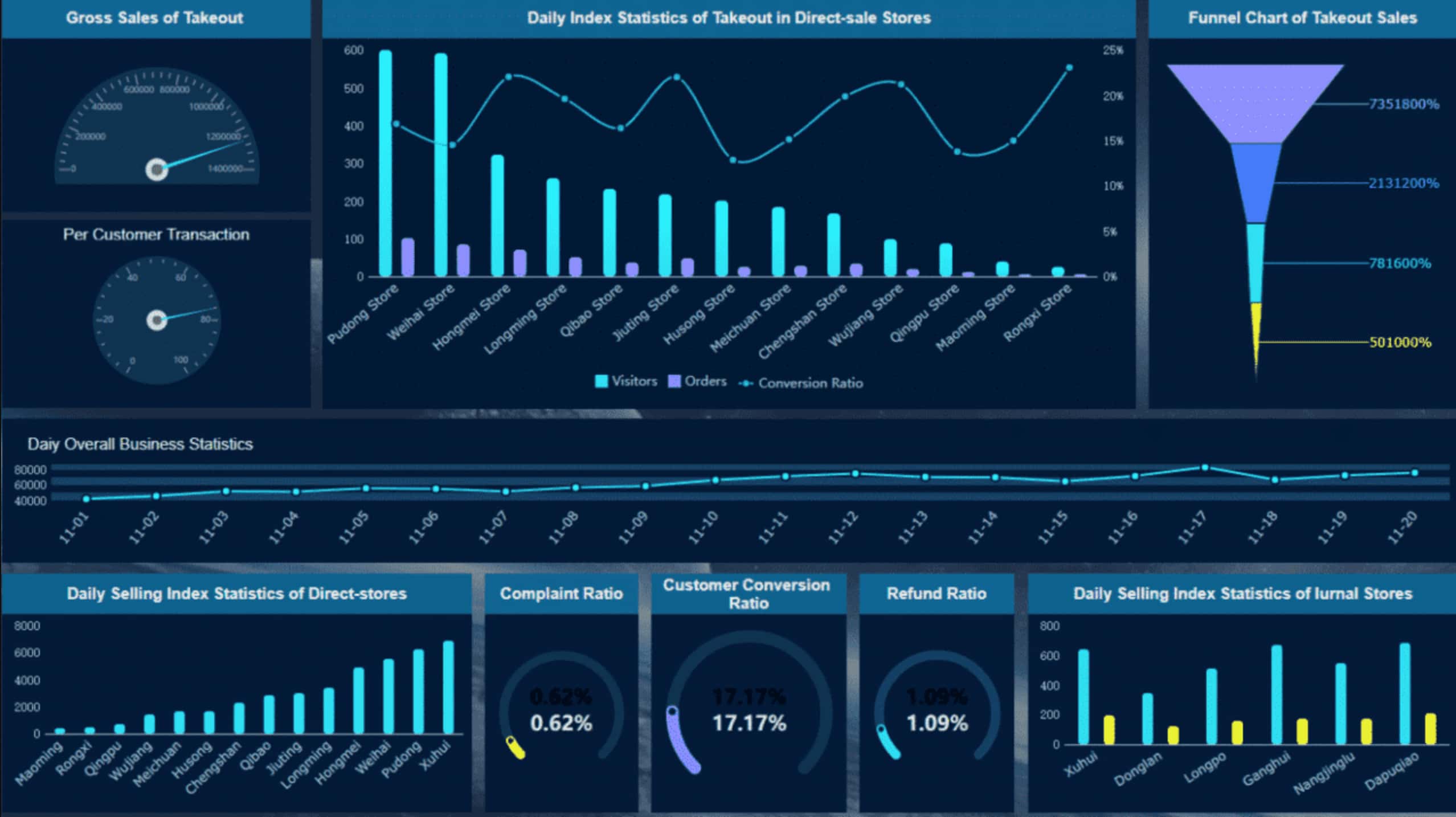
01. Preset
Preset is a fully hosted BI tool for Apache Superset, while Apache Superset is open source BI software for data exploration and data visualization, capable of handling data at a petabyte scale.
Fun fact, Preset was started as a hackathon project at Airbnb in the summer of 2015.
 Preset dashboard
Key Features
- Semantic layer: Last-mile SQL data transformations available.
- No-code data exploration: Drag-and-drop report builders to create complex visualizations without the need for writing code. Over 40 types of visualization, including hit maps.
- Charts and dashboards cache: Helps reduce the load on your data stack.
- Slack delivery: Notify your users via Slack when events in your dashboards are triggered.
- Dynamic SQL editor: Collaborative SQL IDE to define dimensions, metrics, & virtual datasets in the semantic layer.
- Dashboard CSS templates: Customize the look and feel of your dashboards by adjusting the code.
Related reading: Community Crowd-Sourced BI Evaluation Worksheet: Feature-to-Feature Comparison
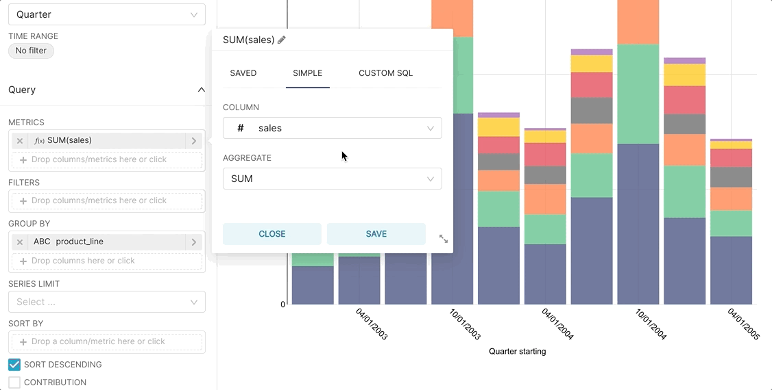
02. Lightdash
Lightdash is a relatively new open-source BI tool that can connect to a user's dbt project, allowing them to add metrics directly in the data transformation layer and then share insights with the whole team.
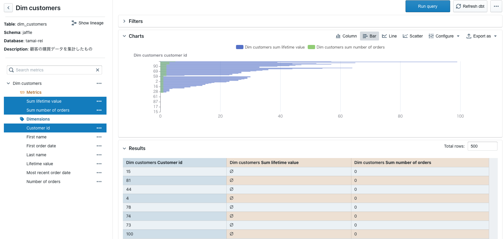 Lightdash Dasboard
Key Features
- Lightdash can be self-hosted or fully hosted by Lightdash. The fully hosted option is not free.
- An unlimited number of users can be added to the project, with an unlimited number of charts and dashboards
- Robust integration with GitHub, Gitlab & dbt
- Dimensions and metrics can be declared in YAML alongside your dbt project.
- Team collaboration option for cloud and enterprise versions.
- Access management, dedicated account manager, advanced support, and SSO for the enterprise version.
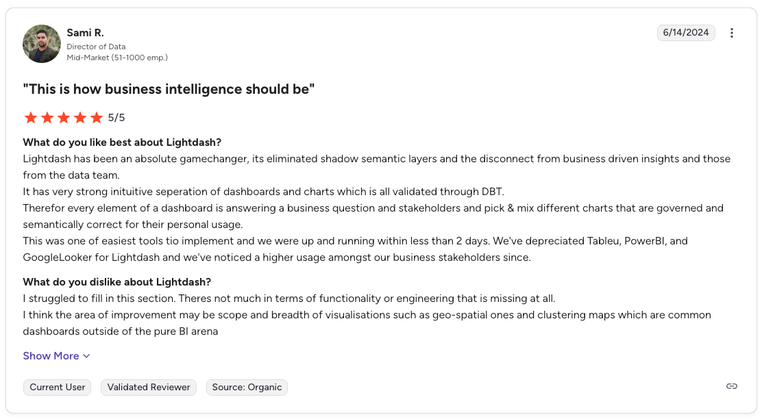
Reviews and Ratings
On Capterra, Lightdash has a 5/5 rating. Most users love its ease of use and native integration with dbt.
Honorable mention: Holistics, as-code self-service BI tool
Before diving into the list, you might want to check out Holistics.
To be fully transparent, Holistics _is not an open source BI tool _ - but possesses similar flexibility and ease of use.
Holistics comes with a code-based modeling layer with self-service data exploration.
Holistics is 100% cloud-based, provides a centralized data modeling approach for BI teams, and empowers business users who don’t know SQL can do true self-service.
See how Holistics works here.
Similar to Lightdash and Looker, Holistics is also dev-friendly: You can write code (DSL) to define your analytics logic, and check them into Git version control for better governance, or sync your logic with dbt integration. Plus, it has a pay-as-you-go pricing model so it's risk-free.
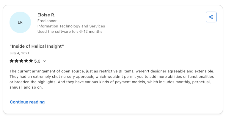
03. Helical Insights
Helical Insights is an open-source BI tool that has a quite unique approach to self-service analytics by introducing a platform that allows the end-users to leverage the API to add any functionality as per requirement.
 Helica Open Source dashboard
Main Features
- Instant intelligence: Leverages machine learning and NLP to empower non-technical users with quick insights.
- Workflow: Design workflows based on your business process to determine when and which functional module would get triggered.
- Robust APIs: Helica’s API allows you to add functionalities, such as adding a new exporting type, new data source type, core functionality expansion, new charting in ad-hoc analysis, etc.
- Fully browser-based: Eliminates the need to download or install heavy memory-consuming developer tools as well as allows users to connect with databases and analyze across any device.
- Various exporting options: Users can export reports and dashboards as images, PDF, CSV, Excel etc.
- Scheduling options: Reports and dashboards can be sent to emails in the format of image, PDF, Excel, etc. Users can also configure other functionalities like saving in FTP, triggering emails based on certain events or values, etc.
Reviews and Ratings
On Capterra, Helica Insights has a rating of 5.0.
Most users love their clean design and report visualization. Customer support has also been cited as one of Helica’s fortes.
04. BIRT
BIRT, which stands for “business intelligence reporting tool”, is an open source BI software project within the Eclipse Foundation.
BIRT pulls data from various data sources that can be used for reporting and visualization.
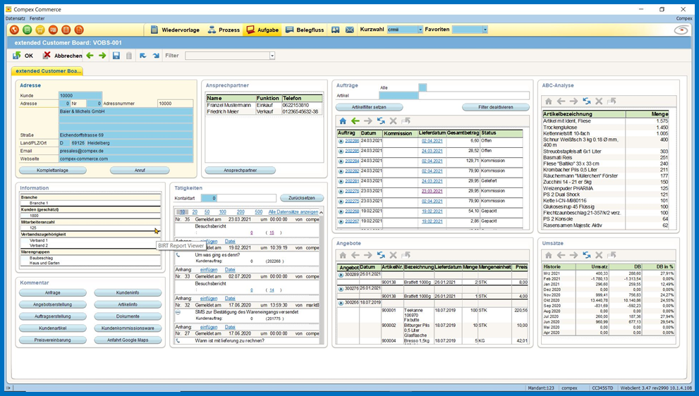 BIRT dashboards
Main Features
- Data customization: Various business logic can be applied to BIRT dashboards via computed columns, column meta-data, filtering, and scripted data sets.
- Scripting: Use JavaScript in order to access the Report Object Model for complete control of the report to handle even the most complex report formatting tasks.
- Project management: Integration with Eclipse project management suite to manage and organize related reports.
- Customized dashboard design: BIRT styles are CSS-based and any web developer can set a style in one place and project it onto the entire report.
- Libraries: BIRT supports libraries that organize shared resources across the reports. The shared resources include styles, data sources, report items, scripts, etc.
- Internationalization and localization: Components like text localization, language packs, dynamic formatting, and bidirectional support are available in BIRT.
Reviews and Ratings
Reviews on Capterra praise its data analysis capabilities, albeit with a steep learning curve.
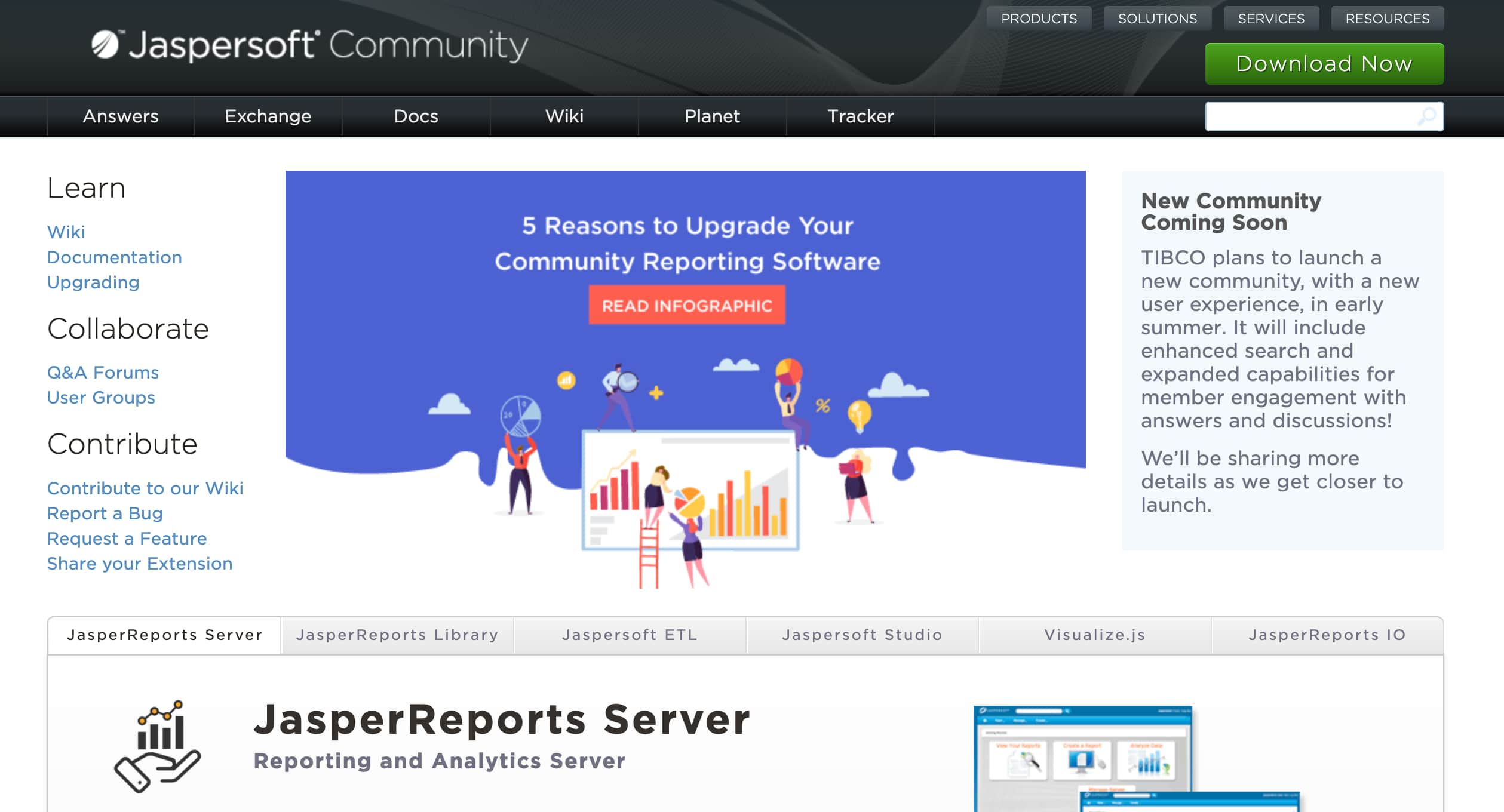
05. Jaspersoft
Jaspersoft is a developer-friendly, open-source BI tool that allows developers to build analytics solutions that meet business requirements.
Main Features
- Embedded Analytics: With an API-first approach, Jaspersoft equips developers with all the functionalities needed to create embedded dashboards. This is done via JavaScript framework and powerful back-end services via REST to handle accesses, SSO, multi-tenancy, etc.
- Flexible deployment: Jaspersoft can be deployed on cloud, on-premise, hybrid or even microservices-based architectures. Furthermore, the source code can be easily modified to build custom features.
- Made for developers: Unlike many BI tools that are designed for business users, Jaspersoft provides the required functionalities and control for developers through APIs and a supportive community.
- Granular security: You can choose to show or hide rows or columns in reports to users by defining permissions based on users.
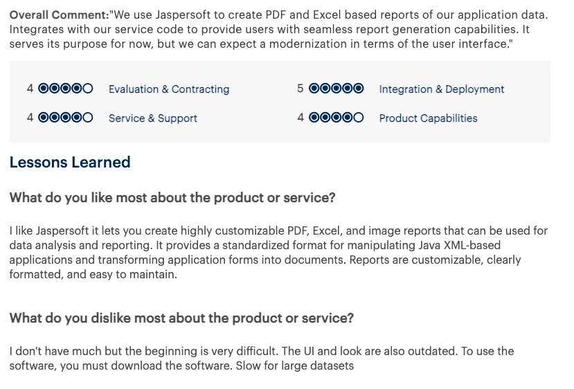
Reviews and Rating
On Capterra, Jaspersoft has a 4.2/5 rating. Users love how customizable it is, especially for Java developers. However, some point out that community support can be lacking for certain issues, and the design interface isn't the most user-friendly.
06. KNIME
KNIME is a scalable enterprise-level software that is focused on empowering data science teams to create actual business values.
Knime provides powerful tools that allow data teams to gather, and model data as well as deploy and manage the results to visualization and insights generation.
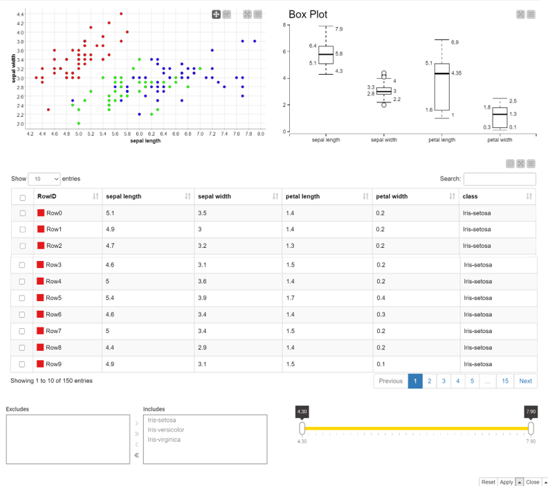 KNIME visualization
Main Features
- Visual programming: Users can create comprehensive workflows using visual programming for data analytics with a drag-n-drop graphic interface.
- Node control: Control the nodes for the entire data lifecycle by modeling each step of the data analysis and controlling the flow of data to ensure data freshness.
- KNIME hub: Using KNIME hub, users can blend tools from different domains, , including scripting in R & Python, machine learning, or connectors to Apache Spark.
- Various data connectors: Users can connect to text format sources (e.g. CSV, PDF), databases (e.g. Oracle, Microsoft SQL), and sources such as SalesForce, Amazon S3, Google Sheets, Azure, and more.
- Data manipulation: Users can carry out mathematical operations including mean, quantiles, and standard deviation, or apply statistical tests to validate a hypothesis.
- AI Support: Build various ML models including classification, regression, dimension reduction, and clustering. You can also validate models using performance metrics such as Accuracy, R2, AUC, and ROC.
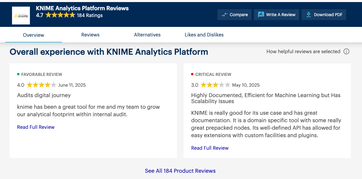
Reviews and Ratings
On Gartner review platforms, KNIME has a rating of 4.7/5, based on 184 ratings.
The most praised aspects are its wide range of native data processing tools, intuitive interface, and built-in machine learning features. On the downside, users commonly point to limited visualization options and high memory usage as major drawbacks.
Related articles:
07. SpagoBI
SpagoBI is an open-source BI tool that enables users to combine and distill traditional data and big data sources into actionable insights via data exploration, data preparation, self-service data, ad-hoc reporting, and many more.
 Spago BI
Main Features
- Built for everyone: Spago has a community version and an enterprise version. The community version has all the basic features that are needed for small and medium-sized enterprises, whereas the enterprise version is built to support more complex use-cases.
- Automatic Dossier: Users can define a doc/ppt template and configure it so that the marked boxes will be automatically filled with the reports at the specified dates. This feature is useful for preparing a draft report or one-click publication.
- Advanced data visualization: Users can take advantage of the custom code functionality to create data visualizations using HTML code, third-party libraries, R/python code. There is a gallery with pre-packaged components that can be further developed to meet more specific requirements.
- Plugins: Spago has a set of useful plugins to enhance user experience, including smart data, location intelligence, performance management and custom analytics.
Reviews and Ratings
On review platforms like Capterra or G2, users generally like Spago’s accessibility since it enables organizations with tight budgets to access a powerful business intelligence tool with tons of features. The biggest downside pointed out by its users is the configuration difficulty of various BI elements, as they require scripting knowledge.
08. ReportServer
ReportServer is a free business intelligence platform that operates under a GPL license. This means that anyone can use ReportServer in their organizations for free. However, offers for service and support and commercial licensing options are also available.
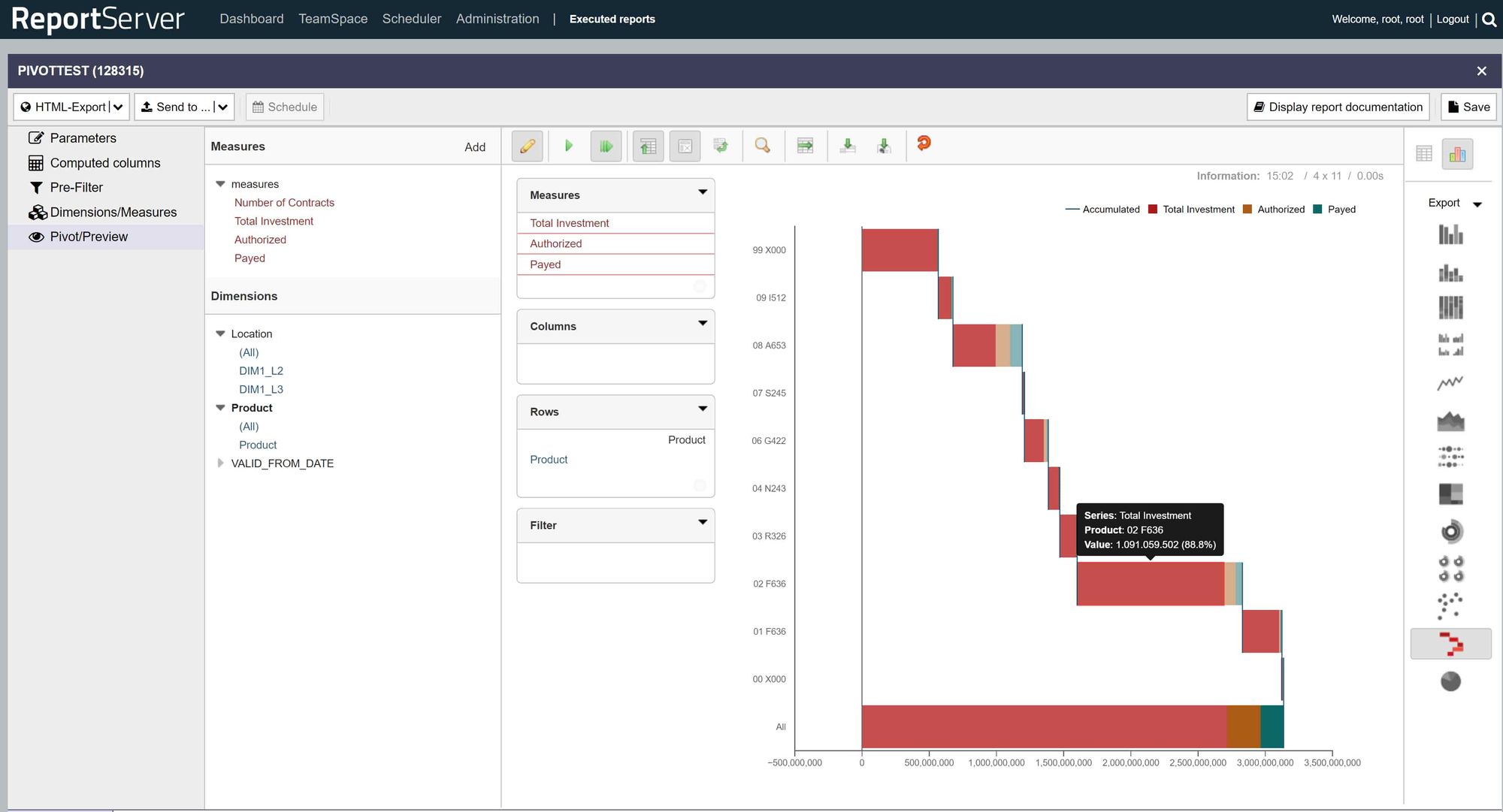 ReportServer BI dashboard
Main Features
- Reporting engine integration: Integration with different providers gives users the ability to select the best reporting engines for their specific use case. Some of the reporting engines are Eclipse BIRT, OLAP & Mondrian, Jasper Reports, SAP Crystal Reports, etc.
- Audit-proof: ReportServer generates detailed documentation for every report. The document covers all user-defined configurations such as the selection of parameter values.
- Extendable via script: ReportServer supports scripting to achieve results faster and in a more efficient manner. For instance, using the scripts, users can automate maintenance tasks, manipulate outcomes as the basis for reports or parameters as well as implement customer-specific extensions without having to amend ReportServer code.
- Flexible parameters: Users can select report parameters from basic params, data source-driven parameters, file-upload parameters, cascaded parameters, and script parameters.
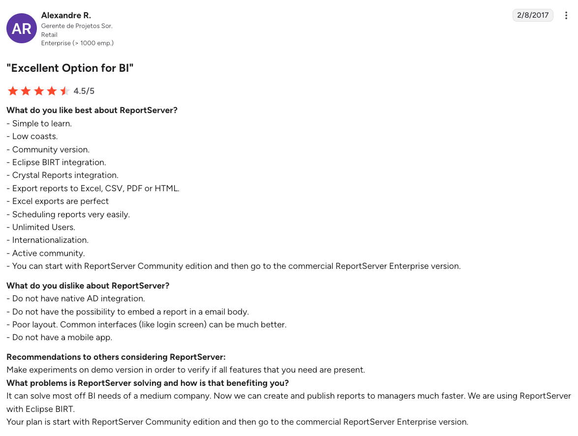
Reviews and Ratings
On G2, Report Server has a 4.2/5 rating, based on 24 reviews.
Most users favor the integration with different reporting engines as well as the ability to use scripts for automation. At the same time, expensive licenses and incomprehensive documentation are mentioned as the downsides of this platform.
09. Tableau Public
Tableau Public is the free version of Tableau that allows users to publicly share and explore data visualizations online. Users can create visualizations using either Tableau Desktop Professional Edition or the free Public Edition.
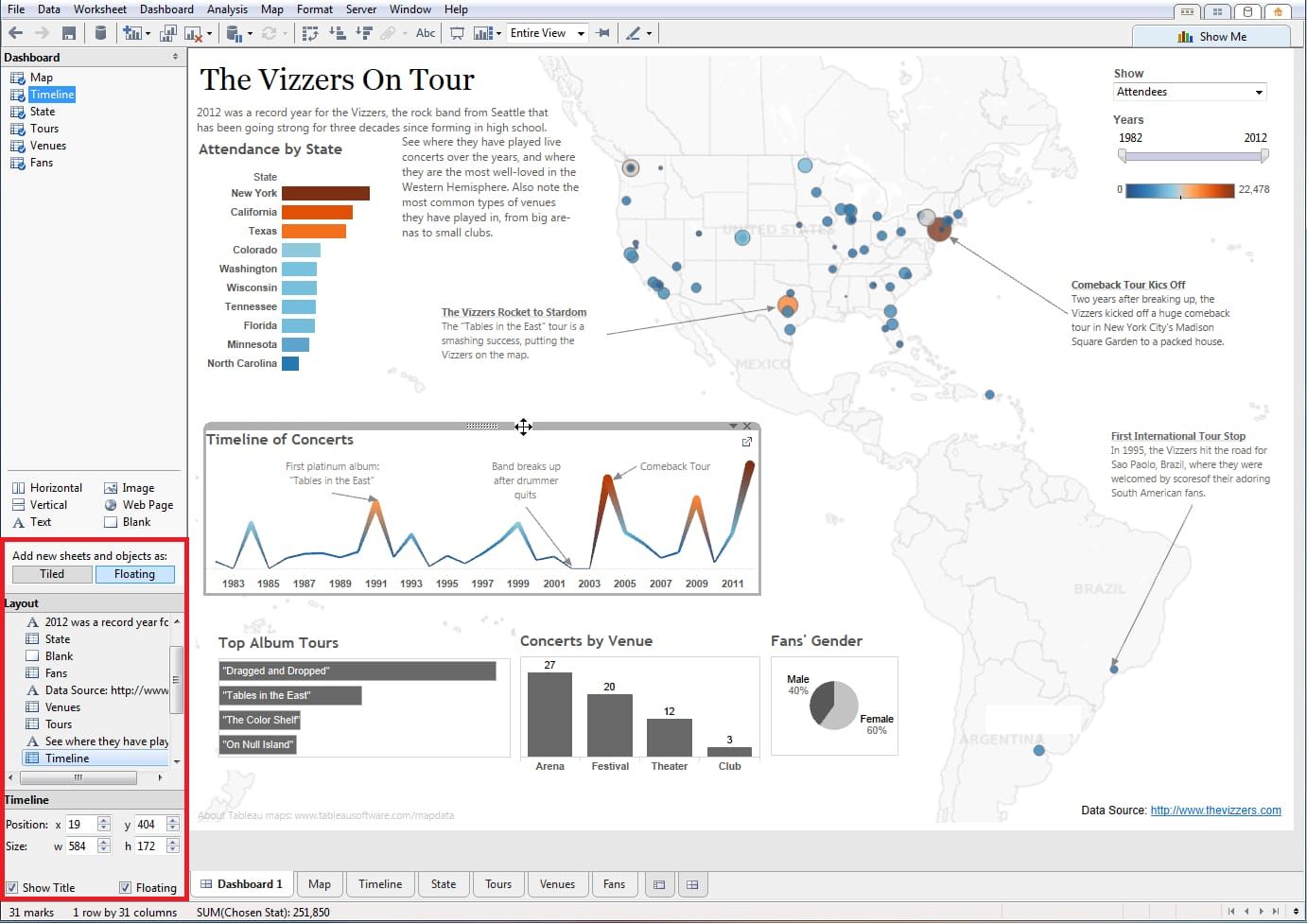 Tableau Public dashboards
Main Features
- Visualizations in Tableau public are available for the whole community to see so that users can use these as inspiration and reference for their own works.
- There are tons of visualization options in Tableau public that users can utilize based on their use cases, including but not limited to: bar, scatter, pie, and waterfall charts to explore relationships between variables, or to present findings/trends in different teams.
- Up to 10 million rows of data can be stored, processed, and shared.
- Tableau Public is beginner-friendly with strong support from Tableau community. It also comes with a wide variety of sample data for users to practice dashboard creation.
Reviews and Ratings
On G2, Tableau Public has a 4.4 rating. Many praised its variety of visualization options and ease of use, while complaints are mostly about the limited connectors available.
10. ART (A Reporting Tool)
ART is an open-source reporting and BI solution that is licensed under the GPLv3.
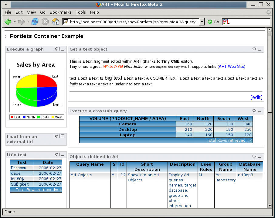
Main Features
- Scheduling options allow users to receive/send dashboards or reports on specific dates and times.
- Installation, administration, and usage of the platform are all designed for non-technical users or beginners.
- Reports can be exported in various formats, including PDF, Excel, and CSV.
- ART supports online analytical processing (OLAP,) which facilitates flexible and self-service BI reporting.
- ART provides an embedded database called HSQLDB to store query definitions, users, permissions and rights, connected databases, etc.
- Existing authentication systems , such as LDAP and Active , are supported for authentication purposes.
11. Abixen
Abixen is a microservices-based software platform for creating enterprise applications. Abixen allows users to implement a new, separated microservice by creating new functionalities. Abixen 's organizational division consists of pages and modules and one of the functional modules is the Business Intelligence service.
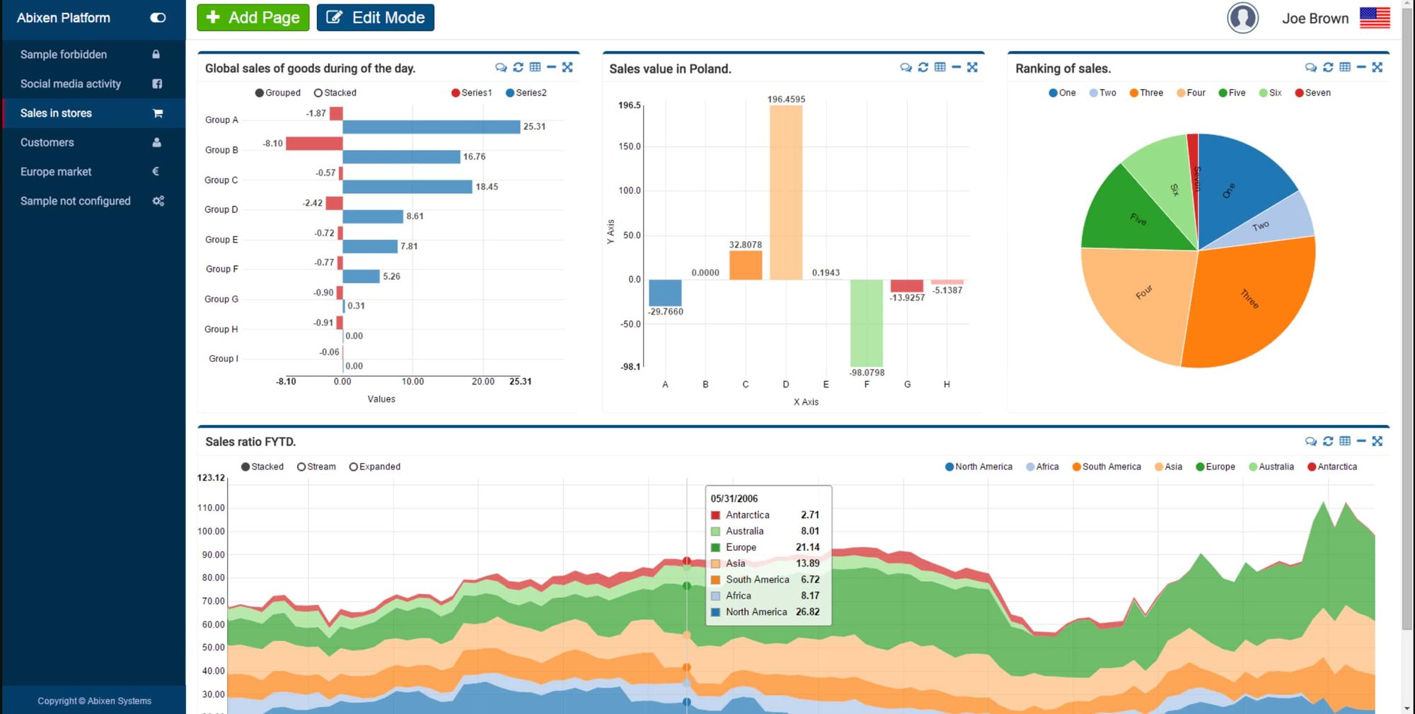
Main Features
- Being a microservice-based software, you can easily add a new business intelligence instance on a page.
- Built-in security system, which ensures full control access to pages, modules, and even the data displayed and used by the modules.
- Easily scalable as microservice instances can be increased as performance surges.
- Abixen is fully cloud-based on Spring Cloud and Netflix OSS. It is compatible with AWS as well.
- 24/7 support is available as well as the option to request customized modules on the platform.
12. FineReport
FineReportis a free Business Intelligence tool that enables users to query, analyze, manage, and visualize data from various data sources.
Main Features
- FineReport Designer allows users to create interactive dashboards with a drag-and-drop report builder.
- There are over 19 categories and over 50 styles of self-developed HTML5 charts, including 3D and dynamic effects to make powerful visualization.
- Various widgets are available to support large data entry, customized data submission, and data validation. Users can also import Excel files online.
- The powerful mobile app enables users to carry out data analysis activities including parameter queries, and message push. Offline viewing, mobile data entry, and more.
- As a Java software, FineReport can be easily integrated with different systems using independent or embedded deployment.
Reviews and Ratings
On G2, FineReport has a 4.1/5 rating. Most users like its ease of use, strong data connectivity, and interactive visualizations. The cons, compared to other business intelligence tools, are the lack of self-service reporting.
13. Grafana
Grafana is an open-source platform widely known for its powerful visualization and data analysis capabilities, especially in monitoring and observability.
Originally designed for time-series data, Grafana has evolved into a robust analytics and visualization tool that integrates with a wide range of data sources, from SQL databases to cloud services like AWS and Google Cloud.
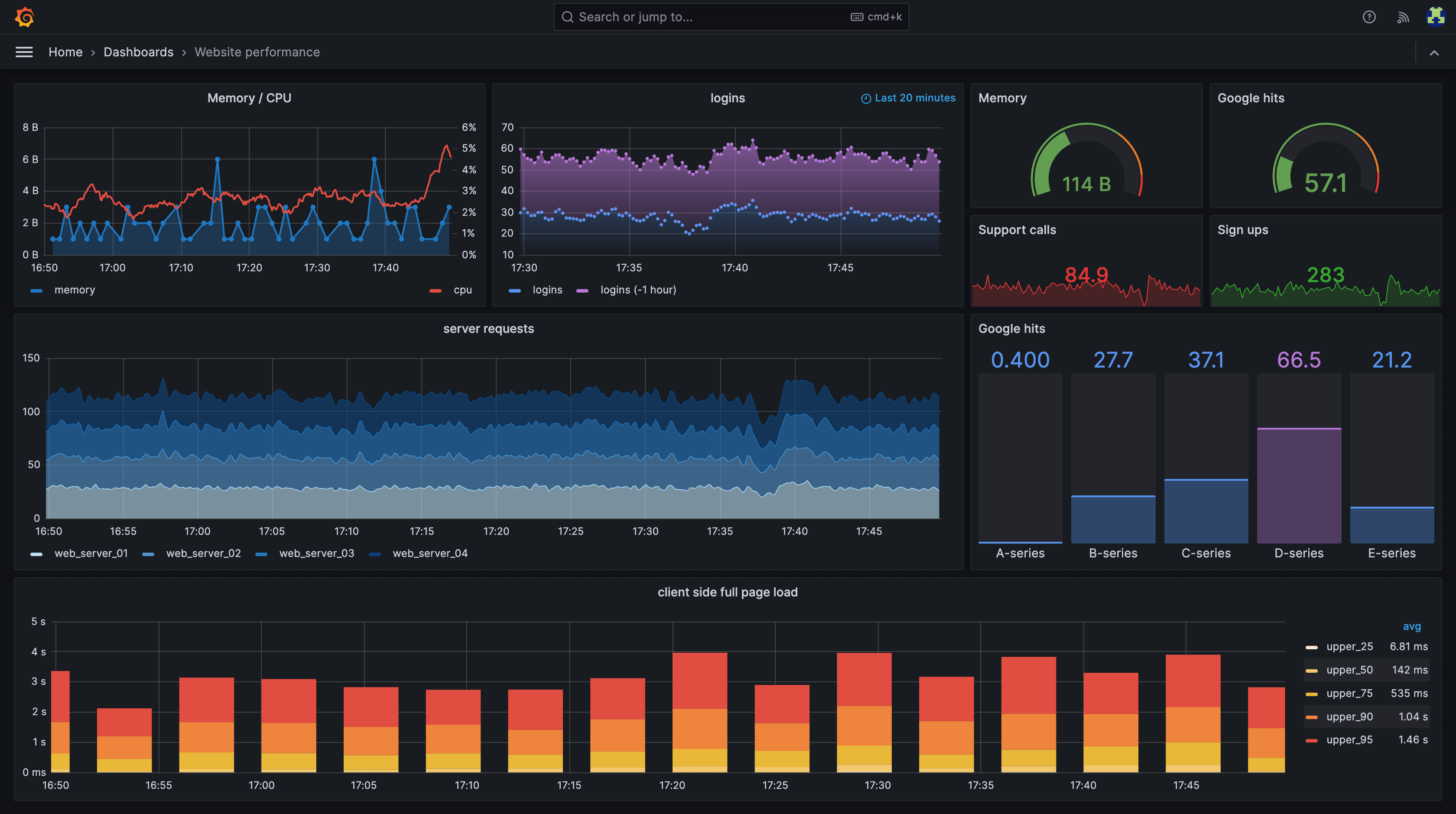 Grafana Dashboard
Key Features
- Customizable Dashboards : Create fully customizable dashboards with drag-and-drop panels, or use pre-built dashboards available in the Grafana community.
- Alerting System : Set up alerts based on custom thresholds, and get notified via Slack, PagerDuty, or other channels when something goes wrong.
- Templating and Variables : Use dynamic, interactive dashboards with templated queries, so users can adjust parameters on the fly without needing to dive into SQL or coding.
- Annotations : Add context to your data by using annotations. You can mark specific events on the timeline to provide insights into trends or anomalies.
- Permission Management : Granular role-based access control (RBAC) helps you manage who can view, edit, or administer dashboards.
- Plugin Ecosystem : Grafana has a rich ecosystem of plugins for data visualization, including maps, heatmaps, graphs, and other advanced chart types.
Reviews and Ratings
On Capterra and G2, Grafana users praise its flexibility and range of integrations. Users appreciate how intuitive it is to set up dashboards and the ability to monitor diverse data sources in one place.
However, some users note that mastering advanced features can come with a learning curve, especially for those unfamiliar with time-series data or complex alerting setups.
14. Evidence.dev
Evidence.dev is an open-source BI tool made for data teams that love working in SQL and Markdown. It lets you take your SQL queries and turn them into narrative reports and dashboards with minimal effort. Built with developers in mind, Evidence.dev makes it easy to share insights without relying on complex BI interfaces or external tools.
Key Features
- SQL + Markdown Reports : Evidence.dev lets you create dashboards and reports using SQL for querying and Markdown for formatting, providing a lightweight, code-first approach.
- Version Control : Since everything is code-based, you can track changes and collaborate with your team through Git, making it easy to manage report versions.
- Automated Updates : Set up schedules to automatically refresh your data and ensure your reports always display up-to-date insights.
- Custom Data Visualizations : Create visualizations that fit your exact needs using existing templates or by coding custom ones directly in the platform.
- Collaboration-Friendly : Evidence.dev integrates with GitHub or GitLab for collaboration, allowing your team to work on the same reports seamlessly.
- Open-Source and Extensible : As an open-source tool, you can customize and extend its functionality to meet your organization’s specific needs.
Reviews and Rating
Users appreciate Evidence.dev for its simplicity and developer-focused workflow. It’s particularly loved by teams that want full control over their reports without needing to invest time in learning a heavy business intelligence tool.
Some users, however, mention that it may not be the best fit for non-technical users who prefer drag-and-drop interfaces, as its SQL-first approach requires some coding knowledge.
FAQ: Open Source Business Intelligence Tools
1. What are the Pros and Cons of Open Source BI Tools?
Pros:
- Users have full ownership forever. Open-source BI tools are often free with unlimited usage.
- Open-source BI tools reduce the perceived long-term risk of vendor lock-in or vendor closing down. They also offer flexibility, you can make as many adjustments as you require to the code to make it suitable for your use casse and all you need is developer resources.
- Since you have full control over the platform, you can embed it into any system such as your CRM and web applications for a seamless experience and maximum adaptability.
Cons:
- Open source BI tools are self-managed and thus require a large developer and IT resources in order to keep the tool running.
- Open source BI tools are limited in built-in integrations compared to licensed solutions. This means that any integration with any other system has to be built from scratch at the code level.
- There is no dedicated support for open source BI solutions. Sure, you will have a community of users who help each other but in many instances, finding personalized support for a specific problem/query can be slight challenging.
2. Is There An Open Source Alternative To Microsoft Power BI?
Yes, there are several open-source alternatives to Microsoft Power BI. Tools like Grafana, Lightdash, and Apache Superset (via Preset) offer similar data visualization, reporting, and dashboarding capabilities.
While they may require a more technical setup than Power BI, they provide greater flexibility and customization without the hefty licensing fees.

Data Engineer turned Product; writes SQL for a living.