11 Best Tableau Alternatives For Modern Data Teams
We look into 11 Tableau alternatives, their pros, cons and everything in between.

Tableau is a classic. The leading data visualization tool. As the old saying goes: No one ever fires you for choosing Tableau.
One way to think about Tableau is as a machine that turns data into insight, but as your organization’s needs evolve, that machine starts to sputter. At first, it’s all about the sleek visuals—beautiful charts and dashboards that make data analysis look simple. But as your demand for deeper analysis grows, you’ll begin to run into limitations that make Tableau feel more like a bottleneck than a breakthrough.
In this blog post, we'll walk you through Tableau's limitations and analyze 12 Tableau alternatives, including Holistics, Looker, Sigma Computing, Sisense and more.
Why Consider Alternatives to Tableau?
Tableau is one of the most popular data analytics tools, famous for its advanced data visualization capabilities. If your company is looking for a BI product with fancy charts to present to your management or your board of directors, Tableau will always be the perfect choice.
(Did you know Tableau means "painting" in French?)
However, as your organization’s analytical needs evolve, pretty charts are no longer enough and you’ll likely run into these Tableau limitations.
1. Analytics Bottleneck at Data Team
Business users still depend on data analysts to create and maintain reports. As requests pile up, analysts end up as “English to SQL” translators, constantly fielding ad-hoc data queries instead of working on high-impact data analysis. The promise of quick, self-service insights fades.
2. Limited Self-service Capacity
Tableau does not allow business users to customize their setup of dimensions and metrics in the reports they want. While users can easily explore pre-defined dashboards, they’re often stuck when they need to tweak dimensions or metrics themselves. If you don’t know SQL, you’re out of luck, and frustration grows.
3. Disparate Metric Definition
As more reports are created, it’s easy to accidentally recreate the same metrics with slight differences across dashboards.
Over time, this inconsistency becomes a headache for data teams, as maintaining accuracy and uniformity across reports turns into a never-ending task.
4. No Code Version Control
Since Tableau uses its own proprietary file formats, there’s no code version control/change process management. One person editing locally and pushing up can overwrite everyone else, making it difficult for a team to manage.
5. Declining Customer Support
Tableau once prided itself on exceptional customer support, especially in its early days. However, since the Salesforce acquisition, many users have reported a noticeable decline in support quality.
Whether it's bottlenecks at the data team, limited self-service capacity, or the lack of version control, many businesses find themselves outgrowing Tableau. Tools like Holistics and Power BI provide strong Tableau alternatives, each with its unique advantages depending on your company’s needs.
12 Tableau Alternatives: A Detailed Comparison and Analysis
Here is a list of our top Tableau alternatives. Each offers unique business intelligence features that might meet different business needs.
- Holistics
- Power BI
- Metabase
- Looker
- Qlik
- Sisense
- Lightdash
- Sigma Computing
- Luzmo
- Looker
- Rill Data
1. Holistics
Holistics is a self-service BI tool built with DevOps best practices. Holistics offers similar data visualization capabilities while innovating on what Tableau is lacking:
- Centralized data management and reusable data models.
- Git integration for version control and maintainable workflows.
- Non-technical users can explore data without writing SQL.
Pricing
Holistics’ pricing starts from $800/month, Holistics charges you based on your usage. It’s designed to scale affordably as you roll out analytics across your entire company, making it competitive in the business intelligence landscape.
Highlighted Features
- Self-Service Exploration Layer: Business users can create their charts via a drag-n-drop chart builder, or explore curated dashboards using filters, automated drills, and native
- Code-based Semantic Layer: Allow data teams to define reusable data models, datasets, and metrics and manage them centrally, ensuring accuracy and consistency across all reports.
- Customization Capabilities: With the Canvas Dashboard (Dashboard as Code), users can arrange building blocks to design customized layouts, reporting experiences, themes, and charts.
- Seamless Integration with dbt: Holistics integrates with dbt, allowing you to model and transform data at the dbt layer and push those definitions directly into the BI layer.
- 1-click analytical functions: Common analytical functions (period over period, percent of total, running total) are 1-click operations without the custom set-up.
Potential Limitations
- AQL Learning Curve: Holistics’ proprietary Analytics Query Language (AQL) adds advanced data analytical capabilities but has a slightly steep learning curve for new users, who are more familiar with visualization tools.
- While technically sophisticated, Holistics' user experience might lack the polish of Tableau.
Related reading: BI Tools Comparison Matrix: A Holistic Collection (Updated)
2. Power BI
Power BI offers strong modeling, rich visuals, and is the usual top choice for Microsoft-based companies.
Pricing
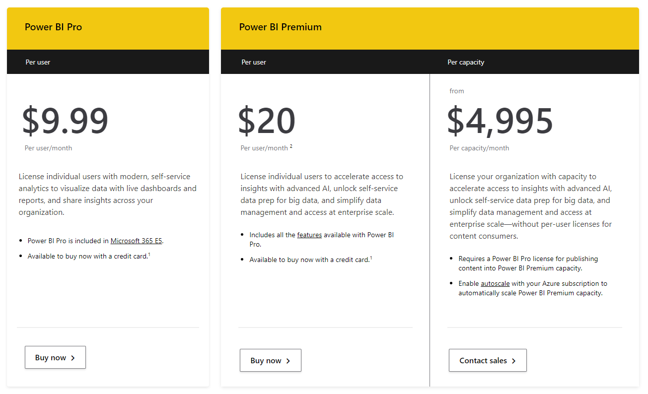
Power BI offers a free desktop version for personal use. For advanced features and cloud solutions, you’ll need to pay $9.99/user/month. For larger needs, dedicated cloud servers start at $4,995/month.
Highlighted Features
- Powerful reporting tools, analytics capabilities and seamless integration with other Microsoft products (e.g.: Powerpoint, Excel).
- Rich visualization marketplace where you can replace your Tableau visualizations.
- Mature data modeling capabilities. Power BI excels at creating complex data models, offering a comprehensive data analytics experience.
Potential Limitations
- The learning curve for advanced functions can be steep. Data analysts need to learn DAX (Data Analysis Expressions) and Power Query M language to get the most out of Power BI.
- Power BI desktop isn’t available on Mac, which can be a problem for teams that rely on Apple devices. (That's why we wrote a post on how to use PowerBI on Mac devices).
3. Metabase
Metabase is an open-source business intelligence tool that makes data analytics accessible to everyone without knowledge of SQL. Metabase lets you ask questions about your data and displays answers in formats that make sense, whether that's a bar graph or a detailed table.
Pricing
Metabase has two versions — on-premise and cloud. On-premise is free. Cloud version starts at $85/month.
Highlighted Features
- Open-Source Flexibility: As an open-source data analytics tool, Metabase allows full customization to fit your organization's specific needs, offering flexibility that proprietary tools like Tableau don’t.
- Ease of Use: Metabase’s simple, intuitive interface allows non-technical users to query data and create dashboards without needing SQL expertise. Users can explore data through point-and-click questions, making data access more democratic.
Potential Limitations
- Limited Reporting Features: While Metabase is perfect for basic querying and reporting, it lacks the rich visualizations that tools like Tableau or Power BI offer, and more advanced analytics tools (e.g. predictive analytics) that data scientists might need.
- Limited Version Control: Allows one-way Git-based version control through Serialization, available starting with the Pro Plan.
- Scaling Challenges: Metabase is excellent for small to medium-sized businesses, but larger organizations with complex data needs might find its performance and feature set limiting as they scale.
For more information on the limitations of Metabase and its alternatives, please check out our article here.
4. Sisense
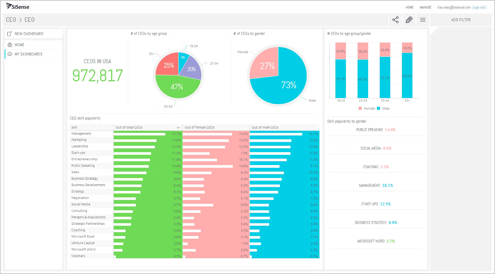
Pricing
Sisense practices to ‘no-surprise’ pricing. This means that everything is included in your annual subscription plan and pricing is customized based on data volume and number of users. For more details on its pricing, check out this article.
Highlighted Features
- Robust Embedded Analytics: With a powerful API and plenty of customization options, Sisense allows developers to integrate dashboards seamlessly into your product and offers white-labeling options that let you customize dashboards to fit right in with the rest of your app.
- Customizability for Developers: If you have a technical background, you’ll appreciate the ability to write custom scripts and extend functionality using JavaScript. This lets you modify dashboard behaviors or add unique features that are not available out of the box.
Potential Limitations
- Steep Learning Curve: Sisense’s Elasticube modeling system can be difficult for average users, often requiring SQL knowledge to operate effectively. Sisense users on Reddit mention that it’s tough to get started, especially if you’re used to more user-friendly tools like Power BI or Tableau. The data modeling view is cluttered and not intuitive—making it hard to see how tables connect and relate to each other.
- Documentation and Support Issues: Sisense users report it to be less than ideal and often filled with outdated links. Based on Gartner Peer Insights aggregated scores, Sisense is also below average in overall rating, willingness to recommend, and community support compared with its peers.
5. Qlik Sense
Pricing
Qlik Sense offers two packages:
- Qlik Sense Business – Priced at $30/month, billed annually.
- Qlik Sense Enterprise SaaS – Pricing for this version is customized, depending on the number of users and other factors, and is available upon contacting the sales team. The enterprise version can be either Qlik-hosted or client-managed, while the business version is only available as Qlik-hosted.
Highlighted Features
- Integrated Data Connectors: Qlik supports numerous data connectors, with many built-in integrations that don’t require separate installations, making it easier to connect multiple data sources.
- Data Discovery for All Users: Features like data discovery allow non-technical users to generate and share data analysis easily, promoting a more data-driven culture within the organization.
Potential Limitations
- Performance Issues with Large Datasets: Some users report slowdowns or errors when handling large datasets, particularly in the data load editor.
- Cost for Large Teams: The enterprise version can become costly for companies with many users, leading some to explore more affordable alternatives.
- Complex User Interface: The interface can feel overwhelming, with too many similar dropdowns and options, making it time-consuming for users to find simple features.
6. Domo
Domo is a cloud-based analytics platform that provides BI and visualization services as well as other products such as embedded analytics, data integration, and app automation.
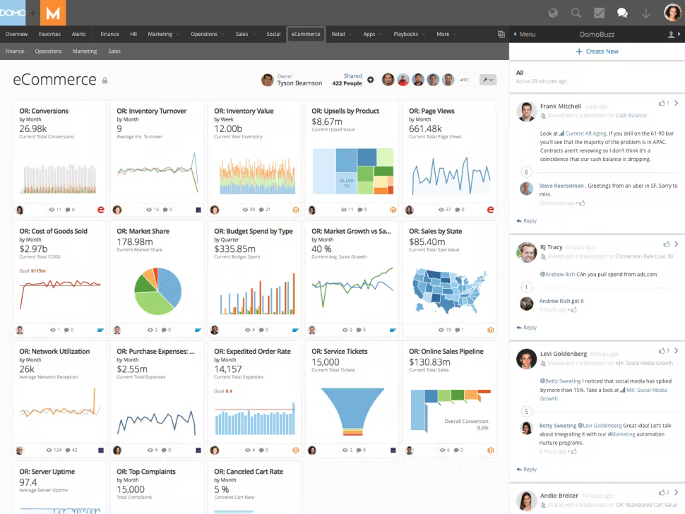
Pricing
Domo’s pricing is customized based on several components related to the usage of the platform, including data storage, data refresh rates, volume of data queries, and the number of users.
Highlighted Features
- Rich Visualization Options and Maps: Domo provides a variety of visualization options, including customizable dashboards and interactive maps, to suit different business needs. Although customization is somewhat limited, these built-in visuals make it easier to start analyzing data without heavy configuration.
- Robust Embedding: Domo supports robust embedded analytics, allowing companies to integrate analytics directly into their own applications and create an on-brand analytics experience.
Potential Limitations
- Limited End-User Functionality: Most data manipulation requires ETL, and the lack of parameter functionality (available in Tableau) means more processes need to be hard-coded.
- High Cost for Large Teams: Domo can be expensive compared to competitors like Tableau, especially when scaling up user profiles.
- No Central Repository for Metric Management: Unlike tools like Holistics or Looker, Domo lacks a semantic layer, which limits its ability to handle complex modeling without heavy customization.
7. Sigma Computing
Sigma Computing takes the familiar spreadsheet-like interface and merges it with powerful data analytics capabilities, offering a middle ground between Tableau's visualizations and more technical tools.
Pricing
Sigma Computing follows a customized pricing model based on your organization's size and usage needs. You’ll need to get in touch with their sales team for specific details, but it’s known to be more accessible for larger organizations looking to scale.
Highlighted Features
- Spreadsheet-like Interface: Compared to Tableau, Sigma Computing is noted for its more intuitive spreadsheet interface, especially for users with an Excel background, making it easy for non-technical users to explore and manipulate data without writing SQL. However, some users have found it to be less sophisticated than Tableau, though still useful for data analysts.
- Real-time Collaboration: Multiple users can work together on data analysis in real-time, making collaboration within teams seamless and efficient.
Potential Limitations
- Limited Visual Customization: While Sigma excels at data exploration, it doesn’t offer the same depth of visual customization that Tableau does. Users looking for flashy or highly stylized charts might find Sigma’s offerings more basic.
- Learning Curve for Advanced Features: Although Sigma is great for basic data exploration, advanced users may still face a steep learning curve when utilizing its more sophisticated data modeling and analytics features.
8. Lightdash
Lightdash is a relatively new open-source business intelligence solution that can connect to a user's dbt project to allow users to add metrics directly in the data transformation layer, and then create and share insights with their team.
Pricing
Lightdash has a free version that is based on open source. There is a cloud beta version that is targeted at startups/scaleups. There is also an enterprise level that is designed to cater to enterprises.
Highlighted Features
- Open-Source Flexibility: As an open-source tool, Lightdash is incredibly adaptable, scalable, and cost-effective for teams looking for a customizable BI solution.
- Strong Community Support: The open-source nature of Lightdash ensures a vibrant, supportive community, especially for the free and cloud beta versions. The enterprise edition also comes with dedicated support for larger teams.
- Robust dbt integration: Lightdash is designed for teams looking for a lightweight, code-first BI tool that can integrate well with existing data workflows centered around dbt.
Potential Limitations
- Technical Complexity: Lightdash requires familiarity with dbt and SQL, which might pose a steep learning curve for data teams coming from Tableau.
- Limited Features: As a relatively young BI tool, Lightdash lacks advanced visualization options compared to Taleau. Dashboard styling options are also limited.
9. Luzmo
Luzmo (formerly known as Cumul.io) is a robust alternative to Tableau, particularly if you're looking for a solution that specializes in embedded analytics. Luzmo’s platform allows businesses to embed interactive dashboards directly into their applications, giving end-users the ability to explore data seamlessly.
Pricing
Luzmo offers flexible pricing plans based on usage and customization needs, starting from $995/month. The pricing model depends on factors like the number of embedded users and data volume.
Highlighted Features
- Embedded Analytics Focus: Luzmo excels at embedding fully interactive dashboards into web applications, making it a great choice for SaaS platforms and product teams that want to provide data-driven insights to their end users.
- Highly Customizable Dashboards: Luzmo offers extensive customization options, allowing developers to design dashboards that blend perfectly into their existing products. From white labeling to complete layout control, it’s built to be flexible.
- Low-code Integration: Luzmo's low-code platform makes it easy to integrate with existing applications. You don’t need extensive coding experience to set up and manage dashboards, making it appealing for teams with limited development resources.
Potential Limitations
- Limited Internal Analytics Features: Luzmo shines in embedded analytics, but for teams looking for an all-in-one BI tool with extensive standalone reporting capabilities like Tableau, it might not be the best fit.
- Lacks Advanced Visualizations: While Luzmo covers most standard visualization needs, it doesn’t offer the same depth and variety of visual customization found in more mature BI tools like Tableau.
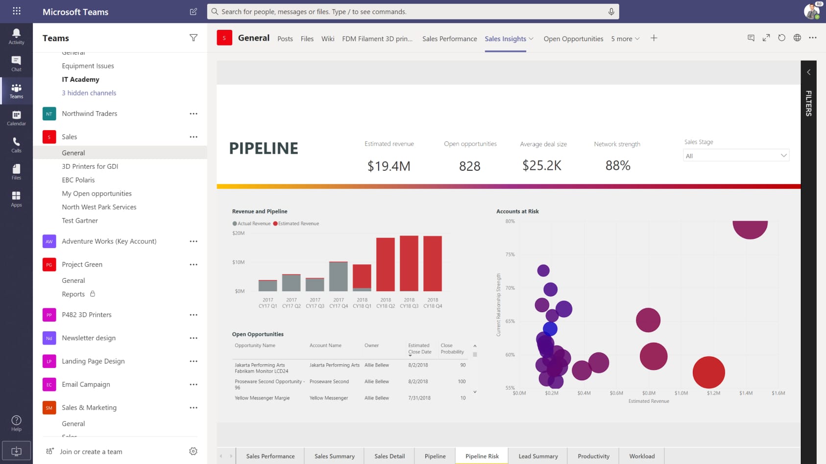
11. Looker
Looker, now part of Google Cloud, is a modern BI platform that stands out for its powerful data modeling capabilities and integration with cloud infrastructures.
Unlike Tableau, Looker is designed to give data teams more control over how data is defined and accessed across the organization, using its LookML language.
Pricing
Looker follows a customized pricing model, which depends on factors like the number of users, scale of data, and integration needs. It is generally considered a more premium-priced tool, reflecting its enterprise-level features and robust integrations with Google Cloud.
Read more: Looker Pricing: A Detailed Breakdown & Calculation
Highlighted Features
- LookML for Centralized Data Modeling: Looker’s LookML language allows data teams to define metrics and dimensions centrally, ensuring that business users are working with accurate, consistent data across all reports and dashboards. This eliminates the common issue of disparate metric definitions.
- Robust Self-Service Interface: With Looker Explore, non-technical can explore data intuitively via a point-n-click interface, drill down, filter, and interact with dashboards.
Potential Limitations
- Steeper Learning Curve: Looker requires a deeper understanding of data modeling and its proprietary LookML language.
- Pricing: Looker is typically priced higher than other BI tools, making it a significant investment for companies. Smaller organizations may find it cost-prohibitive compared to alternatives like Power BI or Holistics.
11. Rill Data
Unlike other Tableau alternatives in this list, which excel in static data visualization, Rill Data is built to handle high-velocity data, making it an ideal alternative for companies that need to make decisions based on live data streams.
Its focus on simplicity, speed, and scalability makes it a strong contender for organizations in industries where real-time insights are crucial, such as finance, retail, and telecommunications.
Pricing
Rill Data offers a flexible pricing model based on the scale of data and query performance. Companies can reach out for a tailored quote, making it accessible for both smaller teams and larger enterprises that need to scale real-time analytics.
Highlighted Features
- Optimized for Real-Time Analytics: Rill Data is specifically designed to handle high-velocity data, offering near-instantaneous insights from streaming sources. This makes it ideal for use cases where delays in data processing could lead to missed opportunities.
- Ease of Use: Rill's intuitive user interface allows users to generate insights quickly without needing a deep technical background.
- Focus on Query Performance: Rill Data is optimized for fast query performance, reducing the time it takes to get answers from large datasets. This makes it an excellent tool for teams that need to process large amounts of data in real time.
- Integration with Streaming Data Sources: Rill Data integrates seamlessly with streaming data platforms like Apache Kafka and Amazon Kinesis, ensuring that businesses can analyze data as it flows, without any delays.
Potential Limitations
- Limited Advanced Visualizations: While Rill Data excels at real-time data handling, its visualization capabilities are more basic compared to Tableau or Power BI. It’s focused more on performance and speed than on creating complex or highly customized visuals.
- Niche Use Case: Rill Data is best suited for organizations that need real-time insights. For teams that primarily work with static or batch data, it might not offer the same value as a more traditional BI tool.
- Less Established in the Market: As a relatively new player in the BI space, Rill Data doesn’t yet have the same brand recognition or widespread adoption as Tableau, which may be a consideration for larger, more risk-averse enterprises.
Frequently Asked Questions
1. What are the best open-source alternatives to Tableau?
Here's our pick of the best open-source alternatives:
- Metabase: Open-source BI tool for small data teams who need a lightweight SQL-to-chart solution.
- Evidence.dev: Code-first BI tool that enables data teams to build analytical reports using SQL and Markdown.
- Lightdash: Open-source BI that's built for dbt.
2. Do all Tableau alternatives require technical expertise?
Some do, some don’t. If you like a quick setup and are familiar with SQL, Metabase or Evidence.dev work well.
3. Is there a free alternative to Tableau?
Yes! Metabase, Evidence.dev, and Superset are open-source and free to use. Power BI also has a free version but with limitations.
What's Next
All the Tableau alternatives mentioned above come with their own unique benefits and drawbacks.
Choosing the right one for your company depends on various factors, such as the size of your organization, your data maturity, budget, and most importantly, the specific use cases you need to address.
This isn’t a decision you can make in a day. I recommend involving all relevant stakeholders—both data builders and data consumers—so you can thoroughly outline your requirements. From there, narrow down your options to the top 4-5 tools, and take the time to test each one.
For more guidance on choosing the right tool, check out Chapter 4 of our Analytics Setup Guidebook, where you’ll find a detailed breakdown of how to navigate the Business Intelligence tool landscape.
What's happening in the BI world?
Join 30k+ people to get insights from BI practitioners around the globe. In your inbox. Every week. Learn more
No spam, ever. We respect your email privacy. Unsubscribe anytime.
