5 Best Tableau Alternatives: An Evidence-Based Comparison Matrix
The concise, evidence-based guide to evaluating alternatives to Tableau.
LAST UPDATED February 13, 2026
AUTHOR  Holistics Team
Tableau is a strong data visualization tool. Its grammar-of-graphics foundation is genuinely powerful, but as a dashboarding platform, it often falls short.
Built for deep drill-down, Tableau’s “anything is possible” flexibility can create three problems: it’s overkill for everyday reporting, it can run into performance and scalability limits with real business-sized tables, and it turns “no-code” into a maze of calculated fields, LOD tricks, and workarounds that feel like coding (just with more friction and less maintainability).
This guide compares Tableau alternatives with one goal: find tools that deliver fast, scalable, interactive analytics with comparable visual polish and flexibility—without the gaps.
Our approach:
- Facts are prioritized over opinions, no recommendations pushed
- Details are backed by official vendor documentation
- High-level criteria are broken down into specific, measurable sub-points
- Findings are presented in in clear, comparable tables
- Linking to real-world discussions from actual users
The alternatives to Tableau BI compared in this document are: Holistics, Looker, Lightdash, Thoughtspot, Metabase.
We understand we might come across as biased, since we're also a vendor selling self-service BI. Rather than claiming neutrality, we'll let the content below speak for itself.
Found an inaccuracy or want your tool added? Use this form.
Feature-by-Feature Comparison Table (WIP)
Scroll to the right to see more
| Dimension | | |  Thoughtspot Thoughtspot |  Power BI Power BI | | |
|---|---|---|---|---|---|---|
| Pricing Structure Understand how each vendor charges and what a realistic annual spend looks like. | ||||||
| | 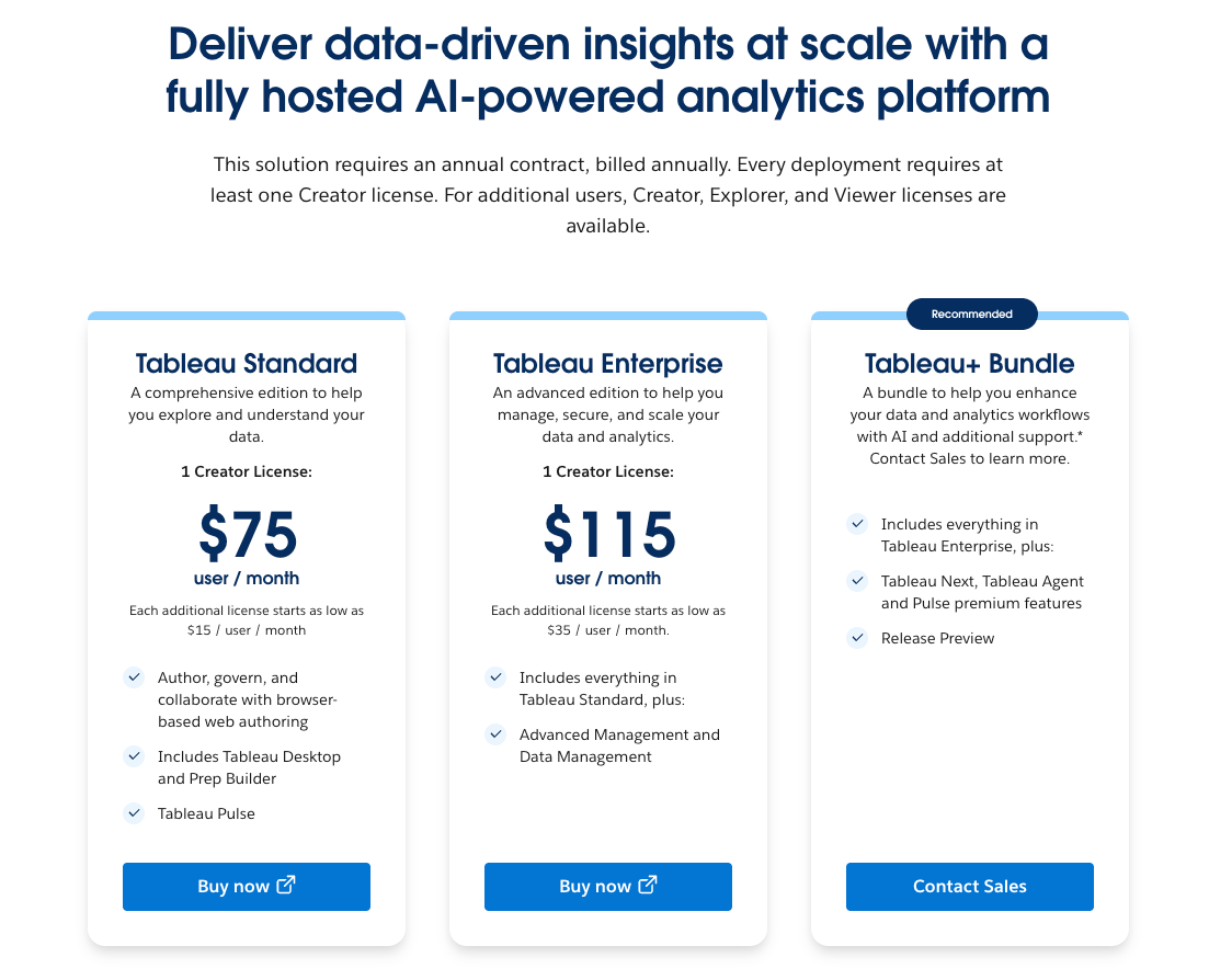 Creator, Explorer, Viewer licenses on annual billing. source | 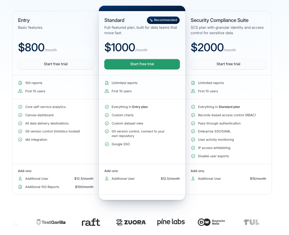 Feature tiers based on users and capabilities. source | 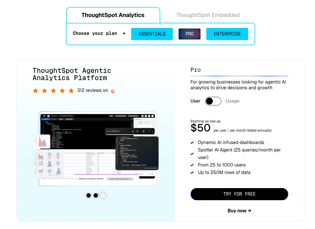 Priced by data rows and permission groups. source | 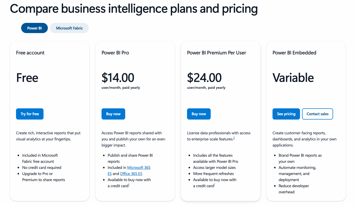 Pro/Premium per user or dedicated capacity SKUs (for embedded analytics). source | Feature Tiers Enterprise packaging by roles, features, and deployment size. source | 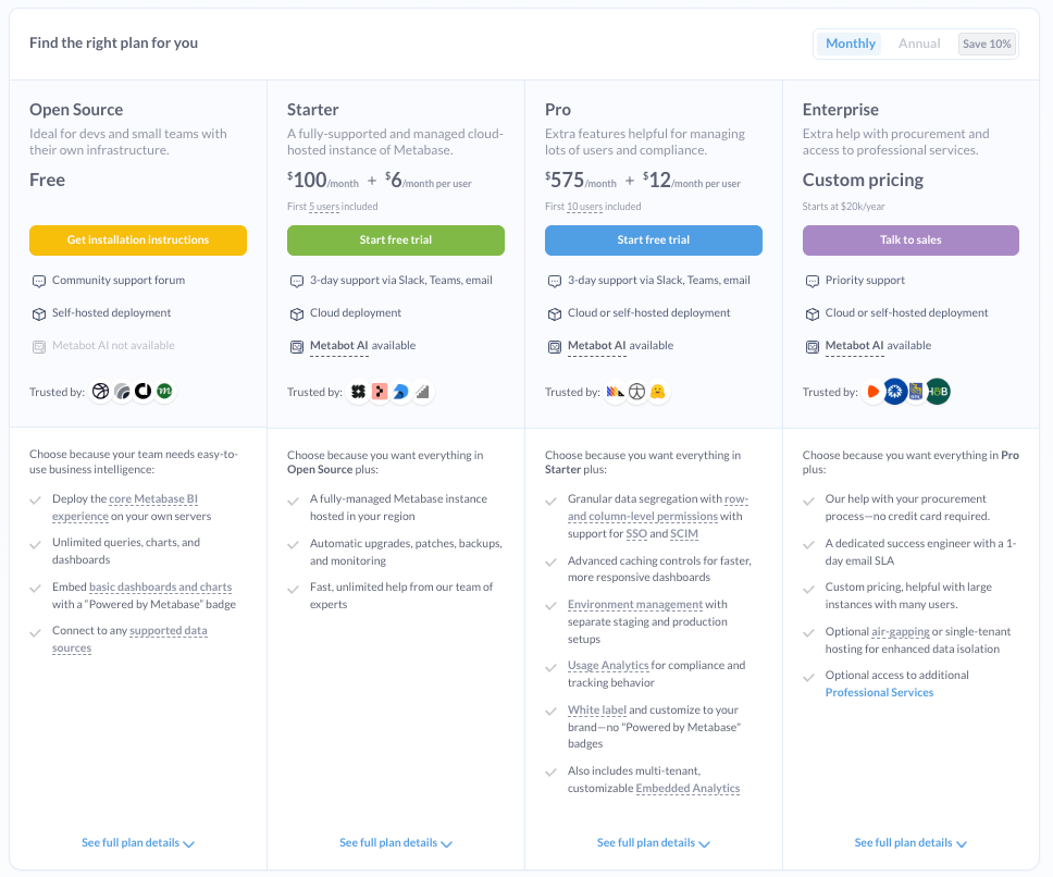 Free plus paid Starter and Pro plans. source |
| | $10,000+/year At $75/user/month for a Creator license, a mid-sized team (10 analysts, 20+ business users) would pay at least $9,000/year. source | $9,000+/year Entry $800/month; higher tiers add governance and custom charts. source | $120/user/year+ Pro $10/user/month; Premium Per User $20; capacity from $5k/month. source | $83,000+/year Vendr benchmarks show roughly $83,665/year on average. source | $1,020+/year Starter $85/month for 5 users; scales with seats. source | |
| Single Source of Truth Ensure all users work with consistent, accurate metric definitions, reducing ambiguity and discrepancies across reports and dashboards. | ||||||
| |  A logical layer relates normalized tables without merging them, and each logical table can contain joined/unioned physical tables. source |  Centralizes business logic in modular, reusable data models, allowing consistent definitions across reports. source |  Worksheets and TML (Thoughtspot Modeling Language) define governed joins and measures. source |  Project-focused and workbook-scoped, using visual interfaces and DAX for defining relationships and calculations. Limited global reusability. source | 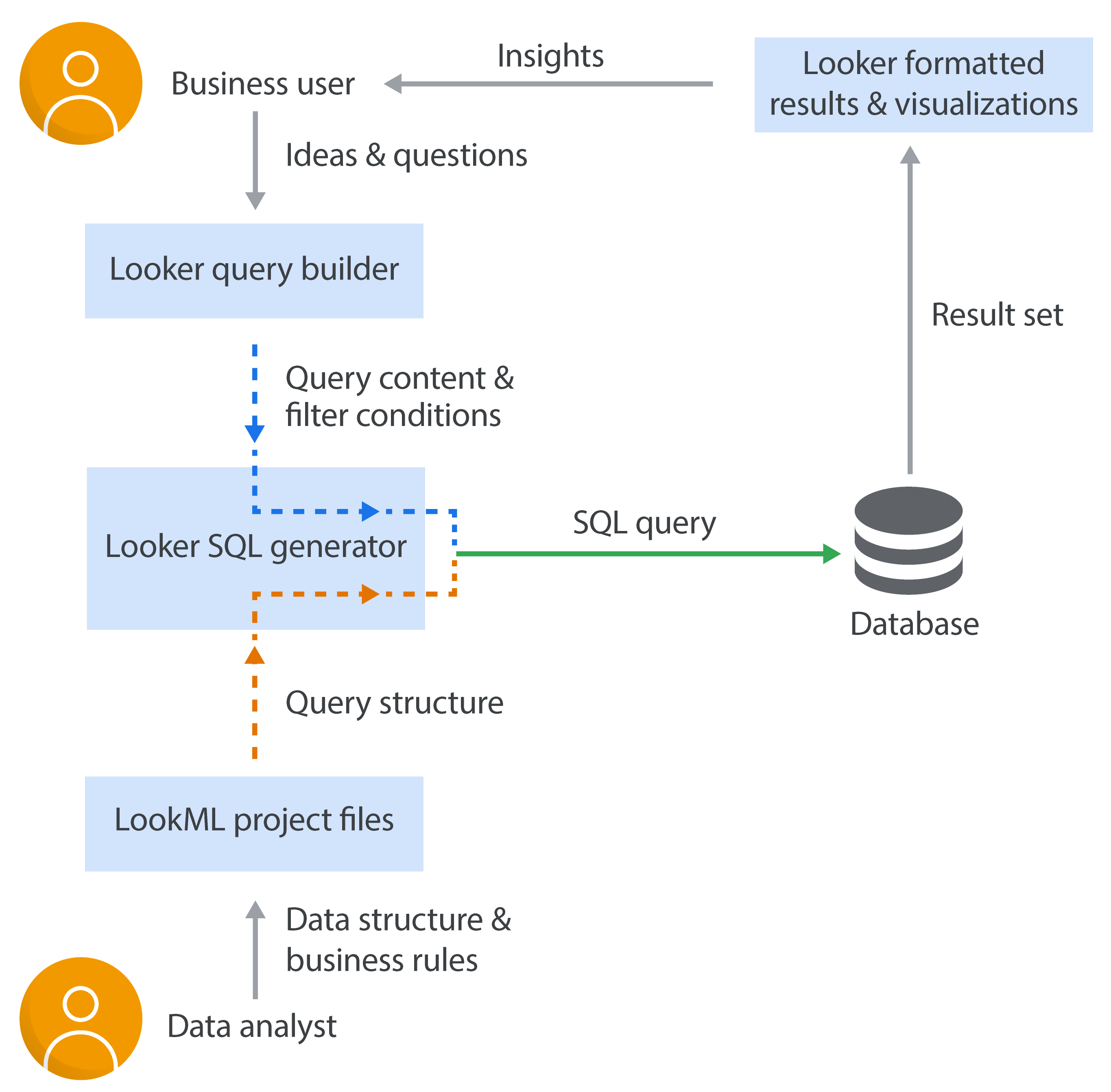 Enables defining centralized, modular data logic that can be reused across reports. source | 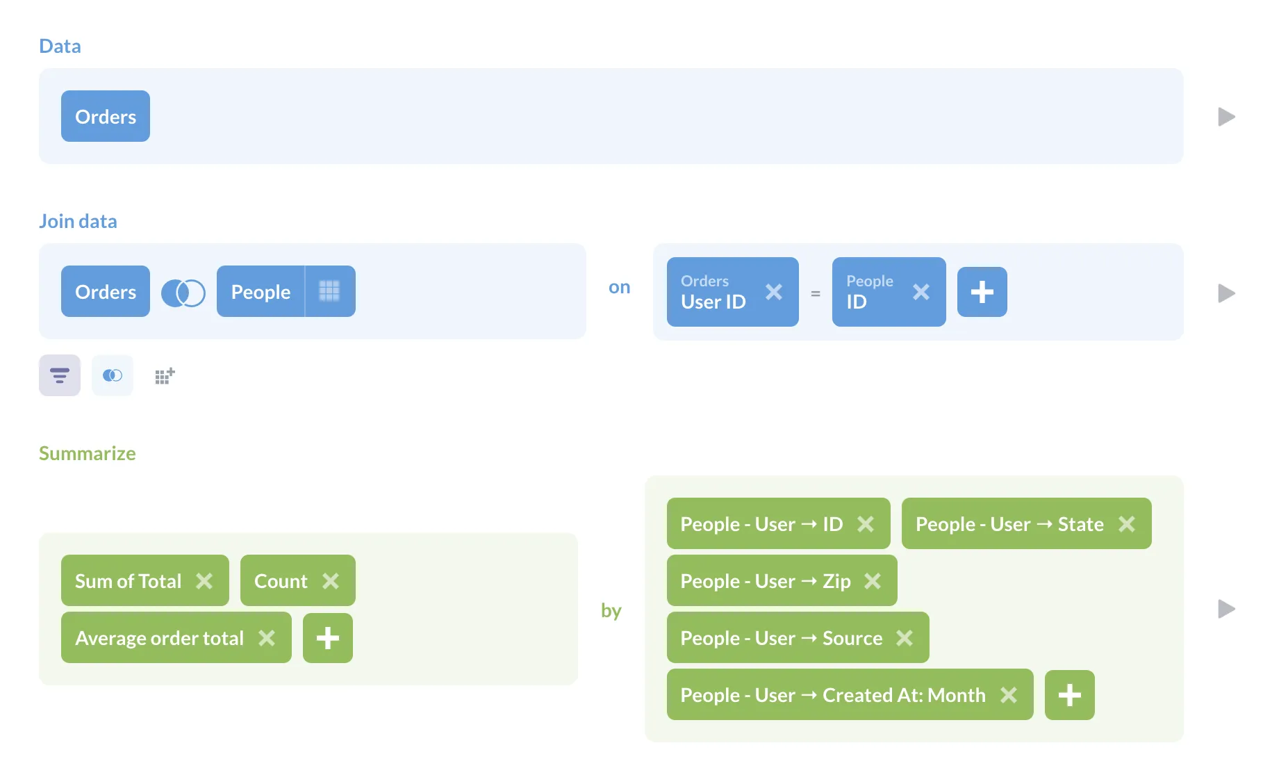 Model data with lightweight table metadata plus reusable Models/Metrics, but it’s not a full semantic layer and is limited by the underlying query performance (and can’t do cross-database joins). source |
| |  Proprietary change history and revisions—no native Git workflow, but you can store TWB files in a Git repo. source | Git version control for models and dashboards. source | 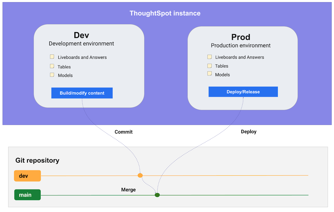 Export and sync TML with Git for change control. source | Proprietary Version Control No native Git integration. But new text-based format (TMDL) makes it easy for developers to set up manual integration with Git version control. source |  Git-based version control for data models, proprietary dashboard versioning. source |  Revisions plus Enterprise Git serialization for exports/imports. source |
| Data Connectivity How well each tool connects to data sources, keeps joins trustworthy, and surfaces SQL transparently. | ||||||
| | Native Connectors Connectors for spreadsheets, databases, big data, and cloud sources. source | Native Connectors + CSV Uploads Connects to all major data warehouses plus CSV uploads. source | Cloud Warehouse Connectors 30+ native connectors with live queries against sources. source | Get Data feature covers files, databases, Azure, Fabric, and online services. source | Connector Ecosystem 800+ sources via Looker Studio and partner connectors. source | Native connectors for major DBs; community drivers when self-hosted. source |
| | ||||||
| | Custom & Initial SQL Supports Custom SQL and Initial SQL on connection. source | SQL Transparency SQL preview for charts plus custom SQL models and AMQL (Analytics Modeling and Query Language) source | SQL View & Editor View search SQL; Analyst Studio offers SQL editor with headers. source | View or Supply SQL View native query or provide custom SQL in advanced options. source | SQL Tab & Runner Explore shows generated SQL; SQL Runner executes custom queries. source | View SQL & Editor View generated SQL or write and run native SQL queries. source |
| Visual Data Exploration Depth of exploratory workflows without rebuilding reports or relying on specialists. | ||||||
| |  Change aggregations or create viz calculations on the fly. source | 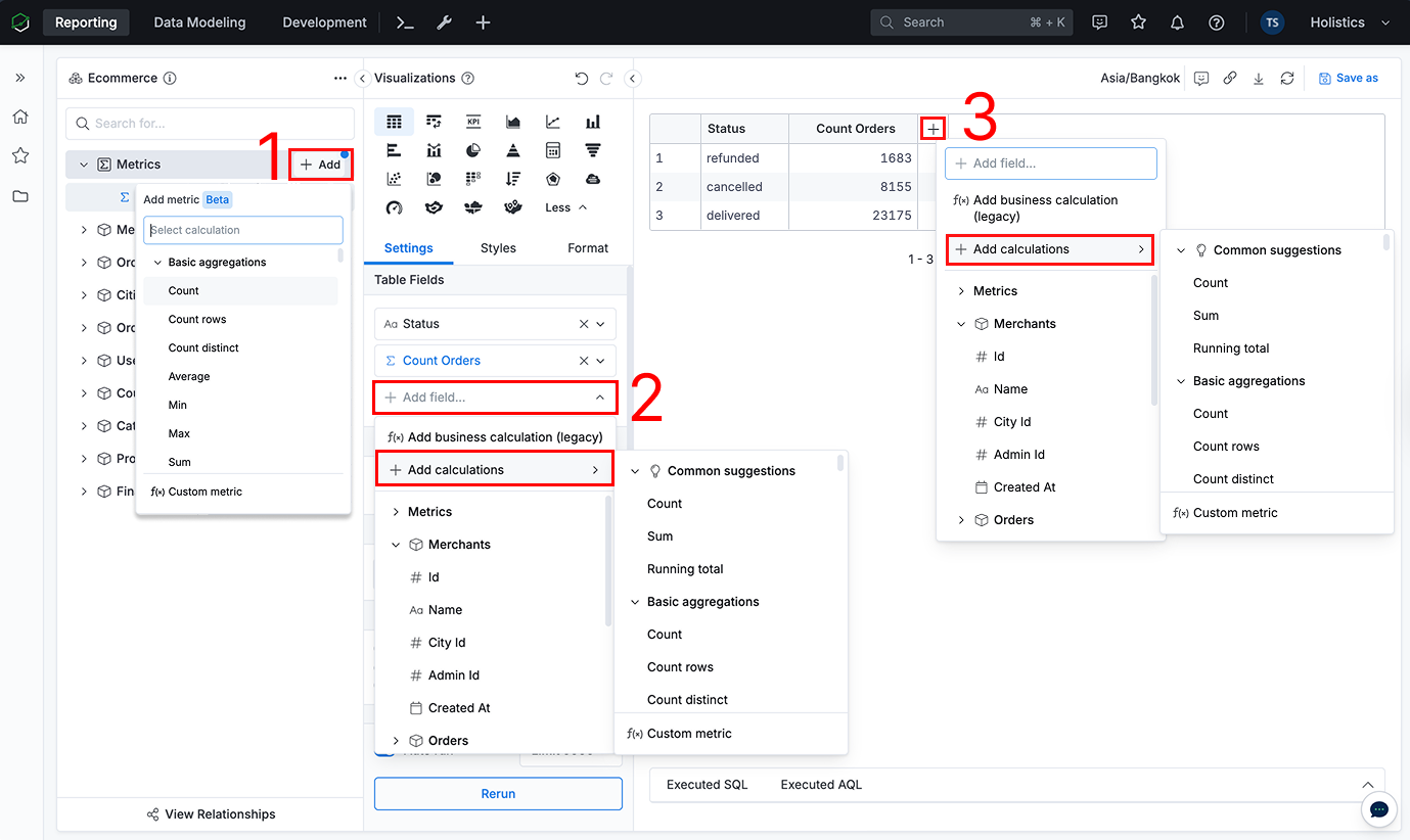 Create reusable, custom metrics and dimensions (Ad-hoc Fields) directly in your report. source | On-the-fly Formulas Change aggregation and add formulas like moving_average instantly. source |  Adjust aggregation per field directly in the visual pane. source |  On-the-fly metrics via table calculations without rebuilding explores. source | Summaries & Expressions Summarize changes aggregations; custom expressions add math without rebuilding. source |
| |  Drill down/up through date or custom hierarchies (and cube hierarchies), plus drill-through-style interactivity via dashboard actions. source | Drill-down, View Underlying Data, and Drill-through opens underlying records with filters preserved. source | 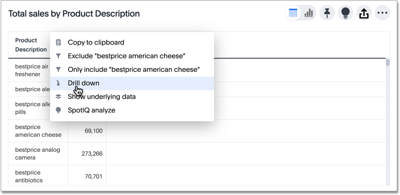 Drill down into a datapoint to get a finer grained view of that datapoint and the data behind it. source | Drillthrough & Show Data Drillthrough pages or show underlying records from visuals. source |  Native drill opens row-level data behind any visualization. source |  Offer basic drill functionalities like drill-through and drill down source |
| | Quick Table Calcs Running total, percent of total, moving average often require complex setup. source | Common analytics tasks can be done by asking Holistics AI, or accessed as one-click functions in the Visual Report Builder. source | Custom Formulas Ask Spotter for basic questions. Require custom formulas for advanced logic. source |  Running sums, moving averages, percent totals via DAX calculations. source | PoP & Running Totals Period comparisons, running totals, percent-of-total requires complex LookML setup. source | Custom Expressions Cumulative sums and period offsets via custom expressions. source |
| |  Filter, cross-filter, sort, and highlight directly in visuals. source | Cross-filtering, drill-down, sorting, and easy parameters on charts. source | Cross-filter Liveboards Liveboards support drill-downs and cross filters across visuals. source | 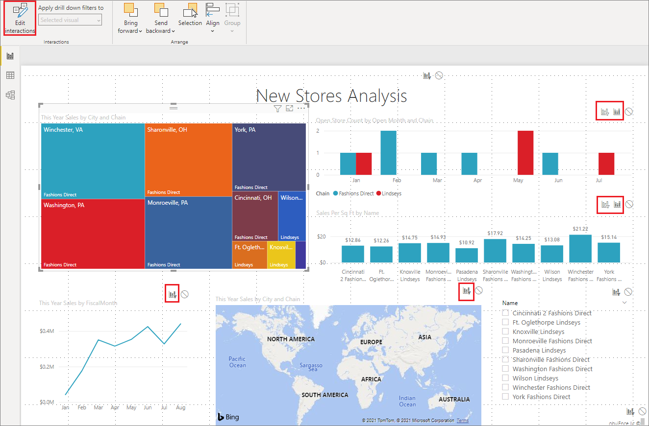 Cross-highlighting, slicers, and drill-down on visuals. source | Dashboard Interactions Cross-filter, expand filters, and sort directly in tiles. source | 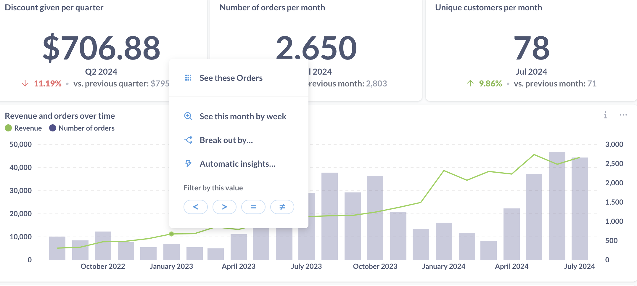 Dashboards support interactive filters and cross-filtering between cards. source |
| Visualization Customizations Flexibility to build, extend, and brand visual content and narratives. | ||||||
| | Extensions enable custom visuals like Sankey and network diagrams. source | 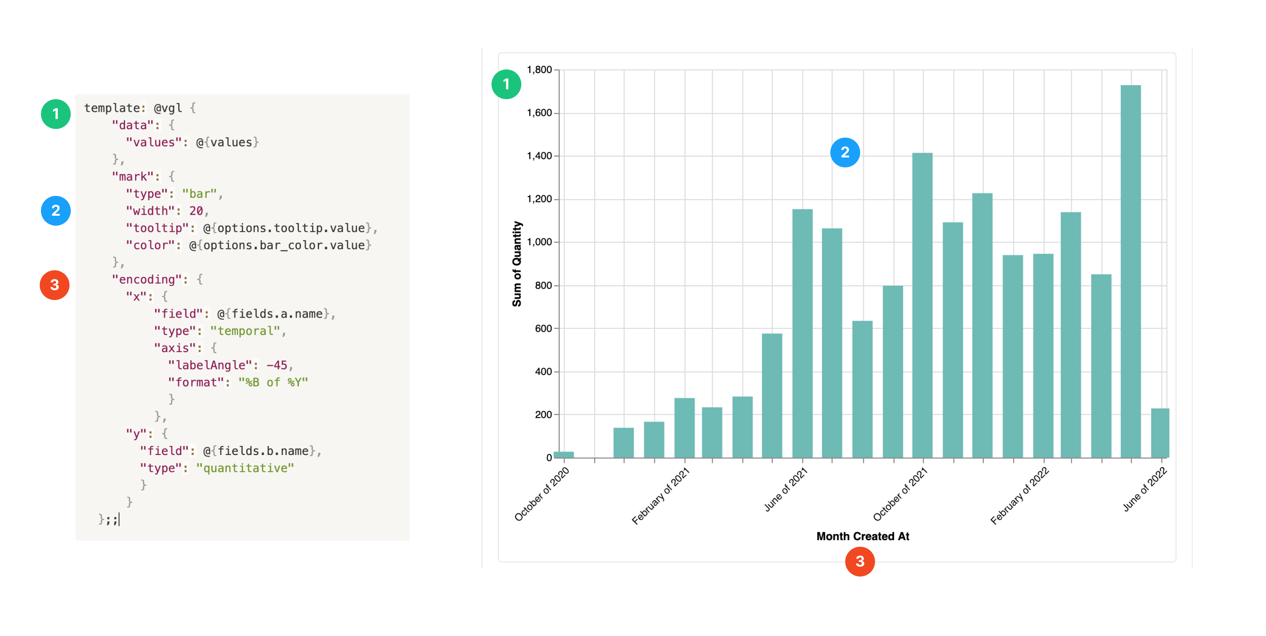 Native charts plus custom visuals via Vega Lite. source | Muze/Vitara Visuals Custom visuals via Muze Studio and Vitara beyond native charts. source | AppSource Visuals Download or build custom visuals via API and AppSource. source | 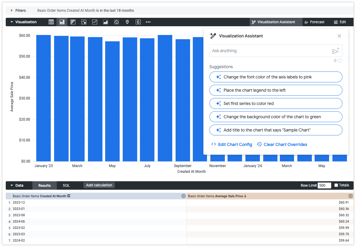 Use Gemini assistance to generate JSON formatting options from text-based prompts to create custom Looker visualizations. source | ❌ Not supported |
| |  Stories and dashboard narratives guide sequences and explanations. source | 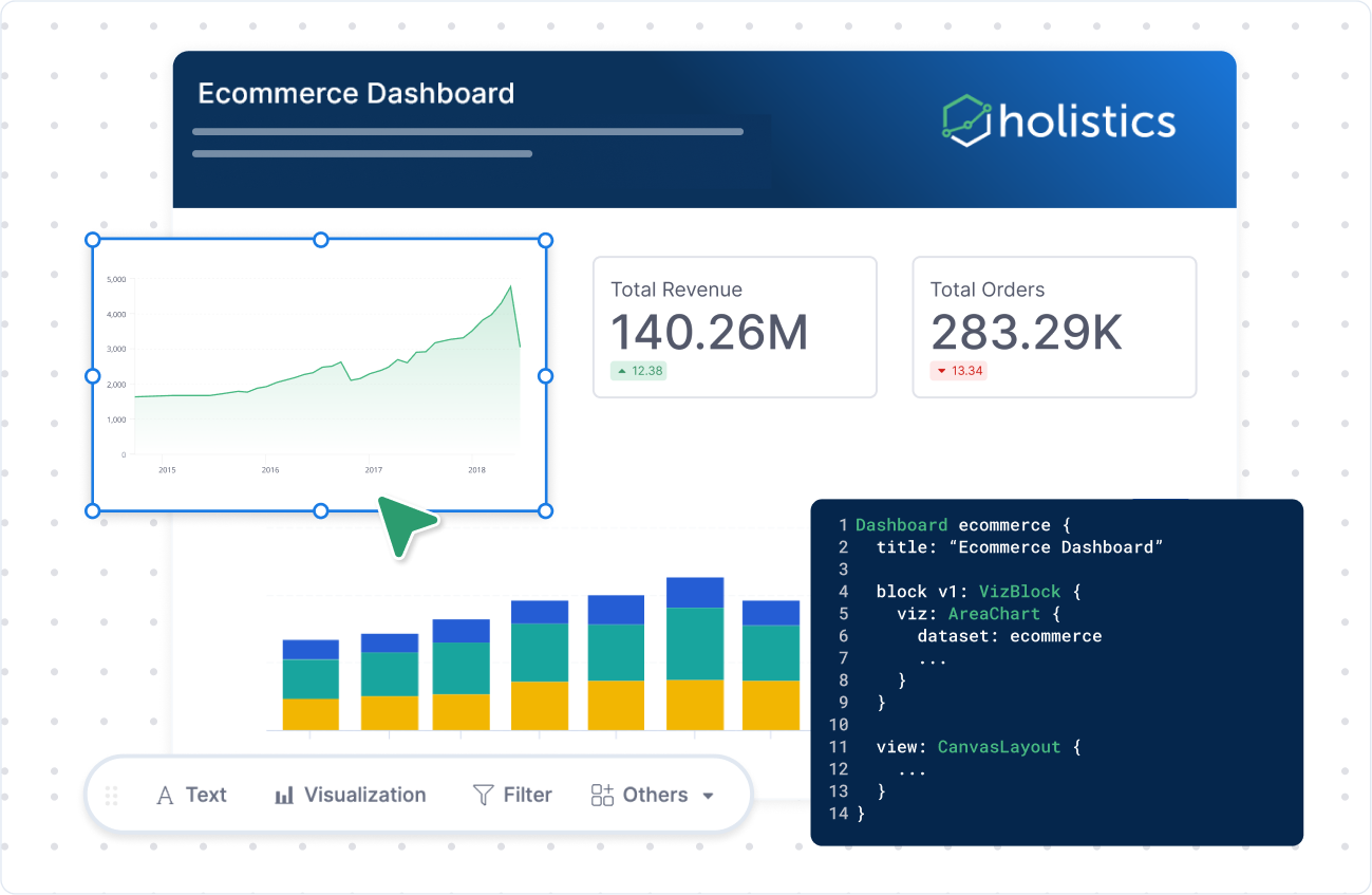 Canvas blocks and annotations enable guided stories. source |  SpotterViz auto builds narratives; note tiles add guidance. source | 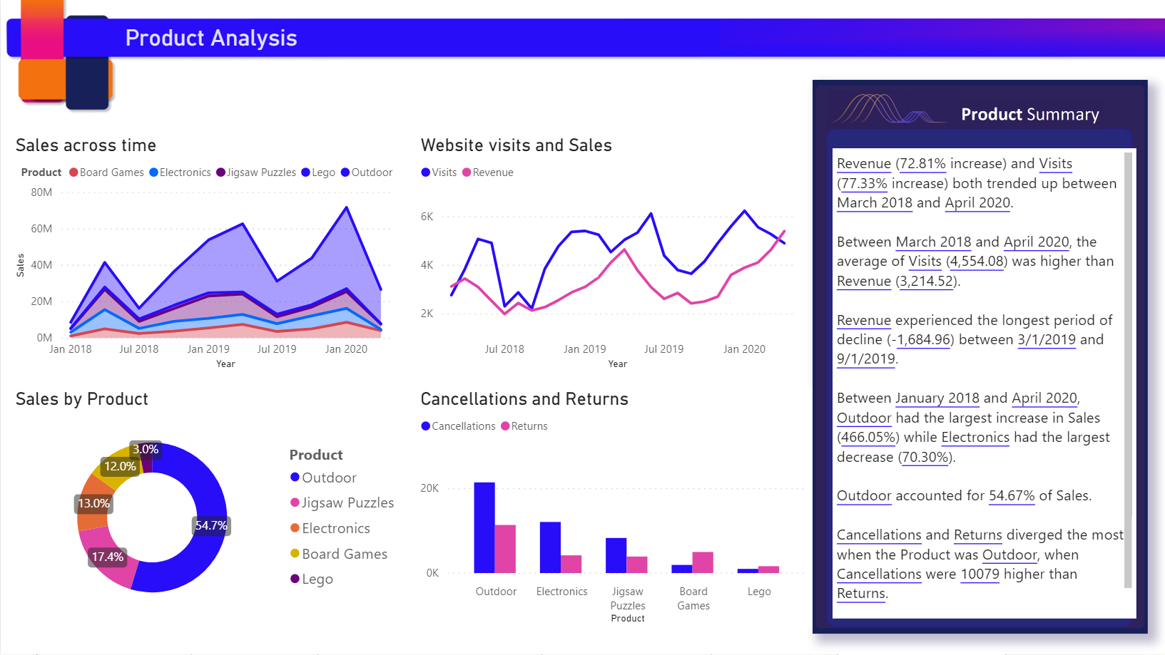 AI-generated text summaries to explain visuals and trends. source | Limited Support Boards curate content with descriptions, links, and text tiles. source |  Documents and text cards add narrative context with charts. source |
| | Themes & Palettes Add a custom theme to your Tableau workbook by importing a JSON file. source | Dashboard themes with custom CSS for branding. source | CSS Theming CSS-driven theming and white-label options for embeds. source | Themes & Formatting Themes gallery and format pane control colors, fonts, styling. source |  Custom themes for internal and embedded dashboards. source | Branding Controls Paid plans support white-labeling colors, logo, fonts. source |
| Analytical Functions The depth of analytical functions determines how well users can explore trends, compare performance, and uncover insights beyond basic reporting. | ||||||
| | Moving Averages Moving averages available through quick table calculations. source | Moving Calculations Moving averages and rolling sums as one-click options. source | Running Window Formulas support running sums and moving calculations. source | Rolling Metrics DAX window functions provide rolling averages and sums. source | Window Functions Table calculations and window functions for moving averages. source | Rolling Expressions Moving averages via custom expressions or SQL windows. source |
| | Period Comparisons Built-in PoP and YoY comparisons without coding. source | Period Comparisons PoP and YoY presets without SQL. source | Period-over-Period Date functions and formulas for WoW and YoY comparisons. source | Time Intelligence DATEADD and SAMEPERIODLASTYEAR enable PoP comparisons. source | Period Comparisons Date offsets support PoP and YoY calculations. source | Period Comparisons Date offsets in GUI or SQL for WoW/YoY. source |
| | Percent of Total Quick table calc for percent-of-total. source | Percent of Total Percent-of-total aggregation from field menu. source | Percent of Total Percent-of-total available via formula builder and search. source | Percent of Total Quick measures and DAX patterns for percent-of-total. source | Percent Totals Percent-of-total via measures or table calculations. source | Percent-of-total Percent-of-total aggregation in Summarize panel. source |
| | Forecast Models Built-in forecasting with smoothing and confidence intervals. source | Forecast via Models Forecasting through semantic models or dbt outputs. source | SpotIQ Insights SpotIQ surfaces trends and projections from patterns. source | Built-in Forecasting Analytics pane offers automatic forecasting on visuals. source | Forecast via Models Forecasting through derived tables or connected ML outputs. source | Forecast via SQL Forecasting handled through SQL models or external outputs. source |
| Governance Ensuring control and compliance across BI environments is critical to maintaining data integrity and trustworthiness. | ||||||
| | Admin Insights Usage metrics, performance views, and audit logs. source | Usage Analytics Native analytics for dashboards, queries, schedules, and audits. source | Monitor & Audit Usage monitoring plus audit logs and telemetry. source | Tenant Metrics Tenant and workspace usage metrics with activity logs. source | System Activity System Activity dashboards track queries, views, and actions. source | Audit & Performance Audit tools and performance insights on paid plans. source |
| | RBAC & Row Security Projects, groups, and row-level security filters. source | Granular RBAC Role-based permissions, dataset controls, and row-level security. source | Permissions & RLS Group permissions, object sharing, and row-level security rules. source | Security & Labels RLS, OLS, sensitivity labels, and Azure AD groups. source | RBAC & RLS Model access grants, user attributes, and row-level controls. source | Groups & Sandboxes Group permissions with sandboxing and row-level controls. source |
| Data Delivery How data and reports are delivered to end users. | ||||||
| | 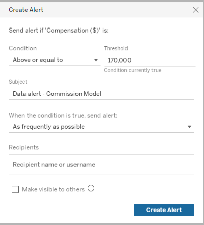 Threshold-based alerts with multiple notification channels. source | ❌ No documented alerts or subscriptions. | Custom Alerts User-defined alerts and scheduled subscriptions. source |  Subscriptions and data alerts for users and teams. source | ❌ No documented alerts or subscriptions. | |
| | Enterprise Sharing Granular permissions and secure sharing options. source | Secure Sharing Password-protected shareable links, RBAC sharing plus exports for external distribution. source | ❌ No documented sharing workflows. |  Share via Teams, PowerPoint, Excel with export options. source |  Shareable Looks to Looker users with export options for external sharing. source | ❌ No documented sharing workflows. |
| Reliability & Performance System reliability, performance optimization, and monitoring capabilities. | ||||||
| | Advanced Optimization Caching, incremental refresh, and performance tuning options. source | ❌ No documented optimization capabilities. | Import Mode Import mode, pre-aggregations, and summary tables. source | In-Database Queries Real-time queries against databases for optimized performance. source | ❌ No documented caching or pushdown features. | |
| | Enterprise Monitoring Performance insights and alerting for enterprise deployments. source | ❌ No documented monitoring or alerts. | ❌ No built-in monitoring or freshness alerts. source | System Activity System Activity Explores track usage and query performance. source | ❌ No documented performance monitoring. | |
| BI Developer Productivity Enhancing productivity for BI developers/data team through automation, modularity, and extensibility enables faster development and easier maintenance. | ||||||
| | APIs & Extensions REST/JavaScript APIs and Extensions API for automation. source | Analytics as Code AML/AMQL with Git and CI-friendly workflows. source | TML & APIs TML plus REST APIs enable scripted deployments. source | Pipelines & APIs Deployment pipelines, Git integration, and REST APIs. source | LookML & Git LookML modeling with Git-backed projects and APIs. source | Serialization & API Enterprise serialization exports config; API supports scripted management. source |
| | Data Sources & Templates Published data sources, parameters, and dashboard templates for reuse. source | Reusable Models Modular models, parameters, and shared datasets reduce duplication. source | Worksheets & Answers Worksheets and saved answers reused across Liveboards and embeds. source | Shared Datasets Shared datasets, dataflows, and calculation groups for reuse. source | Explores & Components Reusable Explores and shared components across dashboards. source | Models & Snippets Reusable models, SQL snippets, and saved questions. source |

Evaluation Criteria for Tableau Alternatives: Our Methods
We believe that the right Tableau alternative should either match Tableau’s strengths (best-in-class visual exploration, expressive dashboards, broad charting, strong interactivity) or close the gaps that create friction at scale (governed metrics, change control, pricing and product-ready embedding).
Here are the core criteria we've looked into:
1. Metric Governance
Your company grows, dashboards multiply, and “finding data” becomes a scavenger hunt through final artifacts. Metric definitions live implicitly inside charts, SQL snippets, calculated fields, and dashboard notes — not in one place. Two teams build the same KPI with slightly different filters. Drift creeps in. Trust erodes.
What to look for:
- Semantic Modeling Layer: A self-service analytics platform should allow you to define and maintain business metrics centrally, ensuring that reports generated across different departments are accurate and consistent. This is usually achievable with a semantic layer that offers centralized metric definition capabilities, and the ability to reference and reuse definitions.
- Version Control: Without governance, self-service report creation leads to report sprawling and not knowing who changes what. Robust git-based version control help you incorporate software engineering best practice to track changes and review changes, and roll backs changes when necessary.
2. Data Connectivity
Tableau connects widely, so you want something with similar capability.
To evaluate alternatives, look for:
- Data Sources connection: Does it offer native connectors to major sources/formats? Is it easy to add and manage new sources as your stack evolves?
- SQL Transparency and support: Can you view the SQL behind a chart/query? Can you copy, modify, and run it, or connect to custom SQL statements without losing functionality?
3. Visual Data Exploration
ableau is strong at interactive exploration, but in many orgs, advanced exploration becomes fragile or expert-only.
If key actions (drill paths, comparisons, investigative workflows) require heavy setup, users stop exploring and start requesting. And when everything depends on data being pre-joined “just right,” richer interactions become brittle and harder to maintain.
To evaluate alternatives, look for:
- On-the-fly Computations: Can users create calculations and change aggregations quickly while exploring, without rebuilding a report?
- Drills: Can users drill down and drill through to underlying records without special configuration or one-off setup?
- Common Analytics Operations: Are running totals, percent-of-total, and period-over-period comparisons first-class features (not workarounds)?
- In-viz Interactions: Can users filter, cross-filter, sort, and navigate directly in the visualization with intuitive, low-friction interactions?
4. Visual Customizations
Tableau excels at product-grade presentation, so when you evaluate Tableau alternatives, the bar isn’t “can it draw charts?” The bar is: can it match that presentation quality, while giving you more leverage to standardize, extend, and scale?
To evaluate alternatives, look for:
- Custom Visualizations: Can you build, extend, or integrate custom visuals when the default chart library isn’t enough? Can you manage those visuals reliably across environments (so they don’t become one-off hacks)?
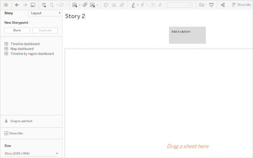
- Data Storytelling Capabilities: Does it support annotations, narrative layout, guided “story” experiences, and commentary so dashboards communicate the “why,” not just the “what”?
- Custom Styling: Can you control themes, fonts, colors, spacing, and component styling to match brand guidelines—and enforce consistency across dashboards so presentation quality scales with the org?
5. BI Developer Productivity
The tool should enable the data team and BI developers to work efficiently through automation, reusability, and modern software development practices for better maintainability.
When evaluating BI tools, you should look for:
- 2-way Git version control integration and deployment workflows.
- Component reusability and templates.
- Dev-friendly BI development workflow.
6. Performance
The platform should maintain responsiveness as data volumes and user counts grow, with tools to monitor and optimize performance.
When evaluating BI tools as Tableau alternatives, you should: - Review caching mechanisms and how they might affect report performance. - Assess performance monitoring and optimization tools to help you manage and improve performance.
Community Discussions
Discover what other practitioners are discussing about this topic.

r/Tableau
Posted on Jan 2021 View source
What limitations with Tableau are you shocked are still around?
Or, things that can be done in an extremely complicated way For me: - No built in support for fiscal 4 5 4 or similar calendars - Cannot set a relative date range default on a date slider - No simple check box to remove 'ABC' from a table
2top comments
r/Tableau
Posted on Feb 2025 View source
Data Analysts, What Are Tableau’s Biggest Limitations in Your Workflow?
Hey everyone, I’m working on a case study to explore how AI could improve Tableau for enterprise teams, specifically in real-time analytics and predictive insights. I’d love to hear from data analysts, BI professionals, or anyone who regularly works with Tableau.
2top comments
The biggest pain point with tableau is that they keep peddling AI features instead of fixing/updating the core product and the core features
I'm going to go a different direction than most comments here and say performance optimization. A good chunk of my work is optimizing poorly designed workbooks. While Tableau already has the performance optimizer using heuristics to improve performance, having an AI system support user with more context information (e.g. directly looking at the resulting query from a viz) could help newer users avoid design pitfalls.
r/Tableau
Posted on Nov 2025 View source
Tableau is Horrible from a UX Perspective
I have used Looker, Powerbi, Excel, Sheets , Python and Tableau takes the cake for the worst Viz tool I have ever used. I also am pretty proficienct and love using SQL. And yes, I did try to approach it with an open mind and use it as Tableau rather than use it as Powerbi/Looker. However there is so much unnecessary complexity and bullshit
2top comments
I’ve used Tableau for 10+ years so have plenty of experience with it.
In general it’s fine, I wouldn’t say it’s horrible but it’s nothing special.
Picking it up and building standard Viz’s is pretty great and calculations are simple if you know SQL.
But plenty of things feel clumsy, or like bodged fixes to solve an issue that someone raised, you just sort of forget because you become used to it.
Also, the product development is scattergun at best, loads of focus on whatever the new hot term is and stagnation of the core product.
Honestly, this reads like someone who is still pretty new to Tableau and running into normal growing pains. Tableau feels strange at first because it uses a different mental model than Power BI or Looker, but once you learn the basics it becomes one of the most flexible tools out there. There is almost nothing it cannot handle.
Most of the “complexity” people complain about usually comes from not knowing the common workflows. Tableau is basically drag and drop Lego pieces for data: dimensions here, measures there, and the visual builds itself. Formatting, duplicating sheets, changing aggregations, and managing layouts seem complicated only until you learn where everything lives. After that it becomes second nature.
For dashboard building, Tableau is far easier than people give it credit for. Once you understand containers and actions, you can build custom layouts, show or hide views, pass filters between sheets, or create full interactive dashboards without writing a single line of code.
r/tableau
Posted on Jan 2024 View source
Alternatives to Tableau?
I am a longtime Tableau user and instructor -- and I'm starting to get to the point where I've just had it with Tableau. It's become so complicated to get them to simply take my money and give me a license key (not to mention the outrageous price that can't be billed monthly) that I'm ready to depart. What are you using as an alternative to Tableau? Which company is easier to deal with?
2top comments
Really depends on your deployment, but PowerBI has continued to close the gap with Tableau fan over the years, and it’s substantially cheaper in most cases, especially (but not only) if you have a lot of investment in the Microsoft stack already. I love Tableau, but PBI has become a solid alternative over the years.
Tbh, Tableau is still unbeatable when it comes to visualizations. I find it hard for some companies to move away from it when execs love those polished dashboards.
I’ve been using Holistics as an alternative and it's been working out great for us. The visualization side isn’t as flashy as Tableau, but you can build dashboards as code, which gives you a lot of flexibility for customization. It also has this code-based semantic layer to manage metrics and logic, which is something Tableau hasn't been good at.
r/datascience
Posted on May 2020 View source
Tableau is slow, clunky, and slows people down who come from a coding background
I hate tableau with a passion. I come from and R, python background, and I guarantee I could build the same dashboard in streamlit within a few hours vs the horrible clicking and dragging I do in 2 days to make one graph. even ggplot is so much easier than stupid garbage tableau. I swear if it wasn’t for stupid business people not having a say in what tools can he used I’d be done with my intern project 3 weeks ago. But instead I’m spending a day and a half just fiddling with clicking and dragging to make a stupid graph of quarterly sales.
2top comments
If your company is like a lot of places, there are probably loads of people who know how to use Tableau, whose job it is to build and maintain dashboards; meanwhile there might be some folks who know Python, but they have better things to do than update your dashboard every time it needs to display the new season's widget categories. Your manager's job is to make sure your projects provide value to the company even after you're gone, of course you can't just use whatever tools you want, no one wants to maintain a giant pile of random intern bullshit.
Tableau has its pain points for sure, but once you know what you're doing it shouldn't take you all day to make a quarterly sales graph. IME, it's faster than ggplot for a lot of simple exploratory data analysis and basic business graphs, but becomes absolutely infuriating the instant you try to do anything really interesting or outside the bounds of what it considers data viz best practice (their design team is quite open about how it's an opinionated piece of software).
You're young and inexperienced, so you don't know this yet. But the best tool for the job is always the one that the rest of your team uses that gets maintained and can be reused for multiple use cases. It's very obvious that for one-offs, most people can design something in Python or R that is better than Tableau. But none of that ever gets maintained or used for other use cases, so your fancy Python/R dashboard is useless to the company beyond your single use case. The value of Tableau is that it's maintained, gets updates, can be used over many use cases, and people can ask somebody when they have questions. Almost none of that will apply to whatever you build.
1. Holistics
TL;DR: How Holistics Compares to Tableau
Tableau and Holistics both help teams answer business questions, but they’re optimized for different “sources of truth.”
Tableau is dashboard-first: business users typically find data by finding dashboards, and definitions often live implicitly inside calculated fields, chart settings, and embedded SQL snippets. Over time, that can create dashboard sprawl and make it easier for the “same” metric to drift into multiple slightly different versions across workbooks.
Holistics is semantic-layer-first: users can discover data through dashboards, datasets, and governed metrics, with metrics designed to be reusable across datasets, reducing sprawl and making definitions easier to locate.
A big difference shows up in change management and quality control.
In Tableau, changes often happen at the dashboard/query level, so impact analysis can be manual. In Holistics, changes happen in models/metrics, where code-level dependencies make it easier to reason about downstream impact. Holistics also highlights typed modeling for stronger validation—catching more issues (field references, types, relationships) earlier during development rather than at runtime via broken dashboards, incorrect filters, or SQL errors.
Highlighted Features
- Code-based Semantic Layer: Allow data teams to define reusable data models, datasets, and metrics and manage them centrally, ensuring accuracy and consistency across all reports.
- Git Version Control: Allow teams to commit analytics code to Git version control and track every change with full audit trails. Perform branching and code reviews to ensure an accurate analytics workflow.
- 1-click analytical functions: Common analytical functions (period over period, percent of total, running total) are 1-click operations without the custom setup.
- Canvas-based dashboards: Analysts can customize charts, widgets, themes and layout to create Tableau-like visuals.
- AI-first Self-service Layer: Business users can create their charts via a drag-and-drop chart builder, or explore data using natural language with Holistics AI.
Potential Limitations
- AQL Learning Curve: Holistics’ proprietary Analytics Query Language (AQL) adds advanced data analytical capabilities but has a slightly steep learning curve for new users, who are more familiar with visualization tools.
- While technically sophisticated, Holistics' user experience might lack the polish of Tableau.
For a more detailed comparison, check out this article: Holistics vs Tableau: Which One is Better?
2. Thoughtspot
TL;DR: How Thoughtspot Compares to Tableau
ThoughtSpot and Tableau both deliver interactive analytics, but they start from different user workflows.
Tableau is built for visual, drag-and-drop exploration so analysts can iterate quickly and build highly customized dashboards with deep control over design and layout, and it’s repeatedly described as strong for data exploration and “beautiful, complex dashboards.”
ThoughtSpot, by contrast, is optimized for search- and AI-driven self-service. Business users can ask questions in natural language and get instant answers, helping teams “get more from data in less time” with less dependence on analysts.
However, this also means trading away on the visual flexibility and interactivity Tableau offers. Users’ reviews on Capterra, G2 and Reddit also note ThoughtSpot may need careful optimization on very large Snowflake-backed volumes, and Tableau can be costlier and harder to govern as content sprawl grows.
Highlighted Features
- Spotter” conversational analyst: ThoughtSpot is pushing agentic/conversational analytics with Spotter, aimed at turning questions into answers plus deeper analysis and follow-ups.
- SpotIQ (augmented analytics): Automatically surfaces trends, outliers, and correlations you might not think to ask for. This is helpful for “what changed and why?” discovery beyond basic dashboards.
Potential Limitations
- Depends on clean modeling/metadata: Natural-language experiences work best when metrics, synonyms, and relationships are well defined—otherwise users can hit ambiguity or inconsistent results.
- Not always ideal for complex, bespoke analysis: Very specialized calculations, niche chart types, or heavily curated narratives may still require tools like Tableau (or a data science stack).
3. Metabase
TL;DR: How Metabase Compares to Tableau
Metabase and Tableau optimize for different users and budgets.
Metabase is a lightweight, open-source-first BI layer that helps teams ship internal reporting quickly: its notebook-style, no-code query builder lets people ask questions, join tables, and create interactive charts and dashboards with minimal setup. Pricing starts with a free Open Source edition, and you can move to paid plans when you need managed hosting or more advanced administration.
Metabase is best when you already have a clean warehouse schema and want a simple, SQL-friendly layer for KPI tracking, alerts, and ad-hoc Q&A. Users often note it’s simpler, but has fewer advanced visualization and complex analysis options than Tableau.
In contrast, Tableau is the heavier-duty option for analyst-led exploration and executive storytelling. Teams value Tableau’s drill-down and interaction depth, but the trade-offs are higher licensing cost (which makes Metabase more attractive), and more operational overhead as content sprawl grows.
Highlighted Features
- Open-Source Flexibility: As an open-source data analytics tool, Metabase allows full customization to fit your organization's specific needs, offering flexibility that proprietary tools like Tableau don’t.
- Ease of Use: Metabase’s simple, intuitive interface allows non-technical users to query data and create dashboards without needing SQL expertise. Users can explore data through point-and-click questions, making data access more democratic.
Potential Limitations
- Limited Reporting Features: While Metabase is perfect for basic querying and reporting, it lacks the rich visualizations that tools like Tableau or Power BI offer, and more advanced analytics tools (e.g. predictive analytics) that data scientists might need.
- Limited Version Control: Allows one-way Git-based version control through Serialization, available starting with the Pro Plan.
- Scaling Challenges: Metabase is excellent for small to medium-sized businesses, but larger organizations with complex data needs might find its performance and feature set limiting as they scale.
4. Looker
Looker, now part of Google Cloud, is a modern BI platform that stands out for its powerful data modeling capabilities and integration with cloud infrastructures.
TL;DR: How Looker Compares to Tableau
Looker and Tableau both deliver interactive BI, but they’re optimized for different operating models.
Similar to Holistics, Looker is semantic-layer-first. Data teams define business metrics, dimensions, and relationships centrally in LookML, and Looker uses that model to generate SQL consistently against your database. This approach can reduce “metric drift” and make governance easier because the same definitions power every Explore, dashboard tile, and embedded experience.
Tableau is visualization-first. It’s widely adopted for analyst-driven, drag-and-drop visual analysis and for building presentation-ready dashboards. Tableau’s role-based licensing (Creator/Explorer/Viewer) and Cloud/Server deployments support broad distribution, but “truth” can end up living inside workbooks (calcs, extracts, filters), which can increase sprawl if governance isn’t tight.
Highlighted Features
- LookML for Centralized Data Modeling: Looker’s LookML language allows data teams to define metrics and dimensions centrally, ensuring that business users are working with accurate, consistent data across all reports and dashboards. This eliminates the common issue of disparate metric definitions.
- Robust Self-Service Interface: With Looker Explore, non-technical can explore data intuitively via a point-n-click interface, drill down, filter, and interact with dashboards.
Potential Limitations
- Steeper Learning Curve: Looker requires a deeper understanding of data modeling and its proprietary LookML language.
- High Cost: Looker is typically priced higher than other BI tools, making it a significant investment for companies. Smaller organizations may find it cost-prohibitive compared to alternatives like Power BI or Holistics.
5. Power BI
TL;DR: How Power BI Compares to Tableau
Tableau is often chosen when teams care most about best-in-class visual design and exploratory analysis, as users praise its flexibility for complex dashboards, and it can be a good fit for larger or more complex datasets. The trade-offs are higher licensing cost and, for some orgs, clunky sharing/governance as usage scales. Power BI tends to win when you want broad distribution at lower cost and tight Microsoft integration, especially for teams already living in Excel/Power Query. Power BI is more robust for data modeling (Power Query, Power Pivot, DAX) and has an intuitive drag-and-drop report builder, but is often seen as less customizable than Tableau and can run into performance issues on very large models.
Highlighted Features
- Powerful reporting tools, analytics capabilities and seamless integration with other Microsoft products (e.g.: Powerpoint, Excel).
- Rich visualization marketplace where you can replace your Tableau visualizations.
- More Mature data modeling capabilities. Power BI excels at creating complex data models, offering a comprehensive data analytics experience.
Potential Limitations
- The learning curve for advanced functions can be steep. Data analysts need to learn DAX (Data Analysis Expressions) and Power Query M language to get the most out of Power BI.
- Power BI desktop isn’t available on Mac, which can be a problem for teams that rely on Apple devices. (That's why we wrote a post on how to use PowerBI on Mac devices).
There's so many! To use tableau is to be constantly internally screaming "Why? Why can't you do that?"
My simplest peeve is probably that you can't have text with a white outline on maps to make the text more readable.
My best example of "you can, but it's absurdly complicated" is Sankey charts. It is possible to make a sankey chart in tableau. I did it once, people really liked it. I will never do it again, it was far too painful.
The inabilities to:
Choose filters' default state when bringing into dashboard (make them all Floating Dropdowns, for instance, so I don't have to change them from the Tiled Lists that end up 10,000px tall by default)
Have numbers automatically display at magnitude ($1.4B, $3.1M, $375.0K, $750.00); this currently requires a tedious workaround for every single measure.
Copy and Paste dashboard objects, like text boxes
Overlay map points from one data source onto a filled map from another data source that only shares ZIP codes (I'm dealing with this very thing just today)
Change which data source is Primary on a given sheet where data blend is used.