30 Best BI Tools in 2026: Ranked and Compared by Category


Contents
The BI tooling landscape in 2026 will be getting more diverse, and more confusing than ever.
Whether you're a data leader trying to scale insights across a company, a startup founder looking to visualize customer data, or a finance analyst who just wants dashboards that work, you’ve probably asked yourself:
Which BI tool should I use? And why this one over the dozens of others out there?
This guide is for people who are evaluating BI tools for internal dashboards, customer-facing analytics, or modern data team workflows. It pulls together first-hand experiences and pain points from real practitioners across industries, so you can avoid common traps, and select the right tool for your context.
You’re in the right place if:
- You’re researching BI tools and are overwhelmed by the sheer number of options. (There are over 50+ BI tools!)
- You’re building a modern data stack and need a BI tool that integrates smoothly with tools like dbt, Fivetran, Snowflake, etc.
- You’ve heard names like Looker, Power BI, Tableau, Holistics, Hex, Sigma, Metabase, Superset, Omni, etc., but don’t know how they really differ.
- You want clear breakdowns by feature sets to match your technical and business needs.
What this blog post will cover:
- A taxonomy of BI tools: grouped into categories like self-service BI, visualization-first, semantic layer-enabled, Git version-controlled, and open-source BI.
- Real user feedback sourced from over 200 Reddit comments and data practitioner discussions, including what real data teams love and hate about each tool.
- A breakdown of pros and cons based on capabilities and features.
- Specific recommendations by company size, budget, and data maturity.
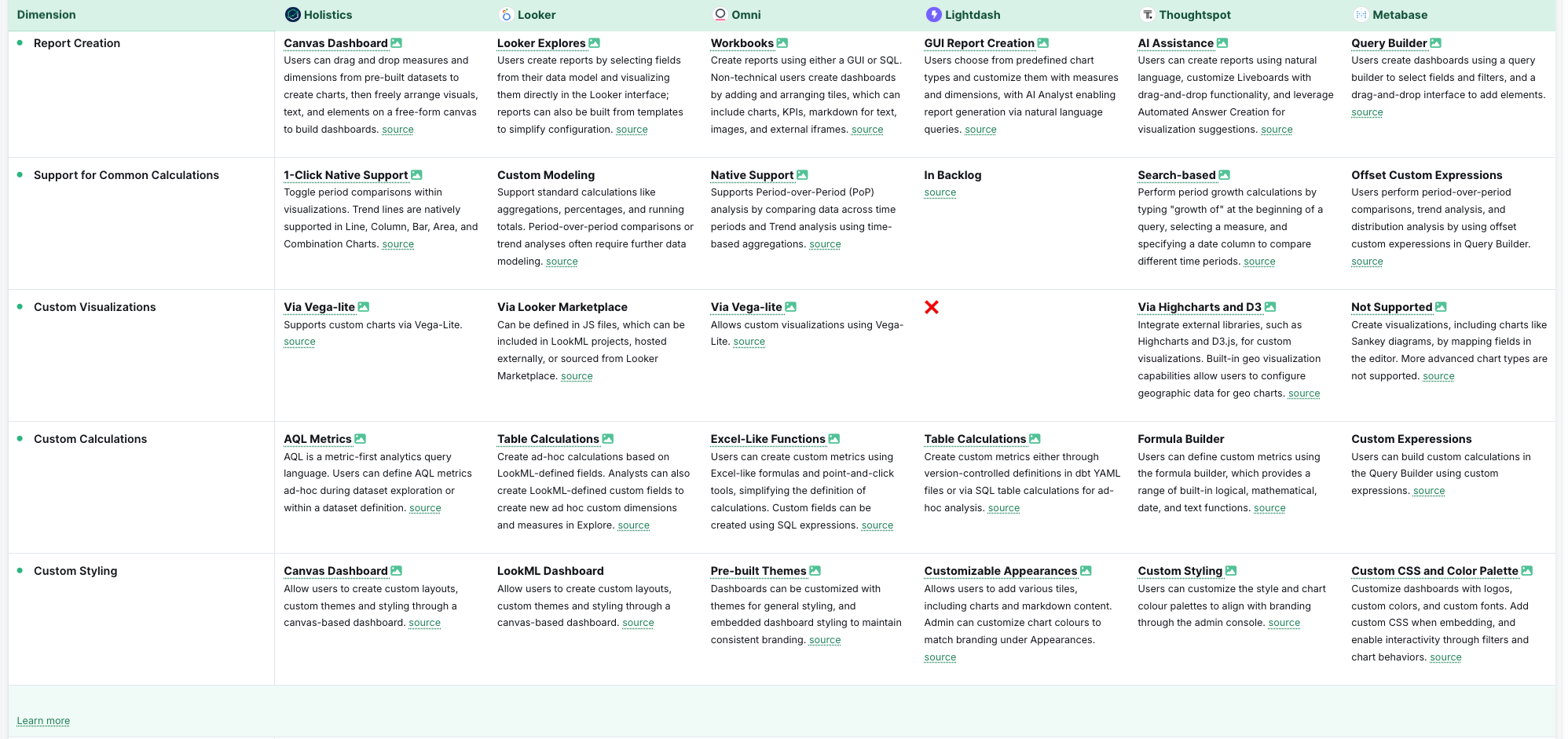
BI Tools at a Glance
Before diving into the full breakdown, here’s a quick comparison of the top BI tools across key categories. For deeper evaluations, see our self-service BI tools comparison and AI-powered BI tools comparison.
| Tool | Best For | Category | Key Differentiator |
|---|---|---|---|
| Holistics | Self-service + DevOps teams | Self-Service, As-Code, Semantic Layer | AQL + Git-native modeling |
| Tableau | Visual storytelling | Visualization-First | Industry-leading dashboards |
| Power BI | Microsoft ecosystem teams | Self-Service | Excel/Office 365 integration |
| Sigma Computing | Spreadsheet-native analysts | Self-Service | Spreadsheet-style cloud BI |
| ThoughtSpot | AI-first search analytics | AI-Powered | Natural language search |
| Lightdash | dbt-centric teams | As-Code | Native dbt integration |
| Metabase | Small teams on a budget | Open-Source | Free, easy setup |
| Looker | Governed enterprise metrics | Semantic Layer | LookML modeling |
Understanding BI Tools: Our Categorization
Not all BI tools are created equal, and that’s a good thing. The best tool for your organization depends not just on what you want to analyze, but who is doing the analyzing, and how your team works with data.
Below, we’ll walk through the five core categories of BI tools that we’ll cover in this guide. Each serves different data cultures, team structures, and analytical maturity levels.
1. Self-Service BI Tools
- Who they're for: Business teams, general analysts, non-technical staff
- Used When: You want non-technical users to create dashboards without help from data engineers. You don't want your analysts to become Excel jockeys or IT helpdesk who spend their entire day answering ad-hoc data questions.
- Team environment: Decentralized analytics where departments need to access and analyze data independently.
- Typical tradeoffs: Easier to use, but limited in governance and modeling depth
These tools prioritize ease of use. They typically offer drag-and-drop interfaces, spreadsheet-style querying, and out-of-the-box visuals. They are often chosen by organizations aiming to reduce reliance on central data teams.
Our recommendations for BI tools with self-service analytics: Power BI, Sigma, Looker, Holistics, Thoughtspot.
Also, if you are still wondering what exactly self-service is, check out this short comic book.
2. Visualization-First BI Tools
- Who they're for: Analysts, data-savvy business users, presentation-heavy teams
- Used When: You care most about clear, attractive storytelling through dashboards.
- Typical tradeoffs: Strong visuals, weaker in modeling, analytical capabilities and governance features.
These platforms are laser-focused on how data looks and how easily stakeholders can understand it. They are ideal when stakeholder communication is the main goal (e.g: quarterly business reviews, performance monitoring, or product metrics dashboards). Visualization-first tools usually have flexible charting options but less focus on metrics governance or developer workflows.
Our recommendations for BI tools with strong data visualization: Tableau, Qlik Sense, Superset, Evidence.dev.
3. Semantic Layer-Enabled BI Tools
- Who they're for: Larger/growing orgs, data teams scaling governance, cross-functional teams.
- Used when: You want a single source of truth for metrics across tools and teams.
- Typical tradeoffs: Strong governance, but steeper learning curve and setup time.
Semantic-layer tools allow teams to define metrics and dimensions once, then reuse them across dashboards and queries. This creates consistency across departments, makes permissions and definitions auditable, and reduces duplicated logic.
Our recommendations for BI tools with a semantic layer: Looker, Omni, Holistics, GoodData.
4. As-Code BI Tools (BI with Git Integration)
- Who they're for: Analytics engineers, data engineers, developers. High maturity data organizations that value maintainability, reusability, and reproducibility.
- Used when: You need version control, testing, CI/CD, and integration with dbt
- Typical tradeoffs: Requires technical skills, but enables much stronger governance and reuse
These tools treat analytics like software. You define models, metrics, and dashboards in code, store them in Git, and run reviews via pull requests. They’re well suited for setups where governance, testing, and deployment pipelines matter.
Our recommendations for best as-code BI tools: Holistics, Cube.dev, Looker, Evidence.dev, GoodData.
5. Open-source BI Tools
- Who they're for: Developer-heavy teams, budget-conscious orgs, startups.
- Used when: You want to control hosting and customize the platform
- Typical tradeoffs: Free and flexible, but requires engineering resources to deploy and maintain.
Open source BI tools offer transparency and extensibility at the cost of ease. They’re often better suited for companies that already have DevOps infrastructure or want to embed dashboards into customer-facing products without vendor lock-in.
Our recommendations for best open-source BI tools: Apache Superset, Metabase (self-hosted), Dash (Plotly), Redash, Grafana (limited BI use), Lightdash.
6. AI-powered BI Tools
- Who they’re for: Teams that want to make data more accessible by letting non-technical users ask questions in plain english and get visual answers.
- Used when: You want stakeholders to interact with data in plain language, automatically generate visualizations or narratives, and uncover insights without manually writing queries.
- Typical tradeoffs: AI can accelerate exploration but still relies on clean, well-modeled data to be accurate. Without governance or reliability, AI-generated queries can be inconsistent or misleading. These tools work best when paired with a strong semantic layer or curated datasets.
Our recommendations for best AI-powered BI tools: ThoughtSpot Spotter, Hex’s Magic, Looker Gemini, Holistics AI.
The Best Self-Service BI Tools
Self-service BI tools exist to solve one core problem: how can business users get answers from data without waiting on a data engineer?
In practice, this means drag-and-drop interfaces, natural language querying, spreadsheet-style metaphors, and prebuilt integrations with popular data warehouses. These tools are built for speed and autonomy, especially in teams where data requests would otherwise pile up in an analytics backlog.
But that accessibility comes with tradeoffs. Governance is often weaker. Logic can be duplicated across dashboards.
1. Sigma Computing
Best for: Finance teams and spreadsheet-native users who want BI without SQL
Sigma bridges the gap between Excel and the data warehouse. Its spreadsheet-like interface makes it accessible for operations and finance teams who are used to modeling in rows and columns.
Under the hood, it generates SQL against your cloud data warehouse. This hybrid makes it a strong contender for teams that want self-service BI without retraining their business users.
Use Sigma if:
- Your analysts/users work best in spreadsheets
- You’ve adopted a cloud-native data stack (e.g., Snowflake, dbt)
- You want a low-barrier self-service tool for non-SQL users.
Quick Consideration:
- Intuitive for Excel users
- Native support for joins, pivots, and custom logic
- Real-time warehouse querying.
2. Holistics
Holistics is a self-service and modeling-centric BI tool with a unique “dashboard-as-code” approach. It combines self-service exploration with centralized logic via a semantic layer, all version-controlled via Git. It’s designed for data teams who want business users to ask better questions, without bypassing data governance.
Use Holistics if:
- You want self-service exploration without sacrificing metric consistency
- Your data team prefers Git version control and modular modeling
- You need flexible control over dashboard layout and chart logic
- You want to centralize business logic and reuse definitions across teams
Quick Consideration:
- Business users build on top of centrally defined models and datasets
- AI-assisted data exploration for stakeholders
- Strong support for dbt-like workflows and reusable logic
- Git-based modeling and CI/CD support
3. Power BI
Power BI has become the default choice in enterprises running on Microsoft 365. Its cost structure is hard to beat, especially if you're already paying for an E5 license. Business users can build reports in Power BI Desktop and publish them via Power BI Service, with strong Excel integration along the way.
But it's not without friction. The UI can be unintuitive, DAX has a steep learning curve, and deployment complexities hit when you need to share reports across orgs or external stakeholders. Still, if you're in the Microsoft ecosystem, Power BI is often the path of least resistance.
Use Power BI if:
- Your company is already in the Microsoft ecosystem (Excel, Azure, Teams)
- Your finance or ops teams are spreadsheet-heavy
- You need affordable per-user licensing
- You prefer desktop-based development with web publishing
Quick Consideration:
- Low cost of entry
- Deep Excel and Teams integration
- Mature ecosystem with enterprise-grade features.
4. Thoughtspot
Thoughtspot offers natural language search to assist self-service exploration, allowing users to type questions into a search bar and get answers back as visualizations. It’s fast, intuitive, and ideal for sales and revenue teams who want to skip building custom dashboards and get to insights faster.
That simplicity comes with limitations: Thoughtspot is powerful when queries stay within well-defined models, but it’s not built for complex joins or deep metric modeling. Still, for organizations that need lightweight access to high-level data, it can be a game-changer.
Quick Consideration:
- Natural language interface
- Fast for high-level exploration
- Strong enterprise partnerships
5. Looker Studio
Looker Studio (formerly Google Data Studio) is Google’s free, web-based dashboarding tool. It’s designed for teams that need to build simple reports quickly, especially when working with marketing data, Google Sheets, or BigQuery. While it shares a name with Looker, it’s a separate product with no built-in semantic modeling or Git support.
Use Looker Studio if:
- You need a free, easy way to create dashboards and reports
- Your team is already using Google Analytics, Google Ads, or BigQuery
- You want a lightweight tool for marketing, performance, or content metrics
- You’re not managing complex metric governance or modeling needs
Quick Consideration:
- Easy to use and widely adopted
- Connects directly to BigQuery, Sheets, GA4, and hundreds of connectors
- No semantic layer or Git integration
- Best for lightweight internal or client-facing dashboards
- Can become messy without naming conventions or central guidance
For a detailed feature-by-feature comparison of self-service BI tools, see our self-service BI tools comparison matrix.
Best BI Tools for Interactive Data Visualization
Visualization-first BI tools prioritize the clarity, interactivity, and presentation quality of dashboards. These tools are ideal for situations where data storytelling, client-facing reports, or executive summaries require strong aesthetics and advanced filtering options. They often include drag-and-drop interfaces, calculated fields, and layout customizability, with less focus on semantic modeling or code-based logic. These tools are best suited for teams where the end-user experience and presentation design are top priorities.
1. Tableau
Tableau was built to make data beautiful. Its drag-and-drop interface is intuitive for charts and dashboards, and it has long been the tool of choice for executive reporting and KPI storytelling. Tableau Public and Tableau Server allow for flexible deployment options.
That said, Tableau’s cloud performance can be sluggish, especially at scale. It lacks robust governance, version control or integrated semantic modeling. And post-Salesforce acquisition, the product roadmap has felt uncertain to many longtime users.
Use Tableau if:
- Your organization values visual storytelling and stakeholder-facing reports
- Your analysts are already familiar with the Tableau Desktop workflow
- You need advanced filtering, parameter control, and tooltip customization
Quick Consideration:
- Highly polished dashboards
- Strong mapping and charting features
- Large community and ecosystem
2. Superset
Superset is a powerful open-source visualization tool built by Airbnb and maintained by the Apache Foundation. It supports a wide range of charts and custom dashboards, but requires technical setup and some familiarity with the platform’s structure.
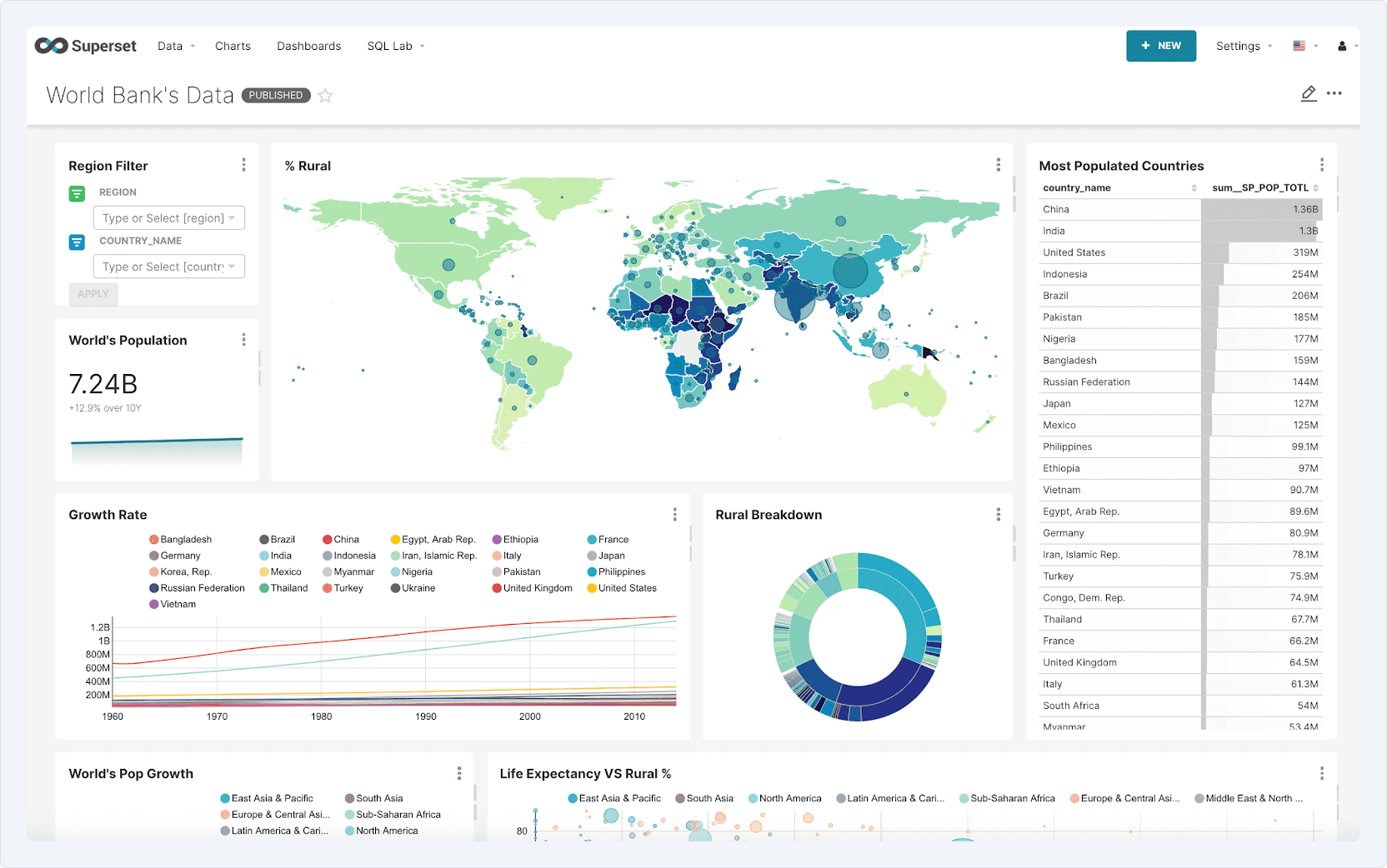
Use Superset if:
- You want full control over dashboard layout and visual styles
- Your data team can handle deployment and ongoing maintenance
- You want to customize visualizations or embed them in apps
- You’re looking for a free, flexible alternative to Tableau
Quick Consideration:
- Strong customization via plugins and front-end extensions
- Grid-based dashboard layout with drag-and-drop
- Extensive chart library (time series, heatmaps, maps, etc.)
- Requires technical onboarding and infrastructure support
- Popular among data-driven product teams.
3. Zenlytics
Zenlytics is a lightweight, spreadsheet-native BI tool that emphasizes ease of use and visual clarity. It targets business users who want to build dashboards directly on top of familiar concepts like rows, columns, and filters, with just enough power under the hood to be useful.
Use Zenlytics if:
- Your business team prefers spreadsheet-style interactions
- You want to deliver dashboards without deep training or onboarding
- You’re layering dashboards over well-defined datasets
- You need fast iteration for performance, marketing, or finance
Quick Consideration:
- Spreadsheet interface with BI charting and filtering
- Google Sheets integration
- Lightweight governance layer
- Not designed for complex joins or transformation
- Great for SMBs and startups that move fast
4. Toucan Toco
Toucan Toco is a narrative-first BI platform designed to simplify how data stories are shared with non-technical users. Its “data storytelling” approach emphasizes guided insights over freeform exploration, making it ideal for external stakeholders, executives, and NGOs.
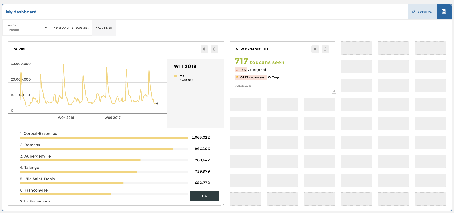
Use Toucan if:
- You need to present insights to non-technical stakeholders
- Your dashboards are used in MBRs, QBRs, or by external clients
- You want precise control over copy, visuals, and guided walkthroughs
- You need fast time-to-value with minimal overhead
Quick Consideration:
- Visual storytelling framework with step-by-step narratives
- Low-code platform for building and publishing dashboards
- Built-in deployment and access control for external audiences
- Prioritizes clarity and UX over customization depth
5. Hex.Tech
Hex blends notebook-style analysis with rich visualization features, making it a great option for analysts and data scientists who want to combine SQL, Python, and dashboarding in a single, fluid workflow. It’s highly effective for exploratory analysis and storytelling in product, growth, and experimentation teams.
Use Hex if:
- You want the flexibility of notebooks, with the polish of BI dashboards
- You need to blend SQL and Python for fast iteration and deep dives
- You care about sharing live, interactive data narratives
Quick Consideration:
- Notebook + dashboard hybrid with branching logic
- Built-in support for SQL, Python, and rich text
- Easy publishing of interactive reports for stakeholders
- Great for experimentation, metric deep dives, and product analytics
- Not built for multi-team metric governance or enterprise scale
Best BI Tools for Git-based, Analytics Engineering Workflows
As-Code BI tools treat dashboards and metrics as software: versioned in Git, reviewed in pull requests, and deployed through CI/CD. They’re built for analytics engineers, data engineers, and technical analysts who want to bring the rigor of software development into the analytics workflow.
Instead of clicking through UI editors, users define models, metrics, and dashboards in code. This makes logic auditable, modular, and reusable, especially powerful for larger teams or orgs that treat data as a product.
1. Lightdash
Lightdash is a Git-native BI tool that connects directly to your dbt models. You define metrics once in dbt and expose them to business users through a clean, fast UI. The result is a transparent and maintainable reporting layer that scales with your data warehouse and dbt pipelines.
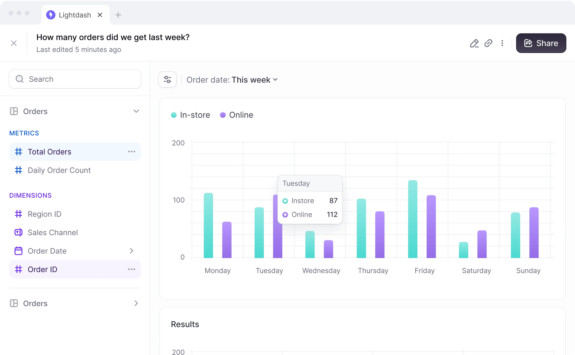
Use Lightdash if:
- You already use dbt and want downstream reporting without duplication
- You want metrics stored in Git and reviewed through pull requests
- You prefer building dashboards on top of defined dbt models
- You’re looking for an open-source, dev-friendly BI alternative
Quick Consideration:
- Tight integration with dbt Core
- Git-based metrics and dashboard versioning
- Simple dashboard builder for stakeholder access
- Transparent, open-source, and improving rapidly
2. Holistics
Holistics mixes drag-n-drop dashboards with Git-based version control for data models. At its core is a custom declarative language that lets teams define metrics, datasets, and relationships in code, versioned in Git and deployed via CI/CD. Business users explore data through drag-and-drop dashboards layered on top of this governed modeling logic.
It’s one of the few BI platforms that truly supports both business autonomy and engineering control. You get reusable analytics components, dynamic environments, automated testing, and team collaboration, all without compromising on semantic clarity or auditability.
Use Holistics if:
- You want self-service dashboards without bypassing modeling governance
- Your data team prefers to define reusable metrics and logic in code, using Git and CI/CD.
- You want a semantic layer with Git-based versioning and governance
- You want to build dashboards programmatically
Quick Consideration:
- Native Git integration with commit history, branching, and review workflows.
- Drag-and-drop dashboard builder on top of reusable data components
- Built-in support for CI/CD, data unit testing, and DAG-based dependency tracking
3. Cube.dev
Cube is a headless BI platform designed for developers. Instead of building dashboards directly, you define metrics and logic in code and expose them via APIs to any downstream app or frontend. It’s used heavily in embedded analytics, customer-facing apps, and teams building custom data products.
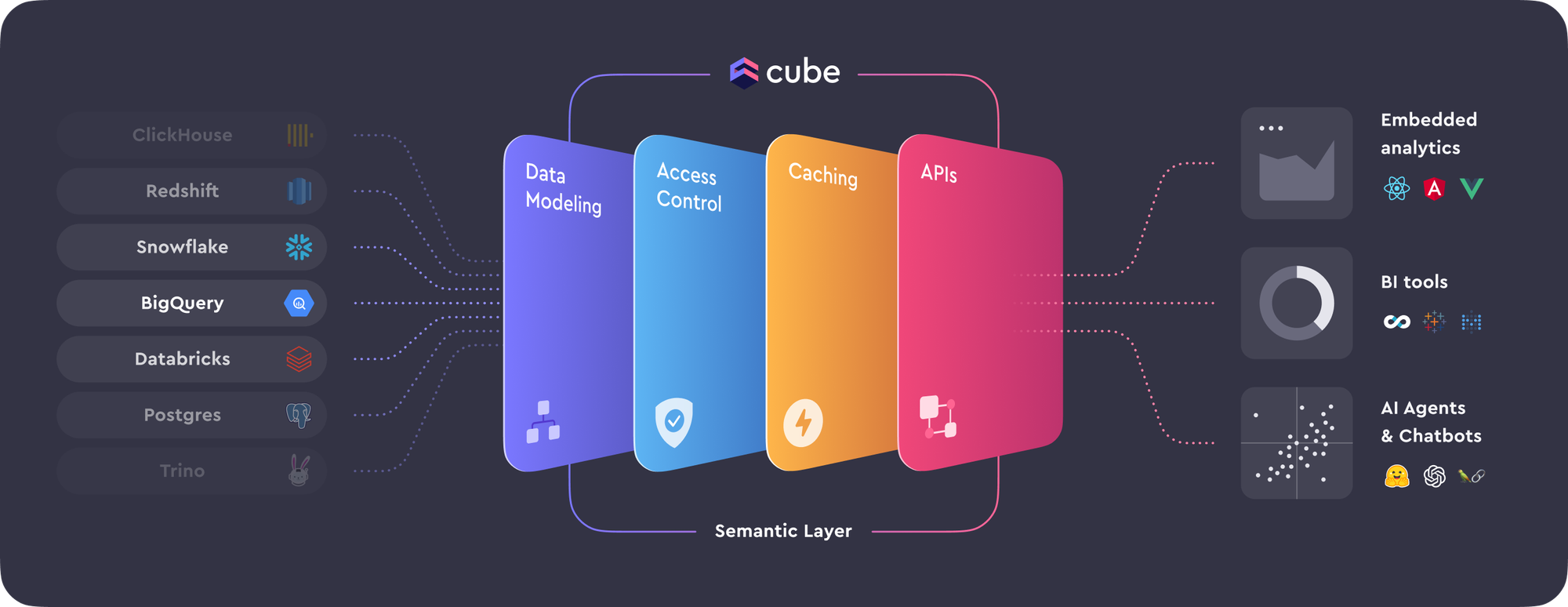
Use Cube.dev if:
- You need to expose governed metrics to external apps or frontends
- You want to decouple metric logic from presentation entirely
- You’re building customer-facing analytics or internal tools
- Your team prefers API-based integration over BI dashboards
Quick Consideration:
- Headless architecture with GraphQL and REST APIs
- Strong role-based access control and caching layer
- Works with any frontend (e.g. Retool, React, Superset, Metabase)
- Powerful for product analytics and SaaS platforms
- Not a dashboarding solution by itself—pairs with presentation layers
Best for: Analysts and data teams who want to write reports in SQL + Markdown
4. Evidence.dev
Evidence takes a fresh approach to BI: you write reports using a combination of SQL and Markdown, then render them into polished, shareable pages. Think of it as “BI for people who like Jupyter Notebooks”—except fully versioned and production-ready.
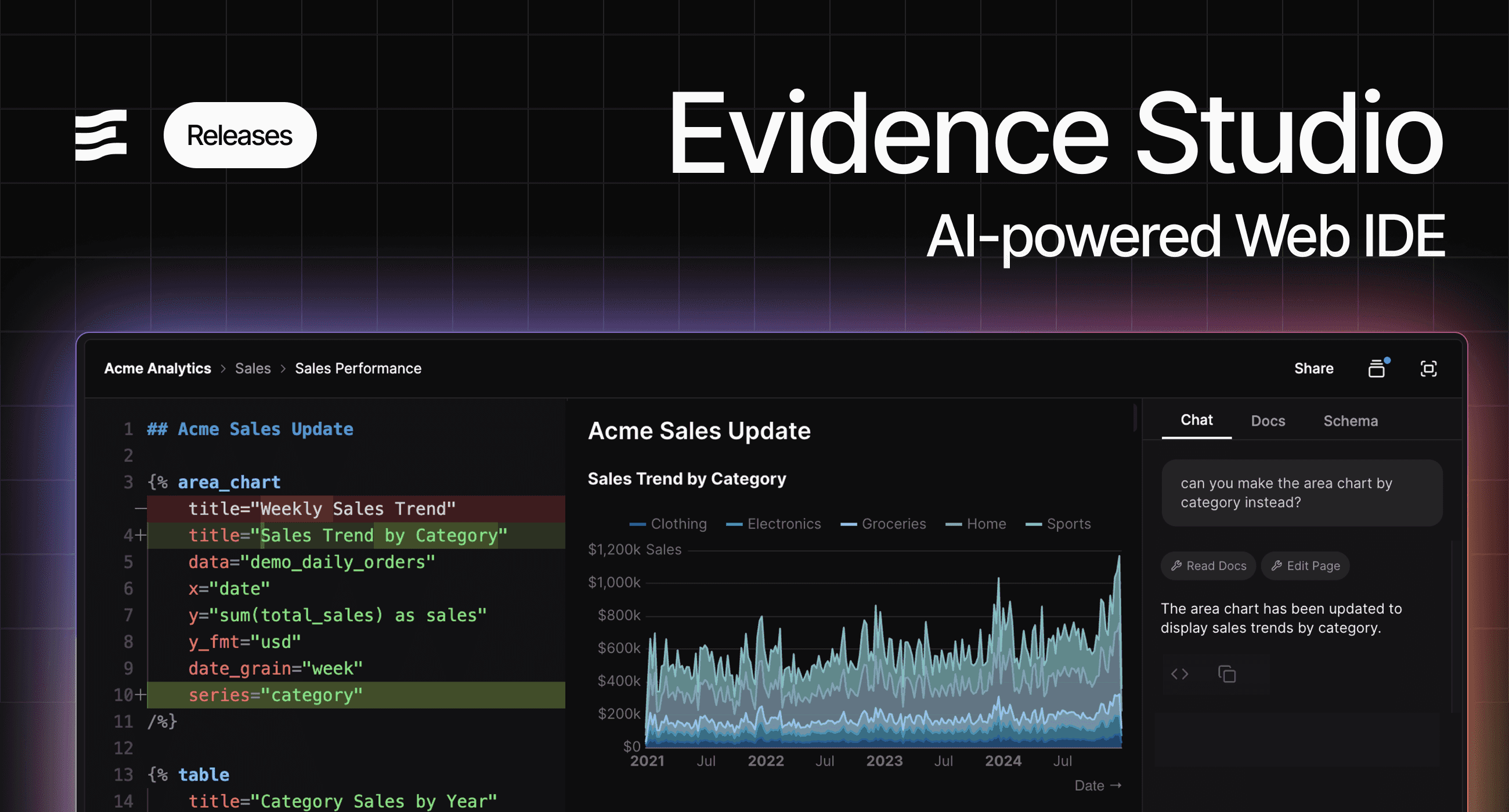
Use Evidence if:
- You write analysis in SQL + Markdown and want full control of output
- You prefer Git workflows, pull requests, and CI/CD for publishing reports
- You need design-friendly layouts for internal reports or stakeholder updates
- You want transparency and auditability in how metrics are defined
Quick Consideration:
- Write dashboards in SQL + Markdown
- Clean design system and templating
- Git-native workflows and version history
- Great for long-form analysis or internal reporting
- Less suitable for executive dashboards or visual-first users
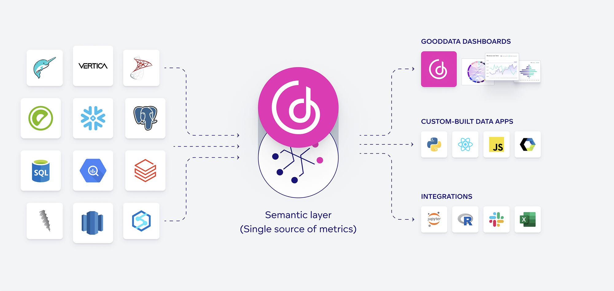
5. GoodData
GoodData offers a modern analytics platform with a strong semantic layer, developer-centric APIs, and full support for version-controlled analytics as code. Its declarative modeling and Git integration make it appealing for enterprises that need scalable governance and embedded use cases.
It supports both business-facing dashboards and programmatic control over metrics via its Logical Data Model (LDM) and MAQL (its own modeling/query language), and provides API-first extensibility for building custom workflows or embedding.
Use GoodData if:
- You want a semantic layer with Git-based versioning and governance
- You’re deploying embedded analytics or need an API-driven platform
- You need a scalable, multi-tenant architecture with RBAC
- You want to define metrics and visualizations programmatically
Quick Consideration:
- Declarative model definitions with version control
- Logical Data Model (LDM) and MAQL for modeling and querying
- Git-based development flows and automated deployment support
- Strong for embedded analytics and white-label dashboards
- Designed for enterprises with complex security and governance needs
Best BI Tools with Semantic Layers
Semantic layer-enabled BI tools focus on solving one of the hardest problems in analytics: consistent metrics across teams, dashboards, and tools.
They let you define core business concepts, like revenue, retention, or active users, once, in a central model. Then that model is reused across dashboards, tools, and teams. This reduces duplicated logic, prevents stakeholder confusion, and scales trust in the data.
You're in the right place if:
- You need consistency across departments in how metrics are defined
- You have multiple tools and want one unified source of truth
- You want to apply governance without blocking exploration
- You’re scaling your data team and want fewer fire drills over metric definitions
1. dbt Semantic Layer
dbt's Semantic Layer is an extension of your dbt project. You define metrics in YAML alongside your models and expose them to BI tools via an API. It gives you governance, reuse, and consistent logic across Looker, Holistics, Mode, Hex, and more, without rebuilding logic downstream.
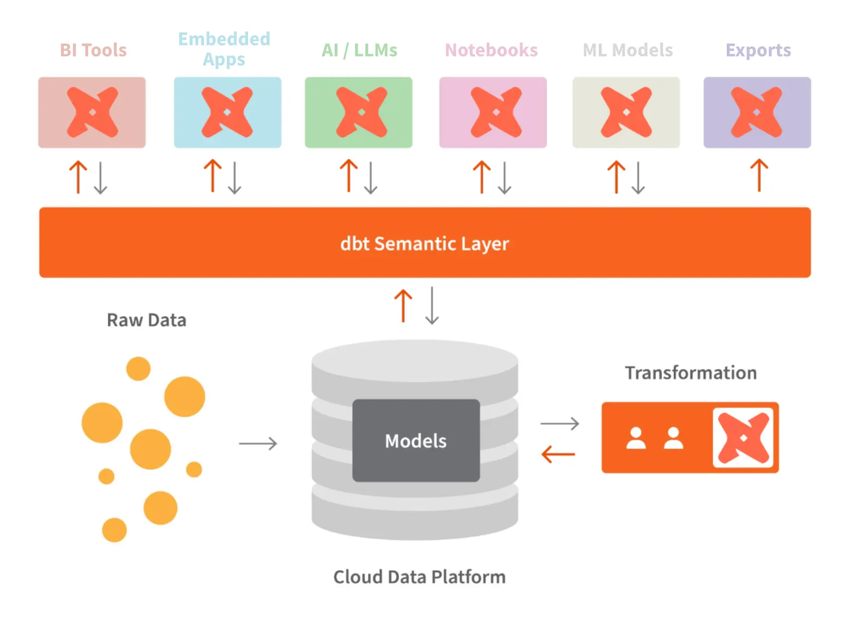
Use dbt Semantic Layer if:
- You already manage data transformations in dbt
- You want to version and test metrics in the same repo
- You need consistency across multiple downstream tools
Quick Consideration:
- Exposes metrics to tools via the dbt Semantic Layer API
- Declarative, Git-native metric definitions
- Pairs well with headless BI or embedded use cases
- Not a standalone BI tool, and it requires a separate BI layer. Most code-based BI tools like Looker, Holistics, Hex offer integration with dbt layer.
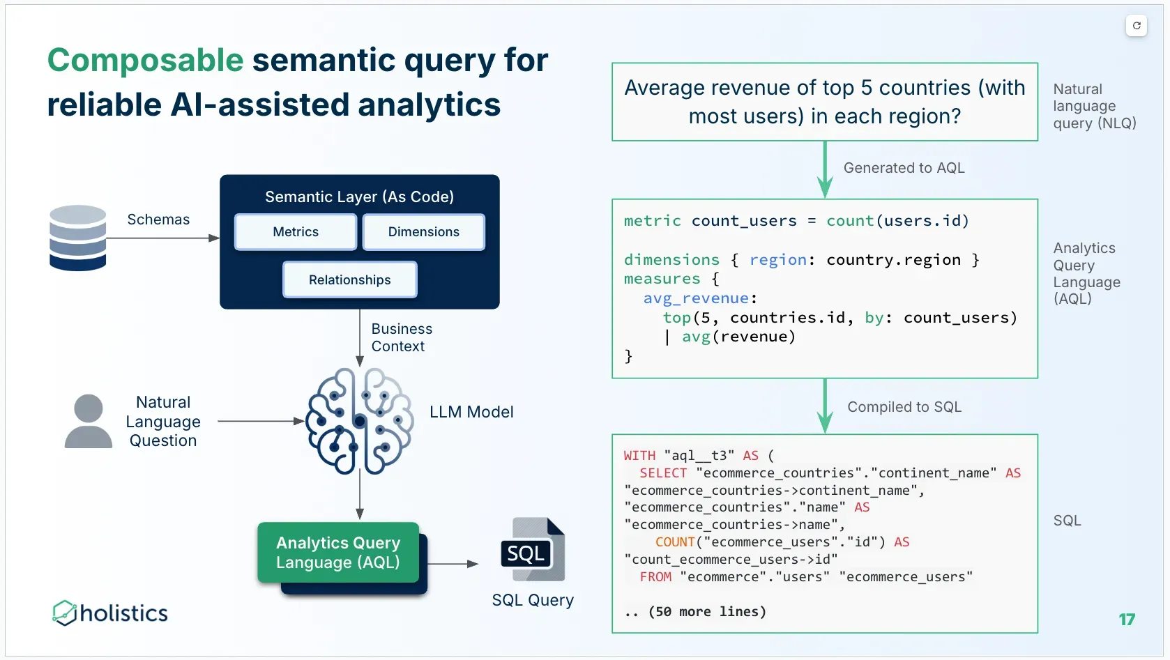
2. Holistics
In earlier sections, we covered Looker and Holistics, two mature BI tools that pioneered the shift from SQL sprawl to semantic-layer clarity:
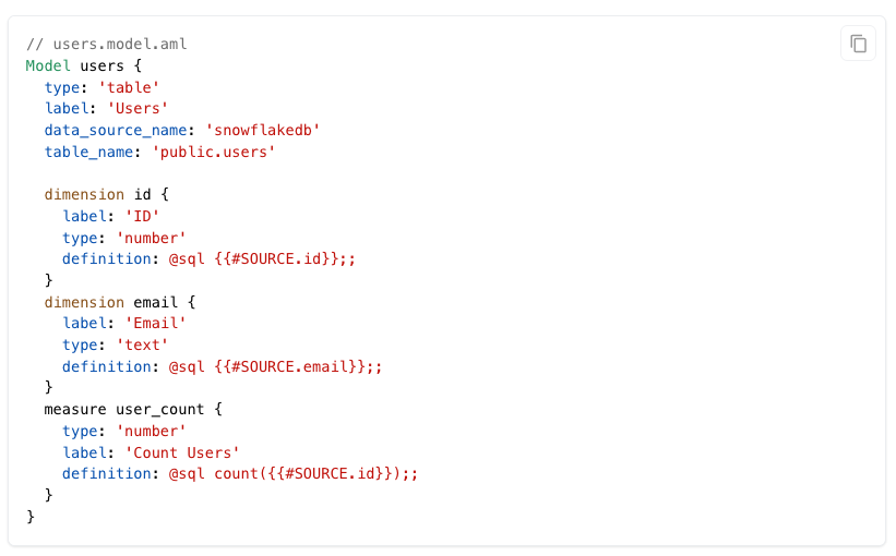
- Looker introduced LookML, a declarative modeling language where metrics and joins are defined centrally, then reused across dashboards.
- Holistics takes that further with AMQL (Analytics Modeling and Querying Language), combining a declarative modeling layer (AML) and query language (AQL) for reusable, parameterized, and composable metrics.
Why AMQL instead of YAML?
Most BI tools rely on YAML for modeling. At first glance, YAML is appealing; it's human-readable and easy to get started with. But as your data models grow, YAML quickly shows its limitations: ambiguous parsing, lack of types, no built-in logic reuse, and fragile templating.
Holistics took a different path with AMQL, a purpose-built modeling language designed for analytics. Unlike YAML, AMQL, by contrast, is:
- Purpose-built for analytics workflows
- Typed, composable, and reusable
- Integrated into a modern dev environment
- Backed by Git, CI/CD, and modular architecture
It gives analytics teams the tooling they need to build robust, scalable, and maintainable, and extensible semantic models without the limitations of legacy syntax or vendor lock-in.
3. Omni Analytics
Omni builds on Looker’s semantic layer ideas but adds Git versioning, a friendlier UI, and faster iteration. You define metrics in a YAML-like model, collaborate via Git, and let business users explore data confidently.
Quick Consideration:
- Semantic modeling + Git-native workflows
- Fast, modern interface for business users
- Tight integration with dbt and data warehouses
- Still growing ecosystem and brand recognition
- Strong support for modeling reuse and metric trust
4. GoodData
Also covered under as-code section, but designed around a core semantic layer. GoodData offers a rich semantic layer with its Logical Data Model (LDM) and MAQL query language. You can define metrics once and serve them via dashboards or APIs. It supports multitenancy, access control, and headless embedding.
Quick Consideration:
- Metric modeling and query logic via MAQL
- Git versioning, CI/CD, and declarative deployment
- Built-in visualization and headless options
- Ideal for embedded and enterprise-grade use cases
Best Open-Source BI Tools
Open source BI tools offer something proprietary platforms rarely do: transparency, extensibility, and infrastructure control. They're ideal for data teams who want to avoid vendor lock-in, embed analytics into products, or adapt tools to their own internal workflows.
But open source isn’t free in the “no effort” sense. These tools require more from your team: deployment, configuration, updates, and sometimes, lots of debugging. What you gain in flexibility, you trade in setup time and support overhead.
1. Metabase
Metabase is known for its simplicity: it’s open source, easy to set up, and intuitive for non-technical users. While it lacks deep semantic modeling or code-based workflows, it’s excellent for internal dashboards, quick exploration, and embedded analytics at smaller scale.
Use Metabase if:
- You need quick, no-fuss dashboards for internal reporting
- You work with stakeholders who prefer simple visuals over dense analytics
- Your team isn’t ready for code-based BI, but wants clarity and consistency
Quick Consideration:
- Easy chart creation and filtering for business users
- Lightweight visualizations, clean UI
- Limited layout control and customization
- Enterprise version offers more governance features
- Can be deployed on-prem or self-hosted
2. Redash
Redash is a lightweight, open-source BI tool built for querying data with SQL and quickly turning those queries into shareable charts or dashboards. It’s fast, minimal, and designed for teams that don’t need drag-and-drop dashboards—just a clean place to write SQL and collaborate on results.
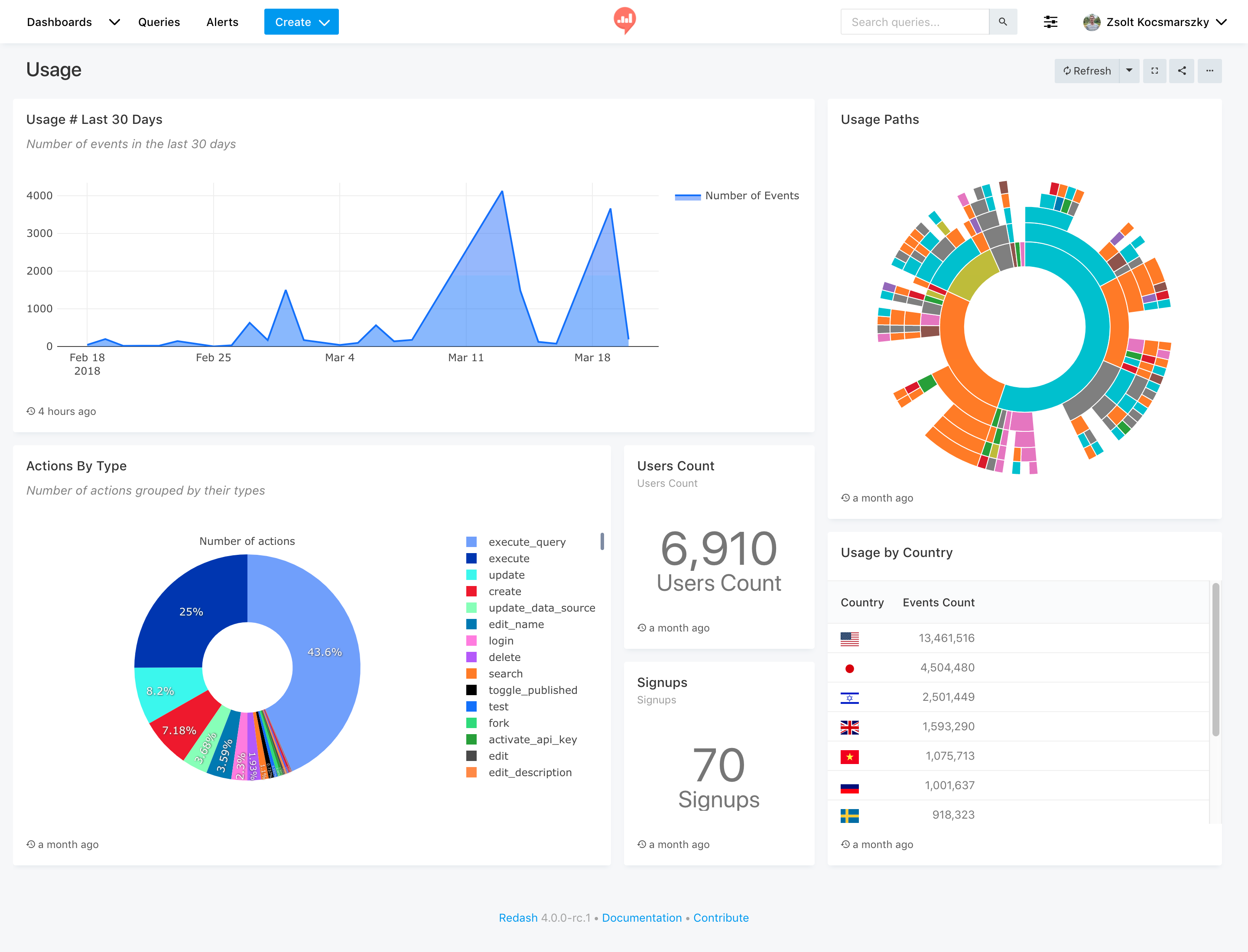
Use Redash if:
- You want a fast, SQL-native tool for querying and sharing insights
- You need to embed charts or dashboards in internal tools or wikis
- Your team prefers minimalism and direct control over queries
- You’re comfortable managing open-source deployments
Quick Consideration:
- SQL-first UI with snippet sharing and parameterized queries
- Clean visualizations and lightweight dashboards
- Requires self-hosting or using the hosted version (which is no longer actively developed)
Easy to embed charts or export results

AI-native and AI-powered BI Tools
AI is reshaping how BI tools surface insights.
Instead of hunting through dashboards or writing SQL, users can now ask questions in plain language, get instant answers, and even generate visualizations or models automatically. These features don’t replace good modeling or governance, but they do lower the barrier to exploration, especially for stakeholders who never open a BI tool otherwise.
Here are some of the best AI-powered BI platforms that let users ask data questions in plain language and see visual answers.
1. Holistics AI
Best for: Teams that want compliant, AI-assisted self-service analytics with governance, transparency, and accuracy
Holistics AI enables end-users to get reliable analytics insights through natural language conversations. Unlike many BI platforms that bolt on AI features as an afterthought, Holistics was purposely built with AI in mind. Its semantic modeling layer, analytics query language, and analytics as code foundation are all designed to give AI the context and structure it needs to produce accurate, trustworthy results.
Three foundational pillars make Holistics AI-native:
- Rich Semantic Modeling Layer: Business metrics, dimensions, and relationships are defined once, giving AI a complete business context to reason over.
- Analytics Query Language (AQL): A composable, analytics-specific query language that focuses AI on high-level analytics logic instead of low-level SQL execution details.
- Analytics Definitions as Code: Every artifact is text-based code, making it easy for AI to read, reuse, and generate new definitions, all under Git-based governance.
Quick Consideration:
- Natural Language Querying: Users can ask questions in plain English to generate charts, tables, and insights.
- Structured Analysis: Breaks down questions into logical steps like period comparisons, top N, and percent of total.
- Conversational Follow-Ups: Supports multi-turn dialogue to refine queries and maintain context.
- Transparent Logic: Each AI-generated step is visible and editable—no hidden calculations.
- Metric Reusability: Analysts can refine and promote AI-generated metrics into the shared semantic model.
2. ThoughtSpot Spotter
Best for: Search-first, conversational analytics with AI-driven suggestions and query generation
Spotter is ThoughtSpot’s conversational AI assistant. It takes the company’s signature search interface and adds AI capabilities to interpret natural language questions, suggest follow-ups, and generate visualizations on the fly. Spotter works best when datasets are already modeled and cleaned.
Use ThoughtSpot Spotter if:
- You want AI-powered, Google-like search for business data
- Your users are already comfortable with ThoughtSpot’s search interface
- You need AI to proactively suggest insights and next questions
Quick Consideration:
- Conversational interface layered on ThoughtSpot’s search
- Proactive “next best question” suggestions
- Instant chart generation from natural language queries
- Works best with governed, curated datasets
3. Hex Magic
Best for: Analysts and data scientists who want AI-assisted code, queries, and narratives
Magic is Hex’s AI copilot for notebooks and dashboards. It helps write SQL or Python, suggest transformations, and even generate narrative text to accompany visuals. Since Hex supports both code and no-code blocks, Magic can speed up workflows for both analysts and less technical stakeholders.
Use Hex’s Magic if:
- You work in mixed SQL + Python workflows
- You want AI help writing queries, cleaning data, and creating narrative reports
- You already use Hex for experimentation or storytelling
Quick Consideration:
- AI-assisted SQL and Python generation
- Natural language-to-query capabilities
- Auto-generates narrative summaries of results
- Integrates directly into Hex’s notebook + dashboard workflow
4. Looker Gemini
Best for: Google Cloud customers who want AI summaries and exploration inside Looker
Gemini brings Google Cloud’s AI models into Looker. It can summarize dashboards, explain trends, and answer questions about your data in plain language. Since it works with Looker’s semantic layer, Gemini respects metric definitions and access controls.
Use Looker Gemini if:
- You’re a Google Cloud / Looker customer
- You want AI-driven summaries of existing dashboards
- You need natural language exploration that respects governance
Quick Consideration:
- Uses Google’s Gemini LLM models for analysis and summaries
- Answers ad hoc questions over governed Looker datasets
- Explains visualizations and trends in plain language
- Integrated into the Looker UI for seamless exploration
For a side-by-side evaluation of AI-powered analytics platforms, see our AI-powered BI tools comparison matrix.
Final Words
If you’ve made it this far, you already know there’s no one-size-fits-all BI tool.
Some tools are great at dashboards. Others are built for governance. A few are trying to reinvent the entire analytics workflow with Git, APIs, or semantic modeling. The smartest teams aren’t asking “what’s the best BI tool?”—they’re asking:
What kind of tool matches how we work?
Here’s another tip: Don’t just evaluate features. Evaluate how a tool will age inside your team. Will it help you move faster next quarter, or create another backlog six months from now?
What's happening in the BI world?
Join 30k+ people to get insights from BI practitioners around the globe. In your inbox. Every week. Learn more
No spam, ever. We respect your email privacy. Unsubscribe anytime.
