Best Data Visualization Tools for Data Storytelling (2026)


Contents
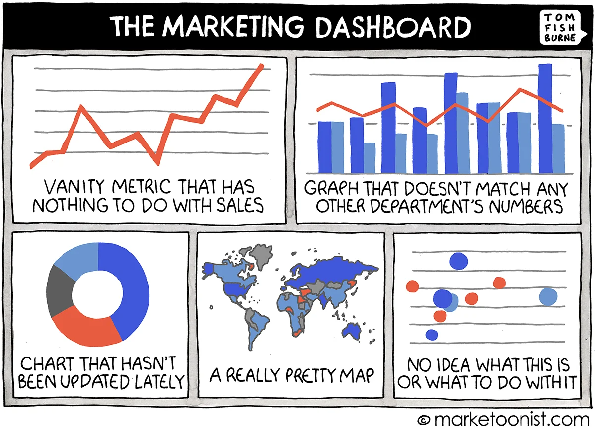
Why Use Data Visualization Tools in Business Analytics?
Data visualization tools help business teams see the shape of the problem. They convert millions of rows into dashboards, charts, and stories that execs, product managers, and marketers can act on.
You'd want to look into data visualization tools when you need:
- Speed: Executives don’t read CSVs. They skim dashboards. Visuals reduce cognitive load and surface trends faster.
- Clarity: Outliers and trends pop on a chart. In a table? They get lost in the noise.
- Contextual storytelling: Good visualizations guide the viewer, what to look at, what matters, and what changed.
- Cross-functional collaboration: Tools like Power BI and Looker allow teams across product, ops, and finance to look at the same truth, often with self-service access.
- Standardization: When paired with semantic layers (e.g. Looker, Holistics), visual tools enforce consistent definitions across teams, no more arguing about what “Active User” means.
5 Types of Data Visualization Tools and Their Use Cases
Not all visualization tools are created equal. Some are drag-and-drop dashboards for execs. Others are code-heavy libraries for data scientists. The best tool depends on your audience, skill level, and use case, and sometimes, you’ll need more than one.
The data viz ecosystem is crowded. From free open-source dashboards to AI-driven chart generators, it’s easy to get overwhelmed. But if you zoom out, most tools fall into a few functional buckets. Here’s how to make sense of them.
1. Self-Service Data Visualization Tools
Best for: Business users, product teams, finance
These self-service tools prioritize interactivity, templated dashboards, and natural-language querying. Their goal is to empower non-technical users to explore data without writing SQL.
Examples:
- Power BI: Deep integration with Microsoft stack. Popular for reporting across sales, finance, and ops teams.
- Tableau: Highly customizable dashboards, strong visualization design control.
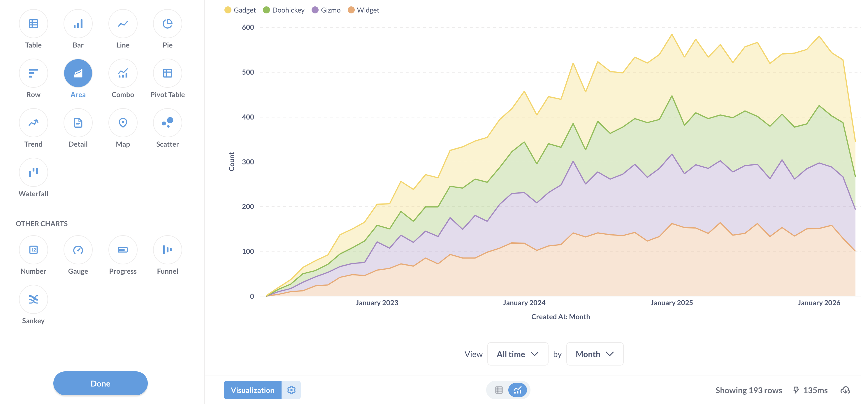
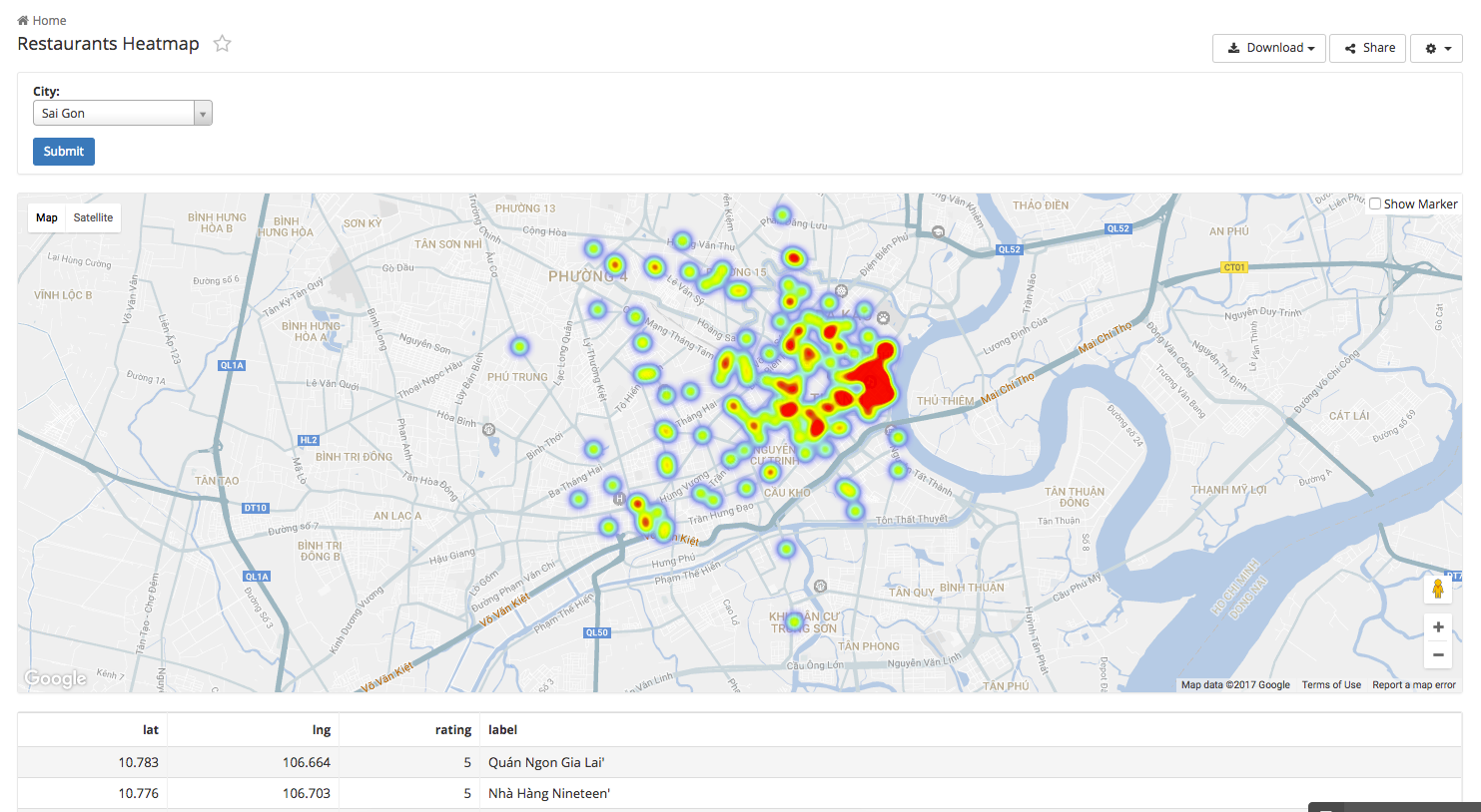
- Holistics: Enables full dashboard customization through its dashboard-as-code. Business users get access to governed metrics without touching SQL.
Power BI and Tableau dominate this category as Tableau is praised for its visual polish, while Power BI wins on price and Microsoft ecosystem.
2. Lightweight Data Visualization Tools for Quick Wins
Best for: Solopreneurs, scrappy marketers, non-technical teams
Tools in this category are user-friendly platforms focused on speed and aesthetics, often used for marketing visuals, pitch decks, or one-off reports.
Most of these tools offer drag-and-drop UI, templates, and visual polish over data structure depth. They typically support CSV uploads or Google Sheets.
Examples:
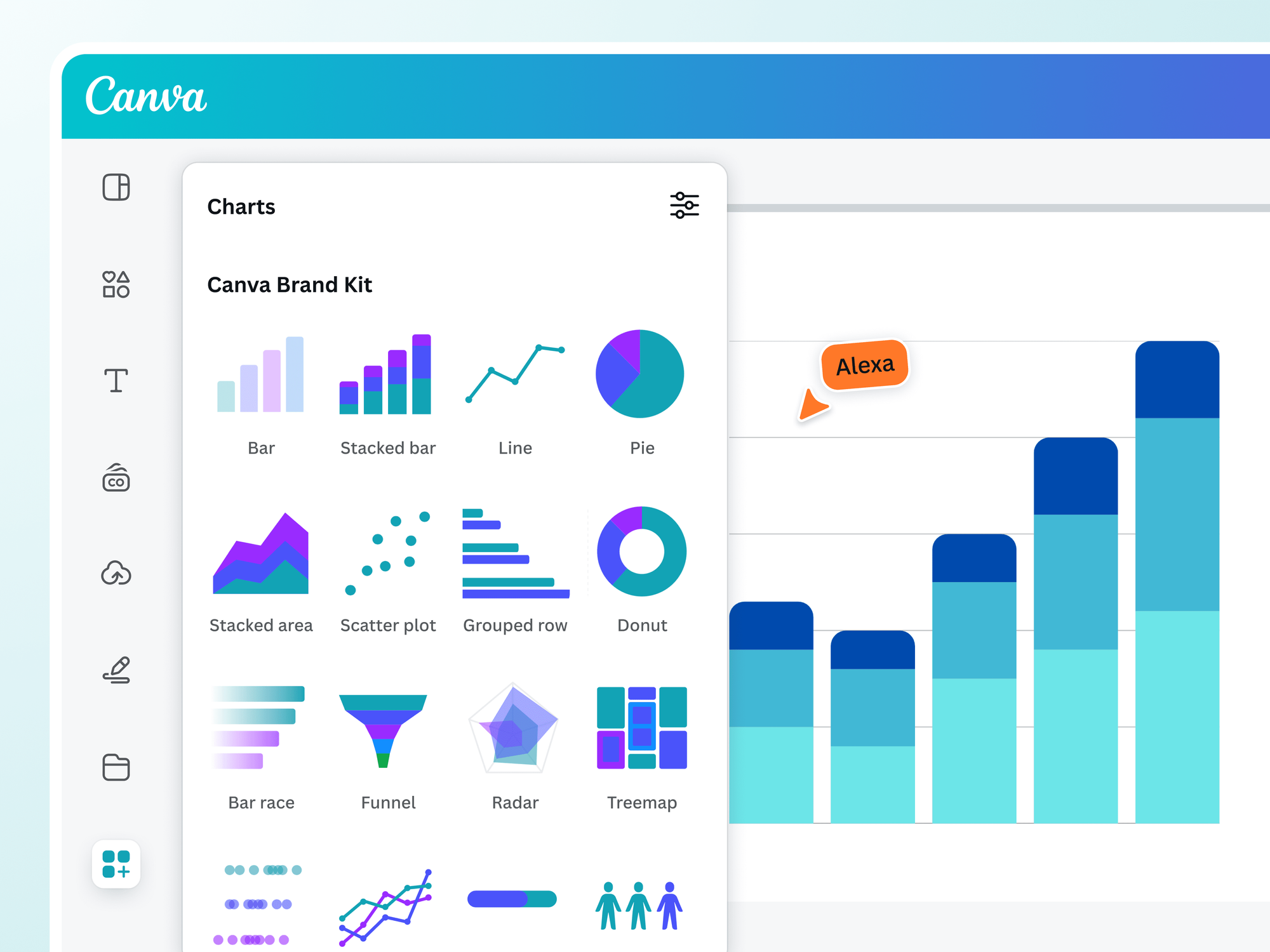
- Google Looker Studio: Simple, free, and integrates with Google Sheets.
- Canva / Visme / Genially: Visual storytelling tools, often used for infographics or social-ready reports.
3. Open Source Data Visualization Tools
Best for: Data teams with engineering capacity, custom product integrations
These tools typically require self-hosting or cloud configuration. Dashboards are often defined using SQL or YAML files, and customization happens at the code or config level.
Examples:
- Apache Superset: Extensible, customizable, widely used in modern data stacks.
- Metabase: Intuitive and lightweight. Popular among startups and non-profits.
- Redash: SQL-first, good for fast prototyping.
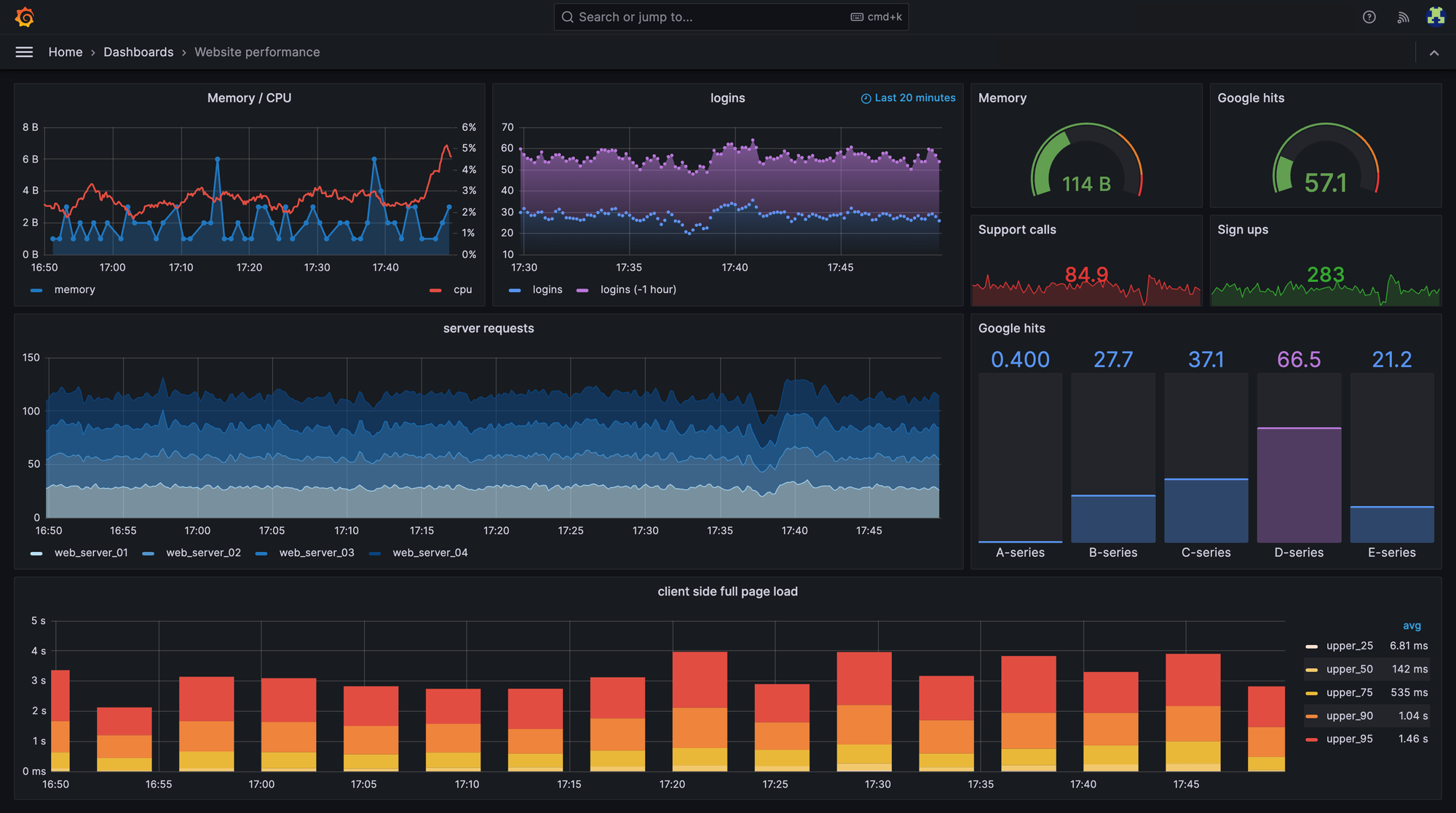
- Grafana: Originally built for monitoring and time-series data (think server logs and app metrics), Grafana is now widely used for visualizing real-time pipelines and system-level analytics.
In this category, Superset gets love from engineering-heavy teams for its extensibility. Metabase is the go-to for teams who want something simple and freedata viz.
4. Notebook and Code-First Data Visualization Tools
Best for: Data scientists, exploratory analysis, R&D
These tools offer interactive environments built for data scientists, analysts, or engineers who prefer to write code to explore and visualize data. Users write scripts in Python, R, or SQL to create plots, run analyses, and output charts inline. These tools are not optimized for exec dashboards — they’re for quick iteration and exploratory analysis.
Examples:
- Jupyter + Plotly/Seaborn/Matplotlib: Python-based toolchains for statistical visualizations.
- R + ggplot2: Widely used in academic and statistical work.
- Streamlit / Dash: Python apps for interactive data apps.
In this category, Python users gravitate toward Plotly and Seaborn for fast visual iteration. R users defend ggplot2 with religious fervor. Not for exec dashboards, but great for development and deep divesdata viz.
5. Geospatial and Network Visualization Tools
Best for: Mapping, logistics, social networks, public policy
Data visualization tools in this category are specialized tools for visualizing maps, geographic distributions, or complex networks (like social graphs or supply chains).
These platforms ingest data with coordinates, shapes, or node-link structures and render them using spatial layers or network diagrams.
Examples:
- Gephi: Excellent for network graph visualization.
- Kepler.gl / CARTO / Mapbox: Heavy-duty GIS tools.
(Bonus) AI Data Visualization and Analytics Tools
These platforms allow users to ask questions in natural language, automatically recommend charts, highlight anomalies, and generate narrative explanations of the data. Most of these tools plug into your existing warehouse or data models and are built to speed up “finding the story” in the data.
Most data visualization tools now support AI-assisted chart generation or natural language queries. So while AI data visualization and analytics tools are becoming a separate category of their own, we won't cover them in this article for the sake of coherence. For more details, check out this article where we look into the core capabilities and the best options available.
Data Visualization vs. Data Analysis Tools
TL;DR: Data visualization tools show you what’s happening. Analysis tools help you figure out why. In a modern stack, you often need both. One to communicate insights, the other to uncover them.
The confusion between data visualization and data analysis tools is understandable. After all, most modern BI tools offer a bit of both. But their core functions are distinct, and knowing where one ends and the other begins will save you from duct-taping the wrong tool to the wrong job.
Let’s break it down.
What visualization tools do best
Visualization tools specialize in turning processed data into clean, legible formats: bar charts, dashboards, heat maps, time series graphs. Their goal is to communicate insights, not compute them.
- Example: Power BI helps a sales leader track MRR trends by region, but it assumes the numbers are already cleaned and modeled.
- Example: Tableau can show which product categories underperformed, but you’re not writing complex statistical models inside Tableau itself.
These tools sit at the last mile of the pipeline, optimized for human-friendly output.
What analysis tools do better
Analysis tools dig into raw or semi-structured data to uncover patterns, relationships, and drivers. They focus on exploration, transformation, and statistical computation.
- Example: Python (with pandas, scikit-learn, seaborn) is ideal for exploring large datasets, feature engineering, and hypothesis testing.
- Example: R excels at statistical modeling and generating exploratory plots like boxplots, violin plots, or multivariate regressions.
- Example: SQL IDEs (e.g. Hex, Mode, DataGrip) help analysts join, filter, and transform raw data into analysis-ready tables.
These tools are essential during discovery and modeling, especially when the questions are fuzzy and the data isn’t clean.
Some platforms, however, blur the line between the two. Holistics, for example, lets developers define charts and dashboard logic as code, giving teams both modeling control and pixel-perfect visuals. That’s valuable in setups where data modeling, reporting and visualization live inside the same repo.
The point isn’t that one class of tools is better than the other. It’s that they’re used at different moments. Exploration comes first. Explanation comes next. Use the right tool for each.
Best Free Data Visualization Tools in 2025
You don’t need a $70/month license to build great dashboards. Today’s free tools are surprisingly powerful, especially for small teams, startups, and learners. If you're comfortable with a light setup or some SQL, there's real value here.
When you’re just starting out, or working in a resource-constrained environment, paid tools like Tableau or Looker can feel out of reach. The good news? The free-tier ecosystem has matured fast. Open-source and freemium tools now offer enough power and polish for serious business use.
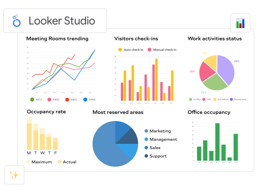
1. Google Looker Studio (formerly Google Data Studio)
Best for: Marketing teams, non-profits, internal reporting, SEO dashboards
This is often the first stop for teams already in the Google ecosystem. It connects easily to Sheets, BigQuery, GA4, and more. You can build and share dashboards with minimal setup, and the interface is intuitive for non-technical users.
- Pros: No cost, easy sharing, real-time updates
- Cons: Limited customization, sluggish with large datasets
2. Microsoft Excel
Best for: Analysts who live in spreadsheets, ad hoc reporting, prototyping visuals
It’s not trendy, but Excel remains one of the most widely used data viz tools on the planet, especially for smaller teams or early-stage companies. From pivot charts to slicers and conditional formatting, Excel can visualize structured data faster than most tools when you’re working alone or under tight timelines.
- Pros: Ubiquitous, flexible, minimal learning curve
- Cons: Not great for scale, version control, or governed dashboards
- Common use case: Internal financial reporting, audit prep, client-facing models
3. Apache Superset
Best for: Engineering-heavy teams, data platforms, internal analytics
Superset is a powerful, open-source BI tool originally built at Airbnb. It supports SQL-based visualizations, a wide range of chart types, and user authentication out of the box. Unlike Looker Studio, it’s built for scale, but it requires some infrastructure overhead.
- Pros: Full control, flexible, supports RBAC and row-level security
- Cons: Requires deployment and config; steeper learning curve
- Common use case: Internal dashboards, monitoring, embedded BI for engineering teams
4. Metabase
Best for: Startups, product teams, simple internal dashboards
Metabase has become a favorite for lean data teams. It’s free (with paid options for advanced features), easy to install, and has a clean, business-friendly interface. It even allows users to ask questions in natural language.
- Pros: Fast setup, clean UI, great for self-service
- Cons: Limited modeling capabilities, basic chart options
- Common Use Case: Product analytics, startup reporting, growth dashboards
5. Evidence.dev
Best for: Analysts who love Markdown + SQL
Evidence uses a Markdown + SQL workflow to build reports. It’s like writing a data blog post, but the output is fully responsive and interactive. It’s ideal for teams that need longform, narrative-style reporting.
- Pros: Fully code-based, beautiful outputs
- Cons: Not drag-and-drop friendly; assumes SQL fluency
- Common use case: Investor updates, stakeholder briefings, data blogs
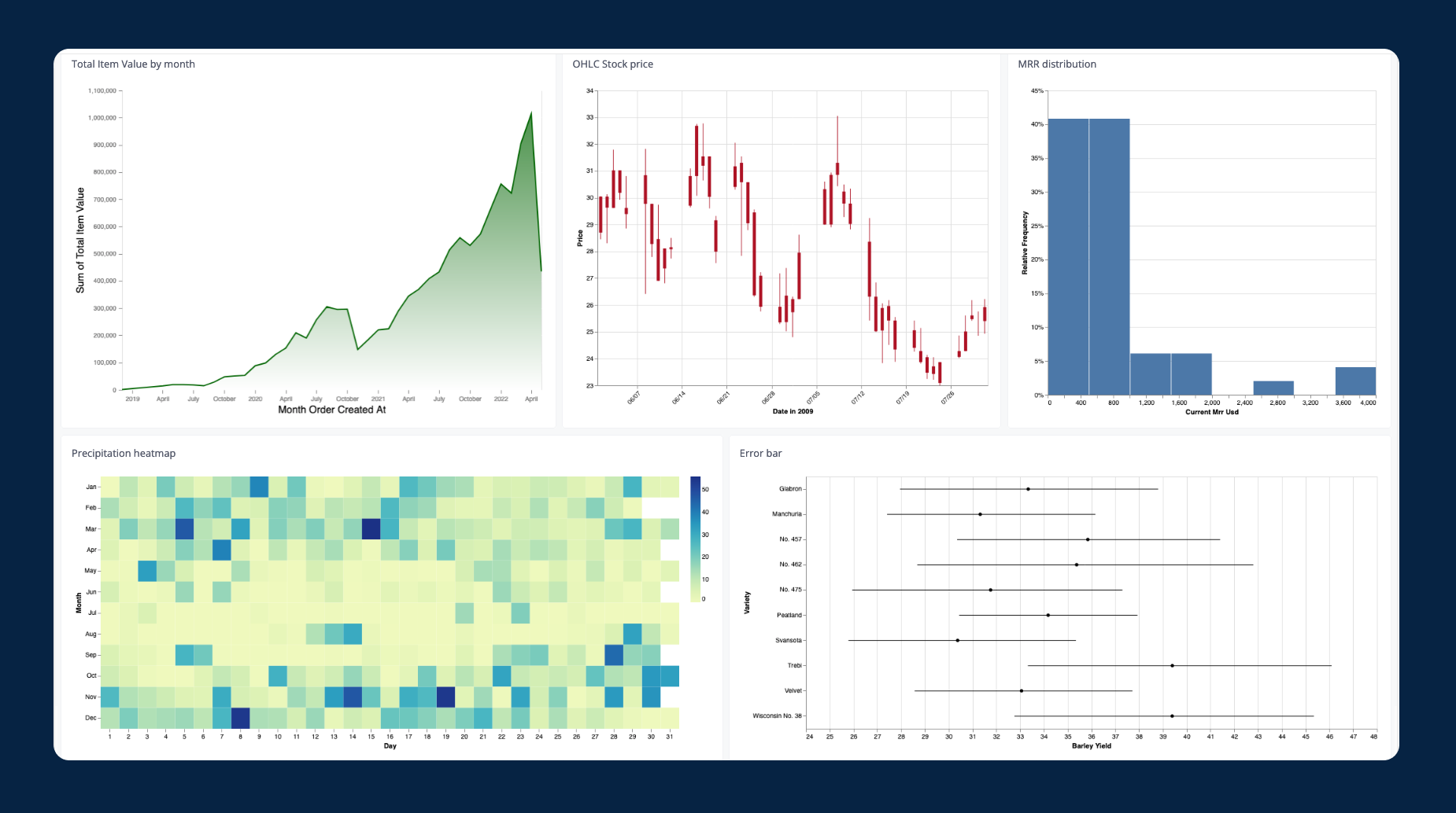
5. Seaborn, Plotly, Altair, Matplotlib (Python)
Best for: Data science notebooks, custom visualizations, one-off charts
They’re plotting libraries. But in data science workflows, they’re often the first place a chart gets born.
- Pros: Fully customizable, great for EDA
- Cons: No UI, not built for sharing dashboards
- Common use case:
Exploratory data analysis, custom visuals, academic reporting
Top Data Visualization Software for Enterprises
If your org is large, regulated, or needs serious governance, free tools won’t cut it. Enterprise-grade BI platforms offer deeper modeling layers, permission controls, audit trails, and support contracts. But they come with price tags and complexity to match.
Here are the top contenders in 2025, including where each one shines, and what users are saying about them in practice.
1. Tableau
Best for: High-design dashboards, flexible storytelling, large analytics teams
Tableau is still the visual standard in many enterprises. Its drag-and-drop builder is more powerful than most, and its visualization engine can handle complex, nested charts. Users love its design freedom, but that flexibility comes with a steep learning curve and licensing complexity.
- Strengths: Rich visual customization, active ecosystem, widespread skill base
- Weaknesses: Expensive, slow in the browser, siloed data model
- Use cases: Executive reporting, marketing analytics, performance reviews
2. Holistics
Best for: Teams that want version control, semantic modeling, and developer-defined dashboards.
Holistics stands out for treating BI like software: dashboards are defined in code, version-controlled with Git, and built from reusable data components. It’s a good fit for teams that want to separate logic from presentation and apply engineering principles to BI.
- Strengths: Dashboard-as-code, custom charts, full semantic layer, reusable logic.
- Weaknesses: Requires developer involvement, smaller community than incumbents.
- Use cases: Teams that want full control over metric definitions and dashboard behavior; embedded analytics.
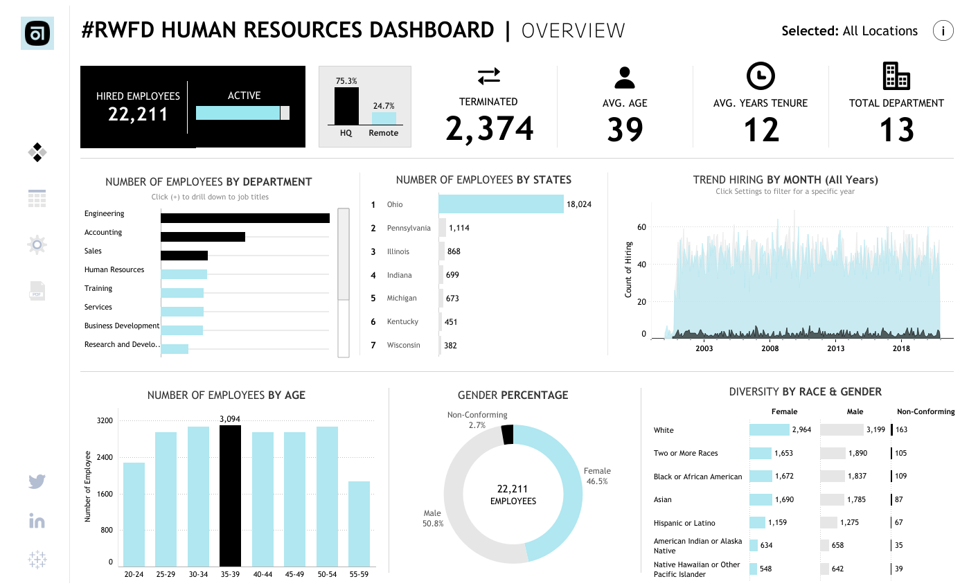
3. Power BI
Best for: Microsoft-native orgs, finance teams, cross-department reporting
If your stack already runs on Excel, SQL Server, and Azure, Power BI is a natural fit. It’s cost-effective, strong on modeling via DAX, and backed by a familiar UI. It’s not the prettiest tool, but it gets the job done, especially in financial use cases.
- Strengths: Cost-effective, robust DAX language, native Microsoft stack
- Weaknesses: Clunky UX, harder to manage at a large scale
- Common use case: Financial reporting, operations dashboards, Excel replacement
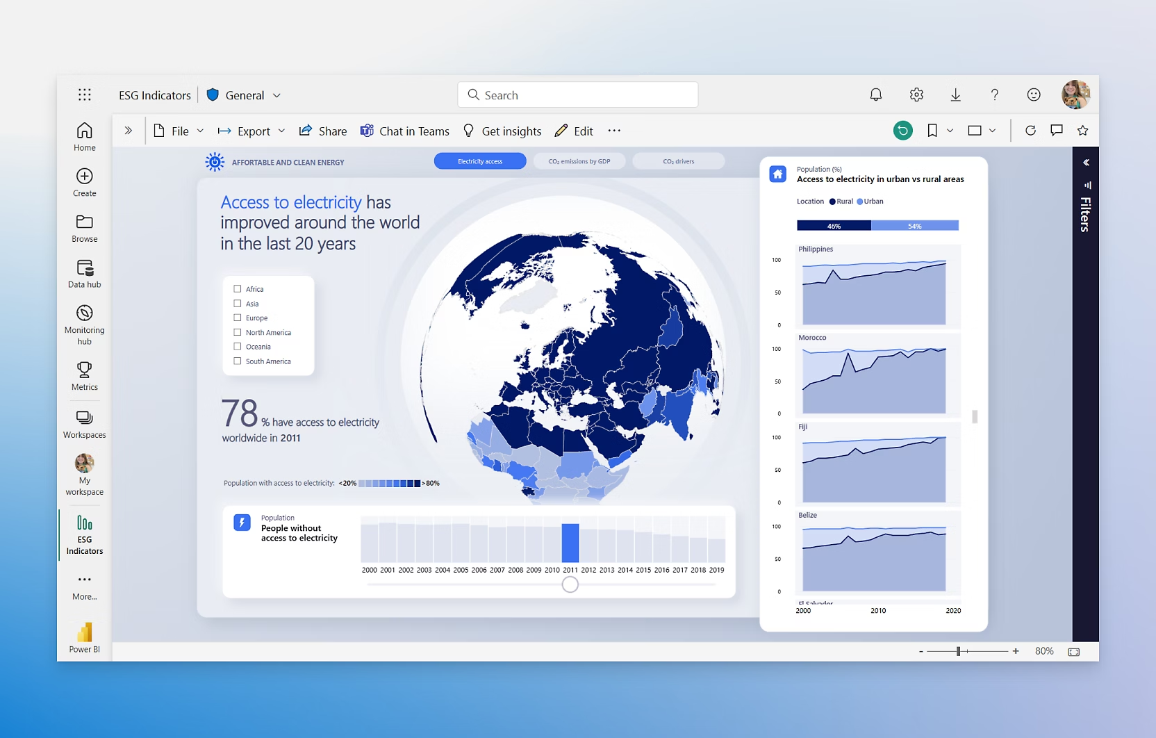
4. Looker (Google Cloud)
Best for: Governed metrics, semantic modeling, version-controlled analytics
Looker pioneered the semantic layer, a way to centralize business logic so everyone’s working from the same definitions. It’s built for developers to define metrics in LookML (a YAML-based modeling language), which business users then explore via the front-end. The result: fewer data discrepancies and more consistency across teams.
- Strengths: Strong modeling, Git integration, reusable definitions
- Weaknesses: Steep learning curve, expensive, relies on SQL fluency
- Common use case: Centralized BI, metric standardization, embedded analytics
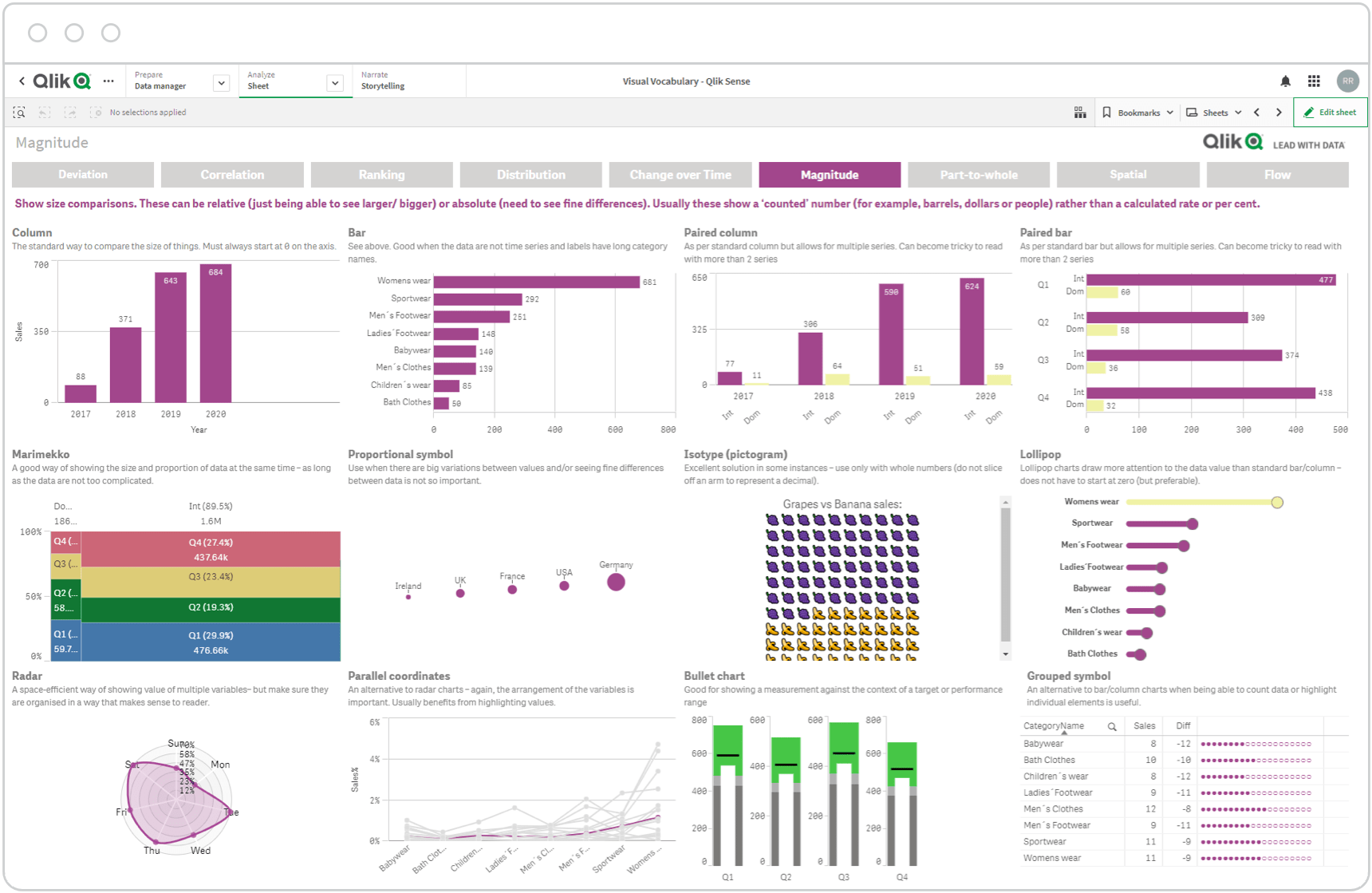
5. Qlik Sense
Best for: Associative querying, complex data relationships, hybrid environments
Qlik Sense handles large datasets well, especially when you need to explore relationships that span multiple tables without a traditional star schema. Its associative engine lets users click through data in any direction, revealing connections you might miss in SQL-first tools.
- Strengths: In-memory processing, strong on-prem support, advanced filtering
- Weaknesses: Complex admin interface, less popular in startups
- Common use case: Multi-dimensional analysis, finance, healthcare
Honorable Mentions
- Domo: Great for embedded analytics but often overkill for internal BI.
- Sisense: Good for white-label dashboards and OEM use cases. Popular in legacy finance and pharma stacks.
Best Tools for Geospatial Data Visualization
If you're working with coordinates, maps, or region-specific data, not all BI tools will serve you well. Some offer native maps with basic overlays; others provide full geospatial engines. Choose based on whether you need visualization, interaction, or actual spatial analysis.
1. Holistics
In Holistics, developers define datasets and dashboards as code, then expose interactive visualizations to business users. When it comes to mapping, this means you get full control over geospatial logic, consistent dimension definitions, and Git-based versioning of dashboards.
Aurora Innovation, a NASDAQ-listed self-driving tech company, uses Holistics for this exact reason. With maps being central to their work, Holistics delivered “the right mix of detail and variety” across map types, trendlines, and reference layers, all in a consistent, code-defined environment.
- Strengths: Semantic modeling, dbt integration, precise control via YAML
- Limitations: Not a GIS engine; best for well-modeled geodata
- Best for: Companies that want geospatial charts inside governed dashboards, e.g. retail territory maps, delivery zones, real estate coverage
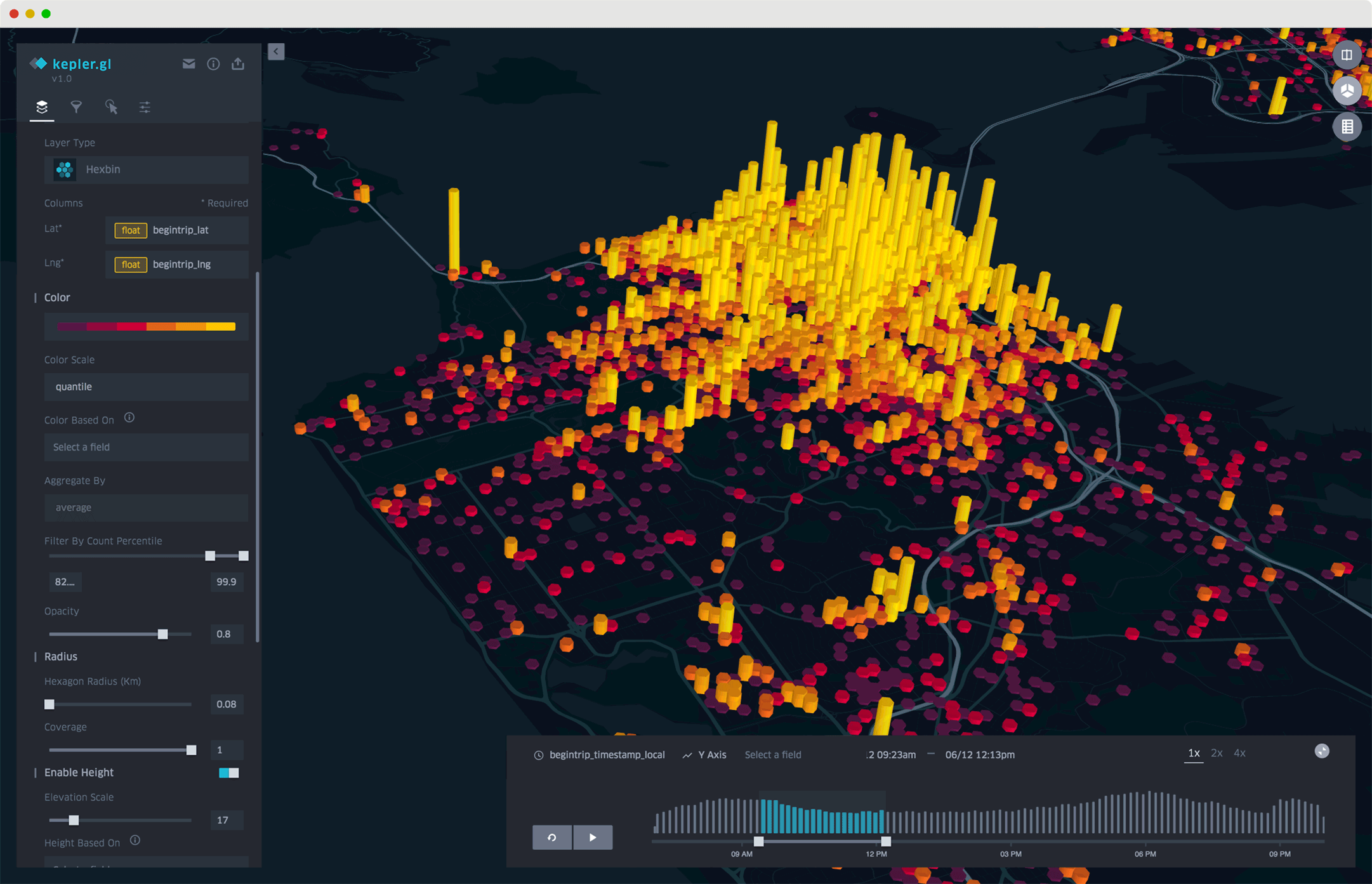
2. Kepler.gl
Kepler.gl is an open-source geospatial visualization tool developed by Uber.
Built specifically for large-scale location data, Kepler.gl is optimized for rendering millions of points. It supports time-based animations, heatmaps, clustering, and hex bins.
- Strengths: Beautiful, scalable, zero-code interface
- Limitations: Not a full BI tool; no modeling or metrics layer
- Best for: Mobility data, time-based animations, public transit analysis
3. CARTO
CARTO is a cloud-native GIS platform focused on advanced spatial analytics.
CARTO supports spatial SQL, spatial joins, and complex geostatistical modeling. It’s a full GIS tool, built for data scientists and geospatial analysts who want deep control, not just map rendering.
- Strengths: Built-in spatial analytics engine, PostGIS support, APIs
- Limitations: Not built for dashboarding; more of a developer/analyst tool
- Best for: Urban planning, climate science, market optimization
4. Mapbox
Mapbox is a customizable mapping platform often used by developers to embed maps and geodata into apps or dashboards.
Mapbox provides fine-grained control over map styles, zoom behavior, and interactions — making it a favorite for front-end teams integrating geospatial insights into digital products.
- Strengths: Highly customizable, performant, developer-friendly
- Limitations: Requires coding; not a BI platform on its own
- Best for: Embedded dashboards, mobile apps, real-time geodata.

How to Choose a Data Visualization Tool for Your Tech Stack
No tool is perfect. The right one depends on your data sources, team structure, governance needs, and how your organization thinks about analysis. Skip the feature checklist and start with your actual use case.
Choosing a data visualization tool isn’t just about UI preferences or chart types. It’s about how well the tool fits into your stack, your workflow, and your data maturity.
Let’s break down what actually matters.
1. What are you connecting to?
- If you're using BigQuery, Redshift, or Snowflake, most modern tools will connect fine.
- For Excel or on-prem SQL Server, Power BI is a strong fit.
- If your models live in dbt, tools like Holistics, Lightdash, and Looker will integrate cleanly.
Pro tip: Choose a tool that doesn’t force you to move or replicate your data. Avoid tools that create shadow ETL pipelines.
2. Who’s building the dashboards?
- Business users? Prioritize drag-and-drop tools like Power BI, Tableau, or Holistics.
- Data engineers? Look for tools with modeling layers, Git integration, or dashboard-as-code, like Holistics, Looker, or Superset.
- Mixed teams? Choose a tool that can support both GUI and code-defined workflows.
3. Do you need governance?
If different teams can redefine the same metric (say, “Active User”), chaos spreads quickly. You need:
- Centralized modeling
- Version control
- Role-based access
This is where tools like Looker and Holistics stand out. They let you define metrics once and reuse them across dashboards.
4. Are you embedding dashboards into a product?
If you're delivering analytics to customers or partners:
- Look for tools that support embedded analytics, white-labeling, embed tokens, and permissioning.
- Looker, Domo, Holistics, Qlik, and Sisense all support this.
Final Tip: Don’t Let Tools Define Your Workflow
A good BI tool should adapt to how your team works, not the other way around. Start with your real reporting bottlenecks, your most-used queries, and your team’s strengths, and evaluate tools based on how well they support those flows.
What's happening in the BI world?
Join 30k+ people to get insights from BI practitioners around the globe. In your inbox. Every week. Learn more
No spam, ever. We respect your email privacy. Unsubscribe anytime.
